Table of Contents >> Show >> Hide
- Why Winter Paint Colors Work Differently
- 1. Creamy Off-White
- 2. Greige
- 3. Mushroom Taupe
- 4. Camel Beige
- 5. Dusty Blush
- 6. Terracotta
- 7. Cinnamon Brown
- 8. Burgundy
- 9. Olive Green
- 10. Forest Green
- 11. Sage Green
- 12. Smoky Teal
- 13. Slate Blue
- 14. Warm Charcoal or Bronze
- How to Choose the Right Winter Paint Color for Your Room
- The Best Rooms for Winter Paint Makeovers
- Conclusion
- What It Feels Like to Live With Winter Paint Colors
Winter has a funny way of turning a perfectly nice room into something that feels a little… emotionally refrigerated. The sun checks out early, shadows get longer, and suddenly that crisp white wall you loved in July feels like it’s judging your throw blankets. That is exactly why the right winter paint colors matter. They do not just change how a room looks. They change how a room feels.
The best winter paint colors are not necessarily loud, trendy, or dramatic enough to deserve their own reality show. More often, they are shades with warm undertones, earthy depth, and enough softness to play nicely with wood tones, layered textiles, and low winter light. Think creamy whites instead of icy whites, mossy greens instead of bright emeralds, and rich browns, rusts, and muted blues that feel like a mug of cocoa in color form.
If you want your home to feel warmer, cozier, and more inviting this season, these 14 winter paint colors are a smart place to start. Some are subtle. Some are moody. All of them can help your home feel like it has a pulse again.
Why Winter Paint Colors Work Differently
Before we get to the shades, here is the golden rule: winter light changes everything. Rooms often look dimmer, flatter, and cooler during colder months, especially north-facing spaces. That means undertones matter more than ever. A white with a yellow, cream, or beige base can feel soft and welcoming, while a white with blue or gray undertones may read stark. The same goes for grays, blues, and greens. In winter, the “wrong” undertone can make a room feel chilly fast.
The solution is simple. Choose colors that either add warmth directly or balance cool light with grounded depth. That is where these winter-ready shades shine.
1. Creamy Off-White
A creamy off-white is the easiest way to warm up a room without committing to obvious color. It reflects light beautifully, but unlike stark white, it does not feel harsh. This shade works especially well in living rooms, hallways, kitchens, and bedrooms that need brightness without that sterile “doctor’s office but make it expensive” vibe.
Pair it with linen curtains, oak furniture, brass hardware, and nubby textiles for maximum softness. If your room gets limited natural light, this color family is often a safer bet than crisp white.
2. Greige
Greige remains a winter favorite for good reason. It gives you the calm of gray with the comfort of beige, which is basically the paint equivalent of wearing your nicest sweater instead of a business suit. In open-concept homes, greige creates continuity while still feeling warm enough for the season.
Choose a version with soft taupe or beige undertones, not icy silver ones. It looks great with black accents, warm woods, and ivory upholstery.
3. Mushroom Taupe
Mushroom taupe is a little moodier than greige and a lot more interesting than plain beige. It has a grounded, earthy look that feels elevated but approachable. In winter, that balance matters. You want a room that feels styled, not stage-set.
This color is perfect for bedrooms, dining rooms, and dens. It also plays beautifully with layered neutrals such as cream, oatmeal, camel, and espresso.
4. Camel Beige
If your goal is instant warmth, camel beige deserves serious attention. It has a sun-baked, golden quality that helps counter cold daylight and makes a room feel wrapped up rather than washed out. It is especially flattering in spaces with wood floors, leather furniture, or woven textures.
Use it in family rooms, entryways, or offices where you want warmth without darkness. It feels timeless, tailored, and quietly luxurious.
5. Dusty Blush
Dusty blush is one of those colors people underestimate until they see it on the wall and suddenly start talking about “soft warmth” like they are on a home makeover show. The appeal is real. A muted pink with beige or brown undertones can make a room glow in winter light.
This is a great choice for powder rooms, bedrooms, reading nooks, or even dining rooms if you want something subtle but not boring. It pairs well with walnut, antique brass, creamy white trim, and charcoal accents.
6. Terracotta
Terracotta brings heat without going neon. It feels sunbaked, earthy, and welcoming, which makes it especially effective during cold months. In the right room, terracotta creates instant depth and personality while still feeling organic.
Try it as an accent wall, in a dining space, or in a kitchen with natural wood and matte black finishes. If a full room feels too bold, terracotta also works beautifully on cabinetry or built-ins.
7. Cinnamon Brown
Brown is back, and winter is the season where it makes the most sense. A cinnamon or cocoa-toned brown adds richness without the severity of black or the heaviness of deep charcoal. It feels enveloping, especially in rooms with soft lighting.
This shade shines in libraries, offices, dining rooms, and small living rooms. Use it with creamy trim, cognac leather, and warm metals. It is dramatic, but in a very grown-up way.
8. Burgundy
Burgundy is bold, yes, but it is also incredibly cozy when used well. A wine-toned wall can make a room feel intimate, layered, and seasonally appropriate without veering into holiday cliché. The key is to choose a muted burgundy rather than a bright red.
It works beautifully in dining rooms, powder rooms, and moody bedrooms. Pair it with warm wood, aged brass, and cream textiles to keep it sophisticated.
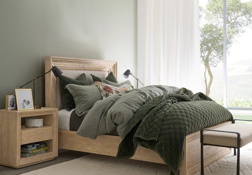
9. Olive Green
Olive green brings the outdoors in, but in a softer, more grounded way than brighter greens. It feels earthy, calm, and quietly elegant, which makes it a natural fit for winter interiors. It also happens to be excellent at making wood tones look richer.
Use olive in kitchens, mudrooms, bedrooms, or living spaces where you want color without chaos. It looks especially good with stone, leather, and vintage-inspired decor.
10. Forest Green
For a deeper, more dramatic option, forest green is hard to beat. It feels cozy, classic, and a little bit like a fancy cabin that knows how to make mulled cider. Dark green walls can absorb some of winter’s flat light and make a room feel cocoon-like in the best way.
This shade is a strong choice for studies, bedrooms, dining rooms, or cabinetry. Balance it with lighter trim, warm bulbs, and natural textures so the room feels rich, not gloomy.
11. Sage Green
Sage green is softer than olive and lighter than forest, which gives it broad appeal. It feels peaceful and restorative, but the best versions also carry enough warmth to hold their own in winter. If you want something calming and versatile, sage is a safe and stylish pick.
It works nearly anywhere: bedrooms, bathrooms, kitchens, nurseries, and living rooms. Pair it with ivory, pale wood, brushed brass, and soft clay accents.
12. Smoky Teal
Smoky teal adds color while keeping the mood grounded. It sits somewhere between blue and green, which gives it flexibility, and the smoky quality makes it feel softer and more winter-friendly than a bright jewel tone.
This is a smart choice for accent walls, cabinetry, offices, and guest rooms. It pairs beautifully with tan, rust, cream, and dark walnut, which makes it easy to style through the coldest months.
13. Slate Blue
Blue can absolutely work in winter, but this is not the season for icy baby blue unless you are decorating an actual snow globe. A muted slate blue with gray or green undertones feels calmer, deeper, and more inviting. It has enough coolness to feel sophisticated and enough softness to avoid reading cold.
Slate blue works well in bedrooms, bathrooms, and living rooms, especially when paired with warm whites, oatmeal textiles, and wood furniture.
14. Warm Charcoal or Bronze
If you love dark paint but want something gentler than black, warm charcoal or bronze is the answer. These shades have brown undertones that make them feel rich and welcoming instead of severe. They can make a room feel intimate and expensive, especially in the evening when lamps are on and the world outside looks like a frozen parking lot.
Use them in powder rooms, dining rooms, offices, or on cabinets and millwork. The contrast with creamy whites and natural materials is especially beautiful in winter.
How to Choose the Right Winter Paint Color for Your Room
Look at your light first
North-facing rooms usually benefit from warmer colors. South-facing rooms can handle more complex neutrals and moodier tones. East- and west-facing rooms change a lot throughout the day, so sample generously.
Test large swatches
A paint chip is helpful, but it is not the final boss. Paint large sample boards or patches and look at them morning, afternoon, and evening. Winter light can pull surprising undertones out of a color.
Think about the whole room
Paint does not live alone. It has to work with your flooring, trim, cabinets, furniture, and lighting. The coziest color in the world can still look wrong next to a pink-beige sofa or orange-toned wood floor if the undertones fight.
Use finish strategically
Flat and matte finishes feel soft and forgiving on walls, which suits cozy winter spaces. Satin and semi-gloss are better for trim, cabinets, and areas that need more durability.
The Best Rooms for Winter Paint Makeovers
If you are not ready to repaint your entire house, start with the rooms you feel most during winter. Bedrooms benefit from soft, cocooning colors like sage, mushroom taupe, and slate blue. Living rooms come alive with creamy whites, camel beige, olive, and warm greige. Dining rooms and powder rooms are ideal for riskier winter shades like burgundy, terracotta, forest green, or warm charcoal, because smaller or more occasional spaces can handle a bit more drama.
Cabinetry, built-ins, and accent walls are also smart places to experiment. You can get the cozy, high-impact look of a winter paint color without repainting every square inch of drywall in sight.
Conclusion
The best winter paint colors do not just make a room prettier. They make it feel better. They soften dim light, flatter natural materials, and turn your home into the kind of place you actually want to hibernate in. Whether you lean toward creamy neutrals, earthy reds, grounded greens, or moody blue-grays, the right shade can transform winter from something you endure into something you decorate for on purpose.
If your home has been feeling a little cold, visually or emotionally, consider this your sign. A paint sample costs less than a spontaneous furniture-shopping spiral, and unlike that giant accent chair you almost bought at 11 p.m., it may actually solve the problem.
What It Feels Like to Live With Winter Paint Colors
One of the most interesting things about winter paint colors is that their impact is rarely dramatic in a loud, instant way. It is more personal than that. You notice it on a dark morning when you walk into the kitchen and the walls do not feel flat. You notice it at five in the evening when it already looks like midnight outside, but your living room still feels warm and settled instead of dull. Good winter paint colors change the emotional temperature of a home.
People often discover that warm whites and soft taupes make everyday routines feel easier. Coffee tastes more civilized. Laundry feels slightly less offensive. A creamy wall color can make a room feel cleaner, brighter, and softer at the same time, which is not a trick every shade can pull off. In homes with limited winter sunlight, these lighter warm tones often become the difference between “cozy” and “why does this room feel like a waiting area?”
Deeper colors create a different experience. Forest green, burgundy, smoky teal, and warm charcoal tend to make rooms feel enclosed in a comforting way. At night, when table lamps are on and the windows turn reflective, these shades can feel luxurious and calm. That is why people often love them in bedrooms, dining rooms, and home offices. They reduce visual noise. They make the room feel intentional. They encourage you to slow down, sit down, and maybe light a candle you forgot you owned.
Earthy colors also tend to age well emotionally. A terracotta or olive room may feel bold at first, but once it is lived in, it often starts to read as natural rather than trendy. Winter especially highlights this effect. These colors echo branches, soil, leather, cedar, dried leaves, and stone. Even when the weather is miserable, the room feels connected to something grounded and organic.
Another common experience is that color changes how decor behaves. Throw blankets suddenly look richer. Wood furniture appears deeper. Brass hardware gets glowier. Even inexpensive lamps seem more confident, which is honestly nice for them. Warm paint colors create a backdrop that helps everything else in the room feel more layered and considered.
There is also the psychological side. During winter, many people crave comfort, softness, and visual calm. A thoughtfully chosen paint color supports that mood every single day without demanding attention. It is not seasonal decor you have to store later. It is a background choice that quietly improves how the house functions and feels. That is why repainting can have such an outsized effect. You are not just changing a color. You are changing the atmosphere people live inside.
In the end, the experience of a winter paint color is about more than trend reports or designer favorites. It is about walking into your home in the middle of a cold week and feeling relieved. It is about rooms that feel warmer when the weather is not. And if a can of paint can make January less annoying, that is not just good design. That is public service.