Table of Contents >> Show >> Hide
- Before You Pick a Color: Two-Minute Gray Wall Reality Check
- Warm Neutrals That Make Gray Walls Feel Cozy (Not Cold)
- Cool, Calm Colors That Make Gray Feel Fresh
- Greens That Make Gray Walls Feel Natural and Collected
- Warm Pops That Keep Gray Walls From Feeling Flat
- Room-by-Room Shortcuts (Because Decision Fatigue Is Real)
- Extra: of Real-World “Gray Wall” Experiences (What People Actually Run Into)
- Conclusion
Gray walls are the introvert of paint colors: calm, reliable, and somehow friends with everyone.
But that doesn’t mean every color pairing looks equally amazing. The secret is undertones.
A cool, blue-ish gray behaves like a crisp winter morning; a warm, taupe-leaning gray acts more like a cozy latte.
Match the “temperature” correctly and your room instantly looks intentionallike you hired a designer instead of panic-buying pillows at 9:47 p.m.
This guide synthesizes room-tested advice from major American home and design publications plus trusted U.S. paint brands.
You’ll get 26 colors that go with gray walls, with practical examples for living rooms, bedrooms, kitchens, bathrooms, nurseries, and home offices
without turning your house into a sad grayscale movie.
Before You Pick a Color: Two-Minute Gray Wall Reality Check
1) Identify your gray’s undertone
Gray isn’t “just gray.” It can lean blue, green, purple, or beige (hello, greige). A quick trick:
hold a sheet of bright white paper next to the wall. If the wall looks a little icy or steely, it’s likely cool.
If it looks slightly beige, mushroomy, or “warm,” you’re in greige territory.
2) Let lighting vote (because it will anyway)
North-facing rooms often make colors look cooler; warm bulbs can make the same gray look softer and more beige.
Test your accent color in the morning, afternoon, and at night. Paint chips are tiny liars. Your wall is the courtroom.
3) Decide your vibe
Want airy and open? Pair light gray with crisp whites and pale blues. Want cozy and rich?
Anchor gray with warm woods, deep blues, wine reds, or earthy clay tones. The color choice is the mood boardchoose the mood first.
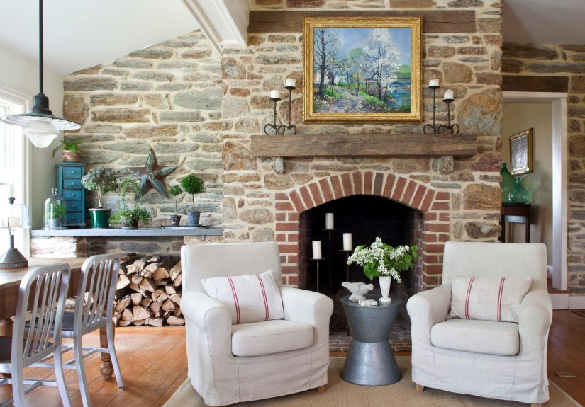
Warm Neutrals That Make Gray Walls Feel Cozy (Not Cold)
1) Crisp White
White trim, white bedding, white cabinetscrisp white is the cleanest partner for gray walls and makes spaces feel bigger.
Use it in small bathrooms or hallways to bounce light around, or in a gray bedroom for hotel-level calm.
Add texture (waffle towels, boucle pillows, linen curtains) so the look feels layered, not sterile.
2) Creamy Off-White
If stark white feels too sharp, creamy off-white warms gray instantly. Think: cozy, not clinical.
Perfect for living rooms with gray walls where you want softnessespecially with warm wood floors.
Bonus: it’s forgiving in real life, where fingerprints happen and we all pretend they don’t.
3) Beige
Beige and gray used to be frenemies. Now they’re bestiesespecially when your gray leans cool and needs warmth.
Try beige upholstery, a jute rug, or woven baskets in a family room. The combo reads relaxed and timeless,
like your home has its life together (even if your laundry doesn’t).
4) Greige
Greige (gray + beige) bridges warm and cool, which makes it an MVP for open floor plans.
Use greige on adjoining walls or large furniture pieces to smooth transitions between rooms.
In a kitchen, greige bar stools or a runner can soften gray cabinets or gray walls without going full beige-era throwback.
5) Taupe
Taupe adds depth without drama. It’s ideal if you want a grown-up neutral paletteespecially in home offices or dining rooms.
Pair taupe curtains or a taupe upholstered chair with gray walls for a calm, “I definitely meet deadlines” atmosphere.
6) Camel / Tan
Camel leather and gray walls are basically a design cheat code. Add a tan leather sofa, camel throw pillows,
or a warm tan rug in a living room. The warmth of tan makes gray feel intentional, not accidental.
It also plays nicely with black accents and brass hardware.
7) Chocolate Brown
If you want richness, go deeper. Chocolate brown adds a grounded, cozy feelgreat for bedrooms and libraries.
Use it in wood furniture, a dark headboard, or framed art. With light gray walls, it reads warm and sophisticated, not heavy.
Cool, Calm Colors That Make Gray Feel Fresh
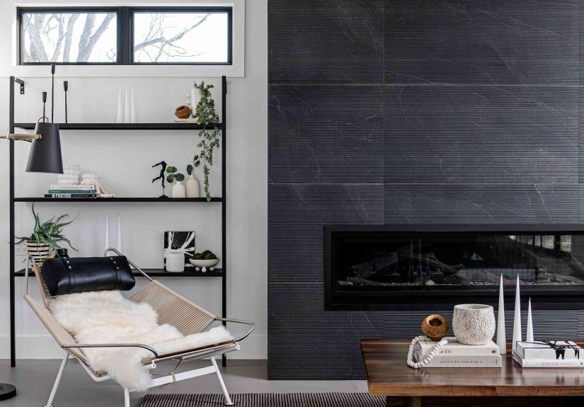
8) Navy Blue
Navy brings contrast without looking loud. With gray walls, navy feels tailoredespecially in a living room or home office.
Try navy built-ins, a sofa, or even a single accent chair. Add brass or warm wood to keep the palette from feeling too chilly.
9) Denim Blue
Denim blue is navy’s laid-back cousin. It works beautifully with medium gray walls in casual family spaces.
Think: denim-toned curtains, a patterned rug with blue threads, or soft blue pillows.
It looks lived-in (in a good way), like your home actually gets used by humans.
10) Sky Blue
Sky blue brightens gray without overwhelming it. It’s a go-to for bedrooms, nurseries, and bathrooms.
Use sky blue towels, bedding, or a painted vanity. The effect is airy and cleanlike a deep breath, but in color form.
11) Powder Blue
Powder blue is softer and slightly mutedideal if your gray walls already have cool undertones.
It pairs well with white trim and chrome fixtures in bathrooms, or with light wood and linen in bedrooms.
Keep it subtle and it’ll feel elegant, not babyish.
12) Teal
Teal adds personality without chaos. With gray walls, it reads vibrant but groundedgreat for living rooms and creative offices.
Try teal velvet pillows, a statement chair, or artwork with teal highlights.
If you’re nervous, start small: one bold teal vase can do a lot of heavy lifting.
13) Aqua
Aqua is playful and light, especially with pale gray walls. It’s perfect for laundry rooms, kids’ bathrooms, or beachy spaces.
Use it on cabinetry, tile, or accessories. Pair with white and natural textures so it feels breezy, not like an energy drink.
14) Lavender
Lavender can be surprisingly sophisticated with gray wallsespecially if your gray has a hint of purple.
It’s lovely in bedrooms and reading nooks. Try lavender bedding, a soft rug, or an accent wall in a lighter shade.
Add charcoal and warm metals to keep it modern.
15) Lilac
Lilac is lavender’s brighter, sunnier sibling. It works best with light-to-medium gray walls in spaces where you want gentle charm:
guest rooms, nurseries, or powder rooms. Pair with white and a touch of black for balance.
Greens That Make Gray Walls Feel Natural and Collected
16) Sage Green
Sage is a crowd-pleaser with gray walls because it’s muted, earthy, and calming.
It’s fantastic in kitchens (sage cabinets with gray walls or vice versa), bedrooms, and living rooms.
Add warm wood and creamy whites for a soft, modern “nature indoors” vibe.
17) Olive Green
Olive brings warmth and depth, especially with cool gray walls that need a little life.
Use olive in textiles, art, or cabinetry in a dining room or den.
It pairs beautifully with brass, leather, and natural stoneaka the “I know what I’m doing” materials.
18) Forest Green
Forest green is moody in the best way. With gray walls, it looks rich and intentionalperfect for libraries, home offices,
or a dramatic bedroom accent wall. Pair with crisp white trim and warm wood so it doesn’t go full cave.
19) Emerald Green
Emerald is glamorous against gray wallsespecially in velvet or glossy finishes.
Use it as an accent in living rooms (sofa, chair, drapes) or in a powder room where drama is welcomed.
Gold accents make it feel luxe; black accents make it feel modern.
Warm Pops That Keep Gray Walls From Feeling Flat
20) Blush Pink
Blush softens gray instantly, especially cool grays. It’s a favorite for bedrooms, nurseries, and even living rooms
when used in pillows, art, or rugs. The key is to keep it dusty and mutedless bubblegum, more “grown-up rosé.”
21) Dusty Rose
Dusty rose is blush with a bit more depth, which makes it great for gray walls in guest rooms or cozy sitting areas.
Pair it with warm neutrals (cream, tan) and a little black for contrast.
It feels romantic, but not in a “heart-shaped bed” way.
22) Coral
Coral brings energy and warmth. It’s excellent for kitchens, breakfast nooks, and playrooms
anywhere you want “happy” to be part of the design plan. Try coral bar stools, dishes on open shelves, or a bold piece of art.
Gray keeps it grounded so it doesn’t feel too loud.
23) Terracotta
Terracotta is earthy, warm, and looks stunning against gray wallsespecially with natural materials like wood, rattan, and linen.
Use terracotta in living rooms (pillows, pottery), entryways (runner rugs), or dining rooms.
It’s cozy without being boring, which is basically the dream.
24) Rust
Rust is deeper than terracotta and adds an autumnal richness to gray walls.
Try rust velvet pillows, a rust-toned area rug, or a statement chair in a den or living room.
This combo is especially flattering with warm gray or greige walls.
25) Mustard Yellow
Mustard is the “cool person” yellowbold, warm, and a little vintage. With gray walls, it creates instant contrast.
Use mustard in a living room (armchair, throw), a home office (art, accessories), or even a kitchen
through textiles. Keep the rest neutral so mustard gets to be the star, not the entire cast.
26) Burgundy / Wine
Burgundy adds depth and sophistication, especially with medium-to-dark gray walls.
It’s gorgeous in dining rooms, bedrooms, and formal living rooms through drapery, rugs, or upholstered seating.
Pair with brass, cream, and a hint of black to make it feel classic instead of heavy.
Room-by-Room Shortcuts (Because Decision Fatigue Is Real)
Living Room
For cozy: camel, beige, terracotta, rust. For tailored: navy, forest green, black accents.
If your living room gets low light, lean warmcream textiles and warm woods help gray look inviting.
Bedroom
For calm: sage, powder blue, lavender, blush. Add softness with layered bedding and curtains.
Gray walls love texturequilted covers, linen shams, and a plush rug do more than another random “accent color.”
Kitchen
Gray walls work with crisp white cabinets (fresh), sage cabinets (organic), or navy lower cabinets (classic).
Brass pulls, warm wood cutting boards, and creamy stone counters prevent the space from feeling chilly.
Bathroom
Keep it bright: crisp white + sky blue or aqua. For spa vibes: sage + warm off-white towels.
In tiny bathrooms, one strong accent (emerald mirror frame, navy vanity) looks intentional and doesn’t clutter the visual space.
Home Office
Want focus: navy, forest green, charcoal-black accents. Want creativity: teal or coral (in small doses).
A gray wall behind your desk is an excellent backdrop for art, shelving, and Zoom calls where you want to look like you’ve got it together.
Extra: of Real-World “Gray Wall” Experiences (What People Actually Run Into)
Gray walls are popular because they’re forgivinguntil they aren’t. One common experience homeowners report is choosing a “safe gray”
that looks perfect in the store, then watching it change personalities at home. In bright afternoon sun, a cool gray can suddenly look
slightly blue. At night under warm bulbs, the same wall might look warmeralmost greige. This is why the smartest “experience-based” move
is sampling: paint a large swatch on two walls (one that gets light, one that doesn’t) and live with it for a couple of days. People who do
this almost always feel calmer about choosing accent colors afterwardbecause they finally understand what their gray is actually doing.
Another real-life pattern: the moment gray walls go into a room, texture becomes twice as important. Many people add color firstpillows, throws,
artthen wonder why the room still feels flat. The fix is usually not “more color,” but more variety in surfaces: a woven rug, matte ceramics,
brushed metal, warm wood, boucle, linen, leather. With gray walls, texture reads like depth. It’s also a sneaky way to make neutral palettes
look expensive without buying a single “designer” object.
People also tend to underestimate how powerful one strong accent can be. A navy sofa against gray walls can carry an entire living room,
especially if you echo the navy once more (a lamp shade, a vase, a stripe in the rug). Same with emerald: one velvet chair can turn a basic gray
room into something that feels styled. The “experience” takeaway is that repeating an accent color two or three timesno moreis often enough.
After that, you risk the room looking like a paint store exploded.
In bedrooms, the most common “win” people describe is pairing gray walls with soft, muted colors like blush, sage, or powder blue.
These shades don’t fight gray; they soften it. The biggest “oops” tends to happen when the accent color is too bright and too pure,
like a loud primary red or neon yellow. Those can look harsh next to a neutral gray backdrop. When someone really wants bold color,
the best experience-based compromise is choosing a deeper, dustier version: burgundy instead of red, mustard instead of bright yellow,
teal instead of neon turquoise. The look stays lively, but it doesn’t feel like the room is yelling.
Finally, there’s the “seasonal test.” Gray walls can feel cooler in winter and more neutral in summer, depending on your light.
People who love flexibility often build a gray room around neutral anchors (cream, tan, white) and then rotate accents seasonally:
terracotta and rust in fall, evergreen and burgundy in winter, sage and sky blue in spring, aqua and coral in summer. It’s a low-cost way to
keep gray walls feeling fresh year-roundand it gives you a perfectly valid excuse to buy new throw pillows, which is basically a hobby anyway.
Conclusion
The best colors that go with gray walls aren’t just “pretty”they’re compatible with your gray’s undertone and your room’s lighting.
Start by deciding whether your gray reads warm or cool, then pick a palette that supports the mood you want:
airy (white, sky blue), cozy (beige, camel, terracotta), natural (sage, olive), or dramatic (navy, emerald, burgundy).
When in doubt, remember the most reliable design formula: gray + texture + one confident accent.
That’s not just a color schemeit’s a lifestyle.