Table of Contents >> Show >> Hide
- Before You Start: The Wood (and Why It’s the Main Character)
- Quick Comparison: Which Transfer Method Should You Use?
- Way #1: Carbon (or Graphite) Paper Transfer for Clean Outlines
- Way #2: Freezer Paper Ink Transfer for a “Printed on Wood” Look
- Way #3: Photo Transfer Medium / Mod Podge Transfer for a Vintage Printed Effect
- Design Tips That Make Any Method Look More Professional
- Conclusion: Pick Your Method, Then Practice Like a Calm Person
- of Real-World “Been There” Experiences (So You Don’t Have To)
Want crisp lettering on wood without buying a laser engraver, a vinyl cutter, or a small herd of fancy tools? Good news:
transferring words to wood is one of those DIY skills that looks like wizardry… until you do it once and realize it’s mostly
prep, pressure, and patience (plus a tiny bit of “please don’t smudge” energy).
In this guide, you’ll learn three reliable, beginner-friendly ways to transfer text onto wood for signs, labels, plaques, and
gift projects. Each method has its own vibesome are great for hand-painting, some give you a printed look, and one is basically
“glue it, wait, rub it, reveal it.” We’ll also cover best wood surfaces, layout tips, and the mistakes everyone makes at least once
(you’ll feel seen).
Before You Start: The Wood (and Why It’s the Main Character)
No matter which technique you choose, your results are only as good as your surface. Wood grain is gorgeous… and also mildly
chaotic. Here’s how to set yourself up for clean lettering:
Pick the right surface for the look you want
- Smooth, sanded pine or poplar: best for crisp transfers and readable text.
- Plywood (cabinet-grade or birch): stable and smooth, great for signs.
- Rustic boards/pallet wood: charming, but expect “weathered farmhouse” softness (a.k.a. less sharp edges).
Sand like you mean it
If your finger catches on the grain, your transfer will catch too. Sand to a smooth finish (especially for small fonts), then wipe
off dust with a dry cloth or tack cloth.
Decide: raw wood vs. sealed wood
For many text-transfer methods, lightly sealing with a thin coat of water-based sealer (or even a light coat of paint for a white
background) can reduce blotchy absorption and make lettering sharper. If you love a stained look, test on scrapsome techniques
pop better on lighter wood.
Quick Comparison: Which Transfer Method Should You Use?
| Method | Best For | Look | Difficulty | Mess Level |
|---|---|---|---|---|
| Carbon/Graphite Transfer (Tracing) | Painted signs, wood burning outlines, hand-lettering | Outline you fill in | Easy | Low |
| Freezer Paper Ink Transfer (Inkjet) | “Printed” text on wood without special mediums | Direct ink-on-wood | Medium | Medium (smudge risk) |
| Photo Transfer Medium / Mod Podge Transfer | Vintage printed text, longer-lasting transfers | Soft printed look | Medium | Medium (rubbing step) |
Way #1: Carbon (or Graphite) Paper Transfer for Clean Outlines
This is the classic, low-drama way to transfer words to woodespecially if you plan to paint, trace with a paint pen, or wood-burn
the lettering. You print your design, place transfer paper underneath, trace the letters, and the outline appears on the wood like
a polite little guide.
What you’ll need
- Printed text/design (any font you like)
- Carbon paper or graphite transfer paper (black for light wood; white for dark-stained wood)
- Painter’s tape
- Ballpoint pen or stylus (something firm that won’t tear paper)
- Optional: ruler for alignment
Step-by-step
- Size and print your words. Use a bold font if you want easy readability from across the room.
- Position the design. Tape your printed paper to the wood at the top edge (hinge style) so it won’t shift.
- Slip transfer paper underneath. Put carbon/graphite paper between the print and the wood (coated side down).
- Trace the letters. Press firmly and trace every stroke. For script fonts, go slowerloops love to hide.
- Lift and check. Peel up a corner to confirm the transfer is showing clearly. If it’s faint, trace again with more pressure.
- Remove paper and refine. If you get smudges, gently erase with a soft eraser (test first so you don’t smear).
Pro tips for sharper results
- Choose the right transfer color: white transfer paper is a lifesaver on dark wood.
- Keep your hands clean: graphite can smudgerest your hand on a clean sheet of paper as you trace.
- For tiny text: use a slightly thicker font weight so your strokes don’t vanish into the grain.
Example project
Kitchen pantry labels on a reclaimed board: Transfer “Flour,” “Sugar,” “Coffee,” and “Tea” in a simple serif font, then fill with a
paint pen. Seal with a clear water-based topcoat for wipe-clean durability.
Common problems (and fixes)
- Problem: Lines look fuzzy. Fix: Sand smoother next time, or switch to a bolder font.
- Problem: Design shifted mid-trace. Fix: Tape the design on at least two edges (top + one side).
- Problem: Smudges everywhere. Fix: Use lighter pressure with your palm, and erase gentlydon’t rub like you’re starting a fire.
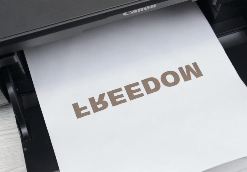
Way #2: Freezer Paper Ink Transfer for a “Printed on Wood” Look
If you want the words to look like they were printed directly onto the woodwithout waiting overnightfreezer paper transfer is a
fun trick. The shiny side of freezer paper doesn’t absorb ink the way normal paper does, so ink from an inkjet printer stays
wetter on the surface just long enough to transfer onto wood when you burnish it.
Translation: you get a “stamp-like” printed effect… as long as you don’t sneeze, blink, or accidentally drag the paper even one millimeter.
What you’ll need
- Freezer paper
- Scissors or paper trimmer
- Inkjet printer (this method is designed for inkjet ink behavior)
- Painter’s tape
- Old credit card, plastic scraper, or spoon (for burnishing)
- Smooth, sanded wood
Step-by-step
- Cut freezer paper to printer size. Match standard paper dimensions so it feeds smoothly.
- Mount it for printing. Many people tape freezer paper (shiny side up) onto a normal sheet of paper to help it feed straight.
- Mirror your text before printing. If you don’t mirror it, your sign will read like it belongs in a mirror universe.
- Print and handle carefully. The ink will be wet on the shiny sidedon’t touch the lettering.
- Place ink-side down on wood immediately. Align once. Then resist the urge to “just nudge it a little.”
- Tape one edge. Create a hinge so it doesn’t slide while you burnish.
- Burnish firmly. Rub the back of the paper with a card/scraper using steady pressure over every letter.
- Lift straight up. Peel carefully from one side. If you drag, you’ll smear.
Pro tips for crisp freezer paper transfers
- Go bigger than you think: medium-to-large text transfers more reliably than tiny hairline fonts.
- Use smooth wood: grain valleys can break letters, especially with light fonts.
- Don’t over-burnish: firm and even is good; frantic scrubbing can shift paper and blur edges.
Example project
Minimalist entryway sign: Transfer “HOME” in a bold sans serif font onto a pale wood panel, then seal with a clear coat to protect from
fingerprints (because humans are basically walking oil slicks).
Common problems (and fixes)
- Problem: Smudged letters. Fix: Tape the paper securely and lift straight up. Practice on scrap first.
- Problem: Patchy transfer. Fix: Increase pressure evenly and make sure the wood is smooth and dust-free.
- Problem: Printer jams. Fix: Flatten freezer paper sheets first and mount them to a carrier sheet for stability.
Way #3: Photo Transfer Medium / Mod Podge Transfer for a Vintage Printed Effect
Despite the name, photo transfer medium isn’t just for photos. It works beautifully for quotes, labels, and typography-heavy designs
especially if you like that slightly worn-in, farmhouse-style printed look.
The concept is simple: the medium grabs the toner/ink from your print, bonds it to the wood, and then you remove the paper backing
with water and gentle rubbing. The results can be gorgeous… and also a lesson in patience if you try to rush the drying time.
What you’ll need
- Photo transfer medium (or Mod Podge photo transfer medium / acrylic gel medium)
- Laser print or photocopy of your text (mirror/reverse the design first)
- Foam brush or soft paintbrush
- Old card/brayer (to smooth paper down)
- Water + sponge/soft cloth (for paper removal)
- Optional: acrylic paint (for a white/solid background)
- Optional: water-based sealer/topcoat
Step-by-step
- Prep the wood. Sand smooth; paint first if you want high contrast, and let it dry fully.
- Mirror your text and print. If your quote isn’t mirrored, it will transfer backwards.
- Apply transfer medium. Brush an even, generous coat onto the print (or onto the woodfollow your product’s directions).
- Place paper face-down. Press it onto the wood carefully, then smooth with a card/brayer to remove bubbles.
- Let it dry completely. Dry time matters here. Rushing = peeling = sadness.
- Remove the paper backing. Dampen the paper and rub gently in small circles until the paper fibers roll away and the text is revealed.
- Seal the surface. Once fully dry, apply a clear topcoat if the piece will be handled or cleaned.
Pro tips for cleaner transfers
- Use regular paper, not photo paper: thick glossy stock can fight you during removal.
- Work slowly when rubbing: gentle pressure prevents lifting the transferred lettering.
- Expect “character”: slight texture and softness is part of the charmif you want razor-sharp, choose tracing or a stencil method.
Example project
Gift quote plaque: Transfer “In a world where you can be anything, be kind” onto a painted wood board, lightly distress edges, then seal.
Looks like boutique décor. Costs like… craft glue.
Common problems (and fixes)
- Problem: Paper won’t rub off cleanly. Fix: Re-wet the surface and rub gently; don’t scrape aggressively.
- Problem: Parts of letters lift. Fix: Dry longer next time and reduce rubbing pressure. Use a thicker, more even medium layer.
- Problem: Blurry text. Fix: Smooth out bubbles before drying; air pockets can distort edges.
Design Tips That Make Any Method Look More Professional
Choose fonts that behave on wood
- Best for beginners: bold sans serif, chunky serif, block lettering.
- Trickier but pretty: thin scripts and swashes (they demand smoother wood and steadier hands).
Mind the spacing
Wood signs look better when text has breathing room. If your quote is long, use two lines, adjust tracking slightly, and consider
a smaller subtitle line for balance.
Always test on scrap
Seriously. Wood species, stain, printer ink, humidity, and the alignment gods all play a role. A two-minute scrap test can save
you from turning your “Live Laugh Love” into “Live L̶a̶u̶g̶h̶ L̶o̶v̶e̶” (now featuring abstract expressionism).
Conclusion: Pick Your Method, Then Practice Like a Calm Person
If you want the simplest path: carbon/graphite transfer is the easiest to control and perfect for painted lettering.
If you want a fast “printed” effect: freezer paper ink transfer is exciting and dramatic (in a good way) once you get the hang of it.
If you want a softer, boutique-style result: photo transfer medium gives beautiful vintage lettering with a little patience.
Whichever route you choose, the best hack is boring but true: prep the wood, tape your paper, and test on scrap. Do that, and your
text will land where you want iton the wood, not on your fingers, the table, or your soul.
of Real-World “Been There” Experiences (So You Don’t Have To)
Most people don’t fail at transferring words to wood because they’re “bad at DIY.” They fail because wood is an unpredictable
material that looks innocent while quietly plotting against tiny fonts. Here are the most common real-world experiences crafters run into
(and how to mentally recover).
Experience #1: The design was perfect… until it moved. This happens most often with freezer paper transfers. You line it up, it’s
centered, it’s beautifulthen the paper shifts during burnishing and your letters double like a glitchy movie subtitle. The fix isn’t “press
less.” The fix is tape like you mean it: create a hinge with painter’s tape, burnish from the center outward, and lift straight up. Also,
accept that your first attempt may be “rustic.” Rustic is just a nicer word for “I learned something.”
Experience #2: The wood grain ate the small details. You chose a delicate script font, because it looked elegant on your screen.
Then you transferred it to pine, and suddenly your “g” and “y” tails disappear into the grain like socks in a dryer. The practical lesson:
on real wood, bold fonts are kinder. If you love script, use smoother wood (or a sanded + lightly sealed surface), and increase font weight.
For tiny lettering, tracing methods are usually more forgiving than ink transfer methods.
Experience #3: The transfer is there… but it’s faint. Carbon/graphite transfer lines sometimes come out too light, especially if your
pressure is inconsistent. People’s first instinct is to go harder and risk tearing the paper. A better approach: trace twice, use a fresh pen tip,
and make sure the transfer paper is actually oriented correctly (coated side down). On darker wood, switching to white transfer paper feels like
turning on a light in a basement.
Experience #4: Photo transfer rubbing takes forever. With transfer medium, the “reveal” step can feel like you’re politely erasing a
novel. If you rub too hard, you lift the lettering; if you rub too gently, you’re still there an hour later questioning your life choices. The
sweet spot is gentle circular rubbing after the piece is fully dryplus re-wetting as needed so the paper fibers roll off instead of shredding.
It’s not a speedrun. It’s a slow-craft moment. Put on music and pretend you chose this vibe on purpose.
Experience #5: Sealing changes the look. A clear topcoat can deepen color, shift contrast, or make transferred text look slightly more
blended into the wood. That’s not always badit can look intentionally “printed” or “aged.” The key is choosing the finish for the job:
matte looks more natural; satin/gloss looks more like signage. If the sign will be handled, cleaned, or hung in a kitchen, sealing is worth it.
If it’s decorative and untouched, you can sometimes skip sealing to keep the raw wood texture.
The biggest takeaway from all these experiences is simple: your second sign will look better than your first. Keep a few scrap pieces,
test your method, and treat the first attempt as practicenot proof that the craft gods dislike you. They don’t. They’re just… deeply committed
to teaching you about painter’s tape.