Table of Contents >> Show >> Hide
- The recipe for a jaw-dropping exterior before-and-after
- 37 before-and-after home exterior remodels that will wow you
- Budget + ROI: where your money shows the most
- Planning checklist: avoid expensive do-overs
- Common faceplants (and how to avoid them)
- Wrap-up: steal these “after” strategies
- : real-world lessons from exterior remodels
You know that feeling when you scroll past a “before” photo and think, “Bless its heart”… then the “after” shows up and suddenly you’re pricing paint swatches like it’s a competitive sport? Welcome. Today we’re touring 37 exterior glow-ups that go from tired to “whoa, is that the same house?”with the design logic behind each one so you can steal the magic (legally) for your own curb appeal makeover.
These ideas are rooted in real, repeatable upgrades homeowners and pros use across the U.S.: smarter color palettes, better materials, cleaner lines, improved lighting, and landscaping that doesn’t look like it was planned by a lawnmower with commitment issues.
The recipe for a jaw-dropping exterior before-and-after
Great exterior remodels don’t rely on one “big thing.” They stack small wins until the whole house reads as intentional. Here’s what consistently separates “nice” from “WOW”:
- One clear style direction: modern farmhouse, coastal, craftsman, mid-centurypick a lane, then drive in it.
- Better proportions: thicker trim, larger house numbers, a door that doesn’t feel like a postage stamp.
- Contrast with purpose: light body + dark accents (or the reverse) to highlight architecture, not chaos.
- Texture upgrades: shake, stone, board-and-batten, warm wood tonesanything that adds depth without clutter.
- Nighttime curb appeal: layered lighting turns “after” photos into “after dark” bragging rights.
- Landscaping as a frame: the house is the artwork; plants are the frame that makes it look expensive.
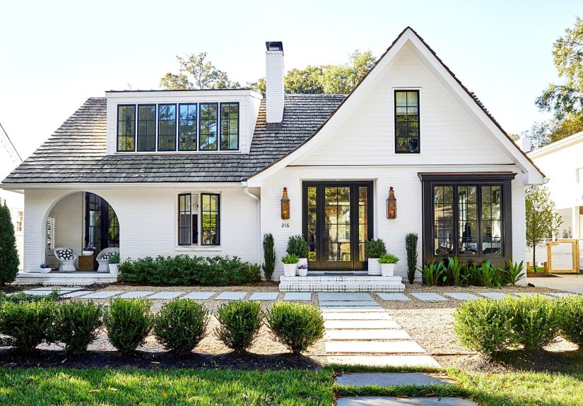
37 before-and-after home exterior remodels that will wow you
Paint & color magic (7)
- Before: Faded beige that screams “builder special, 2006.” After: Warm white body + charcoal trim + natural wood door. Why it wows: crisp contrast makes the lines look sharper and the home feel newer.
- Before: Brick that feels heavy and dated. After: Painted brick (soft white) + matte black fixtures. Why it wows: clean, modern, and it instantly brightens shady elevations.
- Before: Dark house in a dark neighborhood (a.k.a. “Where is the front door?”). After: Lighter body color + bold door color (deep blue or green). Why it wows: the entry becomes a focal point instead of a scavenger hunt.
- Before: Too many colors: trim, shutters, door, and brick all competing for MVP. After: Two-color system (body + trim) with one accent. Why it wows: fewer colors = more sophistication.
- Before: Monotone gray everything. After: Same family of gray, but with warmer undertones + creamy trim. Why it wows: it reads “designed,” not “copy-paste.”
- Before: Stucco looks flat and chalky. After: Fresh coat + darker window frames + updated light fixtures. Why it wows: the contrast creates dimension without touching the footprint.
- Before: Cute cottage… hidden under tired paint. After: Cheerful color (sage, muted blue) + bright white trim. Why it wows: it feels welcoming and photogenic from the sidewalk.
Siding, cladding & texture upgrades (7)
- Before: Warped wood siding with endless peeling paint. After: Low-maintenance siding in a warm neutral + clean trim. Why it wows: the home looks freshand stays that way longer.
- Before: Vinyl siding that’s seen better decades. After: Fiber-cement lap siding with slightly wider reveals. Why it wows: thicker shadow lines mimic high-end construction.
- Before: Front facade feels flat like a spreadsheet. After: Add shake/shingle siding in the gable. Why it wows: one textured zone creates instant character.
- Before: Mid-century ranch lacks visual rhythm. After: Horizontal wood accent panels + simple black lighting. Why it wows: modern, warm, and true to the era without cosplay.
- Before: Split-level feels chopped up. After: Unify with consistent cladding + continuous trim line. Why it wows: it visually “stitches” the levels together.
- Before: Busy stone pattern in random spots. After: Stone veneer used intentionally (base or entry surround). Why it wows: it looks architectural, not accidental.
- Before: Coastal home looks too plain. After: Board-and-batten + bright trim + metal roof accents. Why it wows: texture + crisp detailing = instant seaside charm.
Roofline, trim & architectural details (6)
- Before: Skinny trim makes windows look undersized. After: Thicker trim + simple headers. Why it wows: windows feel larger without replacing them.
- Before: Front porch roof looks like an add-on. After: Extended roofline with matching pitch. Why it wows: the porch finally feels “original” to the home.
- Before: Plain gable ends. After: Decorative brackets or simple craftsman knee braces. Why it wows: small detail, huge personality boost.
- Before: Gutters/downspouts stand out in the worst way. After: Color-matched gutters + cleaner routing. Why it wows: the eye goes to the house, not the plumbing.
- Before: Roof looks tired and blotchy. After: New shingles (or metal) + upgraded vents. Why it wows: it refreshes the whole silhouette and signals “well cared for.”
- Before: Trim is a patchwork of styles. After: One consistent trim profile across windows, doors, corners. Why it wows: consistency is the secret sauce of expensive-looking exteriors.
Entryway glow-ups (6)
- Before: A front door that whispers, “I was on sale.” After: Statement door (color or wood) + modern hardware. Why it wows: the entry becomes a “hello” instead of a shrug.
- Before: Tiny portico that does nothing for rainor style. After: Deeper covered entry with columns that match the home’s scale. Why it wows: it adds depth and looks custom.
- Before: Old storm door and mismatched lighting. After: Coordinated fixtures + glass that feels intentional. Why it wows: matching metals instantly reads “designer.”
- Before: Entry steps feel narrow and steep. After: Wider steps + simple railings + bigger landing. Why it wows: it’s safer, grander, and more welcoming.
- Before: No place to set a package (hello, porch pirates). After: Built-in bench or small covered nook. Why it wows: function upgrades curb appeal more than people admit.
- Before: House numbers you can’t read unless you’re delivering pizza. After: Oversized modern numbers + proper lighting. Why it wows: it’s practical and looks high-end.
Windows, shutters & garage transformations (5)
- Before: Mismatched shutters (wrong size, wrong vibe). After: Either properly sized shutters… or none at all. Why it wows: fewer “fake details” = more authenticity.
- Before: Outdated grids fighting the architecture. After: Updated window style or simplified grilles. Why it wows: windows stop looking like a costume.
- Before: Aluminum window trim looks tired. After: Fresh casing/trim that frames each window cleanly. Why it wows: crisp edges are the difference between “painted” and “polished.”
- Before: Garage door dominates in the worst way. After: New garage door with windows (or modern flat panels). Why it wows: it upgrades the biggest visual surface on many homes.
- Before: Garage + front door metals clash. After: One metal finish family across hardware and lighting. Why it wows: it’s a small move that makes the whole exterior feel curated.
Landscaping, hardscape & lighting (6)
- Before: Foundation plantings that look like green meatballs. After: Layered landscaping: tall (back), medium (middle), low (front). Why it wows: depth makes the yard look designed, not dumped.
- Before: Mulch missing, weeds thriving like they pay rent. After: Defined beds + fresh mulch/stone. Why it wows: it’s the cheapest “after photo” trick in the book.
- Before: Cracked walkway with awkward turns. After: Straightened path (pavers, stone, concrete) to the front door. Why it wows: better approach = better first impression.
- Before: No lighting; the house disappears at night. After: Layered lighting: sconces, path lights, and one feature uplight. Why it wows: it adds safety and serious evening drama.
- Before: Driveway stains and sad edging. After: Pressure wash + clean edging + simple border planting. Why it wows: the “after” can start with a hose and a weekend.
- Before: Yard feels exposed. After: Low fence, hedges, or small trees for privacy and scale. Why it wows: it frames the home and makes the lot feel intentional.
Budget + ROI: where your money shows the most
If you want maximum “wow per dollar,” prioritize changes people notice in the first 10 seconds: the garage door, front door, materials at the entry, and the overall paint/siding palette. National resale data consistently puts several exterior upgrades at the top of the payback listespecially garage door replacement, steel entry doors, manufactured stone veneer, and siding upgrades. The exact return varies by region and market, but curb appeal projects have a reputation for punching above their weight.
Cost-wise, exterior makeovers can be surprisingly flexible: some homes get a dramatic lift with paint, lighting, and landscaping, while others need bigger-ticket items like siding or roofing. The key is choosing upgrades that solve a visible problem (damage, dated style, poor proportions) rather than chasing trends that won’t suit your house.
Planning checklist: avoid expensive do-overs
- Start with the “ugly list”: peeling paint, sagging gutters, broken steps, cracked walkways, dead shrubs.
- Design the big shapes first: roofline, porch massing, window rhythm, garage dominance.
- Pick a tight palette: 2 main colors + 1 accent + 1 metal finish is usually plenty.
- Respect your climate: hail-prone? consider impact-resistant roofing; wildfire risk? prioritize noncombustible cladding.
- Do prep like a grown-up: cleaning, scraping, caulking, and priming often determine whether the “after” lasts.
- Check rules: permits/HOA guidelines and lead-safe requirements for older homes can change your plan.
Common faceplants (and how to avoid them)
- Too many focal points: if everything pops, nothing does. Let the door, lighting, or a gable detail be the hero.
- Ignoring scale: tiny lights and skinny numbers make even a big house look underdressed.
- Skipping water management: bad flashing/drainage can ruin the prettiest remodel. Keep the house dry first.
- Trend-chasing: pick timeless foundations, then sprinkle trends with paint and decor (easy to change later).
Wrap-up: steal these “after” strategies
The best exterior remodels don’t just look betterthey function better. They guide guests to the door, shed water correctly, reduce maintenance, and make the home feel cared for. If you’re stuck, pick one “anchor move” (paint + trim refresh, entry upgrade, or a garage door swap) and build outward with lighting and landscaping. Your future selfand your neighborswill thank you.
: real-world lessons from exterior remodels
After reviewing countless before-and-after projects (and hearing homeowners explain what they’d do differently), a few patterns show up so often they might as well be printed on a contractor’s clipboard.
Lesson #1: The “before” is usually a maintenance story, not a style story. People assume the wow factor comes from trendy paint colors or a fancy door. In reality, many “before” exteriors look rough because of neglected water control: failing caulk, tired gutters, soft trim, and paint that’s peeling because moisture keeps sneaking in. When homeowners fix drainage, flashing, and rot first, the cosmetic upgrades suddenly last longer and look cleaner. The glow-up isn’t just prettierit’s sturdier.
Lesson #2: Most budgets are won or lost in the prep work. Paint is the classic example. Two homes can use the same color, but the one with proper surface prep (cleaning, scraping, sanding, priming, and sealing gaps) ends up looking crisp instead of chalky. Homeowners who skip prep often end up repainting soonerwhich is a very expensive way to learn that shortcuts have interest rates.
Lesson #3: The entry is emotional real estate. When people say an exterior remodel “feels welcoming,” they’re usually describing the front approach: visible house numbers, a clear path, layered lighting, and a door that looks intentional. Even small changeslike upgrading sconces to the right scale or adding a wider landingcan make arriving home feel calmer. It’s not just curb appeal; it’s daily life appeal.
Lesson #4: Consistency reads expensive. One of the most underrated “after” moves is simply making everything agree: matching metal finishes, repeating trim profiles, aligning design lines, and choosing a limited color palette. It doesn’t have to be fancy. It just has to look like a decisionnot a series of unrelated purchases. This is why coordinated lighting + hardware can make a modest home look custom.
Lesson #5: Landscaping is the fastest way to make the “after” photo believable. Fresh mulch, defined edges, and layered plant heights can do more for a home’s first impression than people expect. Homeowners often say they wish they’d planned landscaping earlierbecause it helps determine what the exterior colors should be and where lighting belongs. The house and yard are one composition, and when you design them together, the remodel looks “finished” instead of “almost.”
Bottom line: the most successful exterior remodels are the ones that solve a few real problems (maintenance, clarity, scale, lighting) and then use style as the finishing touch. That’s the secret behind the best before-and-after reveals: they’re not magic tricks. They’re good decisions stacked in the right order.