Table of Contents >> Show >> Hide
- How to Choose a Green That Feels Calm (Not Chaotic)
- 51 Green Color Schemes You Can Use in Any Room
- 1) Soft Sage + Warm White + Natural Oak
- 2) Misty Gray-Green + Linen Beige + Matte Black
- 3) Silvery Sage + Dove Gray + Polished Nickel
- 4) Herbal Green + Cream + Brass
- 5) Olive + Sand + Terracotta
- 6) Olive + Warm White + Walnut
- 7) Moss + Stone Gray + Leather Brown
- 8) Eucalyptus + Soft Taupe + Natural Rattan
- 9) Pale Celery + Cream + Light Maple
- 10) Seafoam + Bright White + Light Oak
- 11) Pistachio + Warm Gray + Champagne Gold
- 12) Mint + Soft White + Pale Pink
- 13) Sage + Blush + Charcoal
- 14) Sage + Denim Blue + Off-White
- 15) Gray-Green + Camel + Soft Black
- 16) Avocado-Toned Green + Cream + Teak
- 17) Chartreuse Accent + White + Natural Wood
- 18) Fern Green + Warm White + Clay
- 19) Forest Green + Crisp White + Brass
- 20) Forest Green + Cream + Aged Wood
- 21) Hunter Green + Burgundy + Warm Beige
- 22) Emerald + White + Gold
- 23) Emerald + Navy + Cream
- 24) Jade + Soft Gray + Black Accents
- 25) Deep Green + Marble White + Warm Brass
- 26) Dark Green + Pale Oak + Warm White
- 27) Spruce + Fog Gray + Copper
- 28) Pine Green + Oatmeal + Soft Black
- 29) Loden Green + Stone + Brass
- 30) Olive + Cobalt Blue + Warm White
- 31) Sage + Cobalt + Soft Pink
- 32) Moss + Mustard + Cream
- 33) Olive + Ochre + Natural Linen
- 34) Sage + Terracotta + Warm White
- 35) Eucalyptus + Soft Blue + White
- 36) Sea Glass Green + Driftwood + Cream
- 37) Mint + Charcoal + White
- 38) Pistachio + Chocolate Brown + Ivory
- 39) Soft Green + Lavender + Warm White
- 40) Sage + Rust + Natural Wood
- 41) Olive + Peach + Cream
- 42) Emerald + Pale Pink + Brass
- 43) Forest Green + Pale Blue + White
- 44) Deep Green + Warm Beige + Natural Stone
- 45) Green-Gray + White + Concrete
- 46) Moss + Cream + Antique Gold
- 47) Olive + Ivory + Woven Neutrals
- 48) Sage + Warm White + Soft Patterned Blue
- 49) Pine Green + Cream + Plaid or Herringbone
- 50) Emerald Accent Wall + Neutral Room + Bold Artwork
- 51) Tonal Greens (Sage → Olive → Forest) + Warm White
- Quick Room-by-Room Tips (So It Looks Intentional)
- Common Mistakes (And How to Avoid Them)
- Real-Life Experiences: What Green Actually Feels Like at Home (And Why People Keep Coming Back to It)
- Conclusion
- SEO Tags
Green is the rare “main character” color that can also behave like a neutral. It can be soft and spa-like, deep and dramatic,
bright and playful, or quietly sophisticatedsometimes all in the same room, depending on your light bulbs and the time of day.
If your home has ever felt a little too “screens, spreadsheets, and stress,” green is the shortcut back to “woods, windows, and exhale.”
This guide gives you 51 green color schemes you can actually useplus practical tips for picking the right undertone, pairing greens
with woods and metals, and avoiding the classic mistake of choosing a gorgeous green… that turns into guacamole at night.
(It happens. Green is sneaky. In a charming way.)
How to Choose a Green That Feels Calm (Not Chaotic)
Understand undertones (aka: the personality behind the color)
Greens usually lean one of three ways: blue-green (cool and airy), yellow-green (warm and sunny), or gray-green (muted and mellow).
If a room faces north or gets weak daylight, cooler greens can feel crisp but may skew chillywarm your palette with creamy whites,
warm woods, and brass. If your room gets golden afternoon light, yellow-leaning greens can glow beautifully, but they may look extra
saturated at nightbalance with soft neutrals and matte finishes.
Let lighting and finish do part of the work
- Matte/flat: cozy, velvety, forgivinggreat for bedrooms and living rooms.
- Eggshell/satin: a little wipeable, still softgreat for hallways and kitchens.
- Gloss accents: doors, trim, built-insadds depth without painting the whole room “forest at midnight.”
Pick your “anchor neutral” first
Greens play especially well with warm whites, creamy beiges, greige, charcoal, and soft black. Choose one anchor neutral you’ll repeat
(trim color, major upholstery, or big rug), then let green do the relaxing, nature-forward heavy lifting.
51 Green Color Schemes You Can Use in Any Room
1) Soft Sage + Warm White + Natural Oak
Classic calm. Use sage walls, warm white trim, and oak furniture for an easy “Sunday morning” vibe.
2) Misty Gray-Green + Linen Beige + Matte Black
Muted and modern. Great for a home office where you want focus, not fluorescent-energy chaos.
3) Silvery Sage + Dove Gray + Polished Nickel
Clean and airy for bathrooms. Pair with marble or quartz to keep it crisp.
4) Herbal Green + Cream + Brass
Warm, inviting, and slightly vintage. Perfect for kitchens with classic hardware.
5) Olive + Sand + Terracotta
Earthy and grounded. Add terracotta through pottery, textiles, or a patterned rug.
6) Olive + Warm White + Walnut
Green becomes the “new neutral.” Walnut adds depth without feeling heavy.
7) Moss + Stone Gray + Leather Brown
Living-room friendly. A mossy wall color makes leather look richer and more intentional.
8) Eucalyptus + Soft Taupe + Natural Rattan
Fresh but not loud. Rattan and woven textures make it feel breezy and lived-in.
9) Pale Celery + Cream + Light Maple
A gentle lift in low-light rooms. Think breakfast nook or hallway that needs optimism.
10) Seafoam + Bright White + Light Oak
Coastal-adjacent without the seashell collection. Great in laundry rooms and sunrooms.
11) Pistachio + Warm Gray + Champagne Gold
Soft and surprisingly sophisticated. Use gold accents sparingly for a “glow,” not a “bling.”
12) Mint + Soft White + Pale Pink
Playful and gentle. Perfect for a nursery, guest room, or anyone who loves a calm-but-cheerful palette.
13) Sage + Blush + Charcoal
Balanced contrast: blush warms the green, charcoal keeps it grown-up.
14) Sage + Denim Blue + Off-White
Casual and timelesslike your favorite jeans, but for your walls.
15) Gray-Green + Camel + Soft Black
Elegant and slightly moody. Works beautifully with boucle, wool, and warm leathers.
16) Avocado-Toned Green + Cream + Teak
A nod to mid-century without going full retro. Teak keeps it warm and cohesive.
17) Chartreuse Accent + White + Natural Wood
Use chartreuse as a “spark,” not a takeover. Try art, pillows, or a single painted chair.
18) Fern Green + Warm White + Clay
Botanical and relaxed. Clay planters and textured ceramics make this scheme sing.
19) Forest Green + Crisp White + Brass
High contrast, high impact. Ideal for a dining room or a dramatic library wall.
20) Forest Green + Cream + Aged Wood
Cozy and heritage-inspired. Add framed landscapes and warm lampshades.
21) Hunter Green + Burgundy + Warm Beige
Moody in a luxurious way. Great for dens, studies, and rooms that want a little drama.
22) Emerald + White + Gold
Instant glam. Keep patterns simple so the emerald stays the star.
23) Emerald + Navy + Cream
Rich and layered. Use navy in upholstery and emerald in walls (or swap, if you’re brave).
24) Jade + Soft Gray + Black Accents
Modern and calm. A good choice for open-plan homes that need a clean color story.
25) Deep Green + Marble White + Warm Brass
Kitchen cabinet heaven. Marble keeps it bright; brass keeps it warm.
26) Dark Green + Pale Oak + Warm White
A Scandinavian-leaning mix that feels natural and unforced.
27) Spruce + Fog Gray + Copper
Copper brings a soft glow that makes cool greens feel more welcoming.
28) Pine Green + Oatmeal + Soft Black
Calm and grounded. Use oatmeal textiles to soften the depth of pine.
29) Loden Green + Stone + Brass
Subtle sophistication. Looks especially good with textured plaster and woven rugs.
30) Olive + Cobalt Blue + Warm White
Unexpected and energetic. Keep blue as an accent so the combo feels playful, not loud.
31) Sage + Cobalt + Soft Pink
Preppy with personality. Try this in a reading nook with mixed patterns.
32) Moss + Mustard + Cream
Warm, retro-friendly, and cozy. Mustard works best in small doses (pillows, art, a throw).
33) Olive + Ochre + Natural Linen
Sunlit and earthy. Linen curtains make everything feel calmerscience-ish, but also just true.
34) Sage + Terracotta + Warm White
The “plant lover’s palette.” Great with clay tile, wood shelves, and real greenery.
35) Eucalyptus + Soft Blue + White
Airy and coastal-leaning. Perfect for bedrooms where you want “breathe in, breathe out.”
36) Sea Glass Green + Driftwood + Cream
Beachy without being themed. Add a jute rug and keep accessories minimal.
37) Mint + Charcoal + White
Fresh contrast. Charcoal stops mint from feeling too sweet.
38) Pistachio + Chocolate Brown + Ivory
Unexpectedly luxe. Chocolate grounds the light green and feels cozy year-round.
39) Soft Green + Lavender + Warm White
Gentle and creativegreat for guest rooms or studios where you want calm inspiration.
40) Sage + Rust + Natural Wood
Autumnal but not seasonal. Rust tones add warmth that makes sage feel extra soothing.
41) Olive + Peach + Cream
Bright and friendly. Peach is your “sunbeam” accenttry it in art, vases, or a small rug.
42) Emerald + Pale Pink + Brass
High style, still cozy. Keep pink dusty rather than neon to preserve the calm.
43) Forest Green + Pale Blue + White
Classic and calming. Works especially well with tailored stripes and simple patterns.
44) Deep Green + Warm Beige + Natural Stone
Grounded and timelessideal for entryways that should feel welcoming, not sterile.
45) Green-Gray + White + Concrete
Modern minimalism with a softer edge. Great for lofts or contemporary condos.
46) Moss + Cream + Antique Gold
Traditional-meets-fresh. Antique gold looks warmer and less “shiny new” than bright brass.
47) Olive + Ivory + Woven Neutrals
Simple, calming, and easy to maintain. A perfect “I like design but also naps” palette.
48) Sage + Warm White + Soft Patterned Blue
Add blue through a rug or curtains. Pattern keeps it layered without adding clutter.
49) Pine Green + Cream + Plaid or Herringbone
Cabin cozy, but refined. Keep the pattern in textiles so it doesn’t overwhelm.
50) Emerald Accent Wall + Neutral Room + Bold Artwork
Let one wall do the drama while the rest stays calm. It’s like eyeliner for your living room.
51) Tonal Greens (Sage → Olive → Forest) + Warm White
Layer three greens in one spacewalls, upholstery, and accessoriesfor depth that still feels natural.
Quick Room-by-Room Tips (So It Looks Intentional)
Living room
If you’re nervous, start with green in “soft surfaces”: pillows, throws, curtains, or a rug with green notes. If you’re ready for paint,
consider a muted sage or gray-green on walls and bring in deeper greens via a velvet chair or a built-in.
Kitchen
Green cabinets are a modern classicespecially olive, deep forest, or smoky jade. Keep counters light (stone, quartz, butcher block)
and repeat your metal finish (brass, nickel, or black) in at least two places so it looks designed, not accidental.
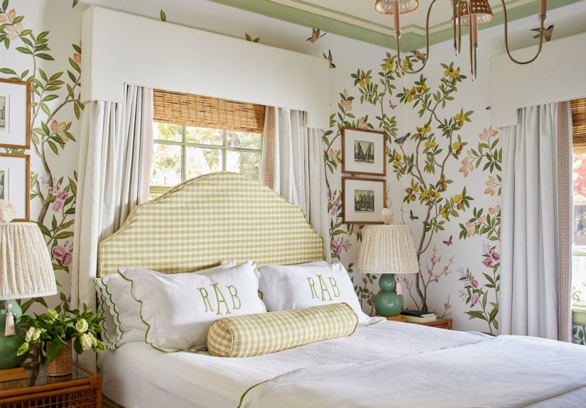
Bedroom
Go for muted greens (sage, eucalyptus, gray-green) to support sleep. Pair with creamy bedding, warm woods, and soft lighting.
Save the brightest greens for small accents unless you want your bedroom to feel like a very cheerful smoothie.
Bathroom
Seafoam, silvery sage, and pale eucalyptus feel clean and spa-like. Use white tile, warm wood accents, and good mirrors/lighting
so the green reads fresh rather than dingy.
Common Mistakes (And How to Avoid Them)
- Picking green without testing at night: sample it and check morning/noon/night under your real bulbs.
- Too many competing undertones: if your green is warm, choose warm whites and warm woods; if it’s cool, keep metals and grays cooler.
- Forgetting texture: green looks best with natural textureslinen, wool, wood grain, rattan, stone.
- Overmatching everything: repeating the exact same green everywhere can flatten a room. Use a “family” of greens instead.
Real-Life Experiences: What Green Actually Feels Like at Home (And Why People Keep Coming Back to It)
The funniest thing about decorating with green is how quickly it changes the “mood temperature” of a space. In rooms that used to feel
like a waiting areawhite walls, gray sofa, the faint emotional soundtrack of unread emailsintroducing green often makes the whole setup
feel more human. Not necessarily more perfect. More lived-in. More like someone actually relaxes there.
One of the most common “aha” moments happens when people try a muted sage in a bedroom. During the day, it reads soft and airy, especially
with warm white trim and simple bedding. At night, under warm lamps, that same sage becomes a quiet cocoon. It doesn’t shout for attention;
it just lowers the volume in the room. The surprise is that it still feels interesting, even when the décor is minimal. Green carries depth
the way neutrals can’tlike it has a backstory.
Kitchens are where green tends to earn its paycheck. A deep olive or forest cabinet color can make an everyday kitchen look custom, even if
the layout is basic. People often expect dark green to feel heavy, but paired with light counters and warm metals, it feels grounded and
high-contrast in the best way. The key “experience” lesson: green looks more expensive when you keep the surrounding materials honest
wood grain that looks like wood, stone that looks like stone, and hardware that doesn’t try too hard.
In living rooms, the most successful green spaces usually layer the color instead of relying on a single big move. A mossy wall, a slightly
different green in a rug pattern, and then a few plants (real or convincing) makes the room feel intentional without looking like a showroom.
And here’s a truth no one tells you: green forgives clutter better than many colors. A little stack of books or a basket of blankets looks
“cozy,” not “messy,” because the color story already feels organic.
The most personal payoff is how green interacts with seasons. In summer, it feels fresh and bright. In winter, deeper greens feel warm and
protectivelike bringing the outdoors in when you don’t want to go outdoors. The overall experience is simple: green makes a home feel calmer
without making it feel bland. It’s nature’s color, but it also happens to be the color of “I have my life together,” even when you absolutely do not.
Conclusion
If you want a home that feels calmer, greener is often the fastest path there. Pick a green that matches your room’s light, anchor it with a
dependable neutral, and add texturewood, linen, stone, woven materialsso the color feels natural instead of flat. Whether you go subtle with
sage or bold with emerald, green is one of the easiest ways to make indoors feel like it borrowed a little peace from the outdoors.