Table of Contents >> Show >> Hide
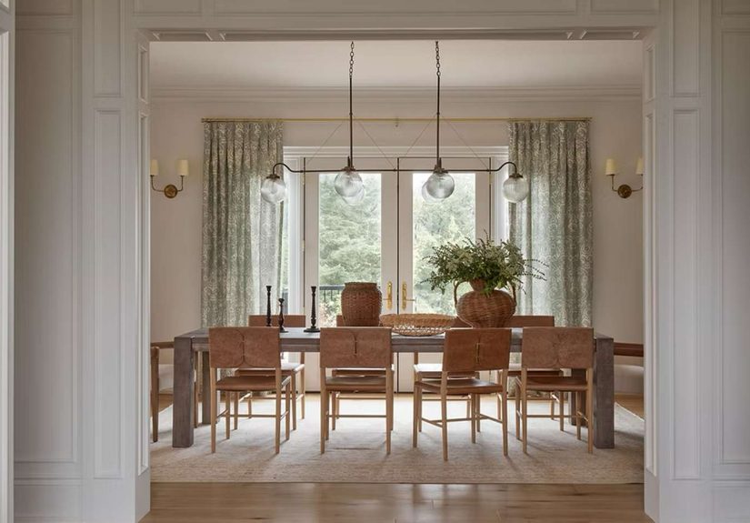
- 1. Hang Curtains Higher and Wider Than Feels Necessary
- 2. Layer the Lighting Like You Actually Want People to Be Flattered
- 3. Use One Oversized Element to Create Instant Confidence
- 4. Add Texture Before You Add More Color
- 5. Fix the Scale and Leave Some Breathing Room
- 6. Style in Odd Numbers, Then Edit Ruthlessly
- Why These Designer Secrets Work So Fast
- Real-Life Experiences: What People Notice When They Actually Use These Tips
- Final Takeaway
Some rooms walk in wearing sweatpants. Others enter like they own the building. The funny part is that the difference usually is not money, magic, or a designer hiding in your closet with a tape measure. It is often a handful of small decisions that make a room feel finished, balanced, and quietly expensive.
That is where underrated designer secrets come in. These are not the loud, obvious tricks everyone already knows, like “buy a cute throw pillow” or “paint the wall beige and call it a day.” These are the behind-the-scenes moves that make people pause at your doorway and say, “Wait… why does this look so good?”
If you want to make any room look better fast, start with the details professionals obsess over: where curtains begin, how lighting hits the walls at night, how much breathing room a vignette gets, and whether your rug is anchoring the furniture or floating around like it missed the meeting. The good news is that these interior design tips work in living rooms, bedrooms, dining rooms, offices, and even those awkward corners that currently serve as a storage center for unopened packages and emotional support laundry.
Below are six designer-approved, deeply useful, surprisingly overlooked ways to upgrade your space without turning your home into a showroom. The goal is not perfection. The goal is a room that looks intentional, relaxed, and pulled together. In other words: less “I panicked at a home goods store,” more “I casually know what I’m doing.”
1. Hang Curtains Higher and Wider Than Feels Necessary
Let’s begin with one of the sneakiest upgrades in home decor: window treatments. A room can have a great sofa, nice art, and a rug that almost makes sense, but if the curtains are hung too low or too narrow, the whole space can feel a little squished. It is the design version of wearing a beautiful suit with the wrong shoes.
Designers love hanging curtain rods close to the ceiling and extending them past the window frame. Why? Because this simple move creates the illusion of taller ceilings and wider windows. Translation: the room instantly feels more polished and more generous with its proportions. Even a standard apartment living room can suddenly act like it has custom millwork and excellent posture.
How to use this trick well
Choose curtains that skim the floor or fall just to it. Avoid panels that awkwardly hover above the baseboards like they are afraid of commitment. Also, make sure the fabric has some substance. Linen blends, textured cotton, or soft woven materials tend to look more elevated than thin, shiny panels that remind everyone of a hotel conference room.
This is one of the easiest ways to make any room look better because it changes the architecture you think you have. And once the windows look taller, the rest of the room tends to fall in line. Your walls look better. Your furniture looks more intentional. Even your lamp starts behaving like it belongs there.
2. Layer the Lighting Like You Actually Want People to Be Flattered
Nothing ruins a beautiful room faster than one lonely overhead light blasting down from the ceiling like it is interrogating the furniture. If your space only looks decent at noon and mildly tragic after sunset, lighting is probably the culprit.
One of the smartest designer secrets is layered lighting. Instead of depending on a single source, build the room with multiple levels of light: ambient lighting for overall glow, task lighting for function, and accent lighting for mood. In plain English, that means a ceiling fixture plus lamps plus maybe a sconce, picture light, or small spotlight on a bookshelf. Rooms look more dynamic when light comes from different heights and directions.
What layered lighting actually does
It softens harsh corners, adds depth, and helps every texture in the room show up properly. Wood looks richer. Fabric looks cozier. Art looks intentional instead of mysteriously abandoned on the wall. Good lighting is less about brightness and more about atmosphere.
If you want a quick win, swap cold bulbs for warm white ones and add at least two lamp sources to the room. Dimmers help, too, because no one needs the same energy at 7 a.m. and 9 p.m. A room that can shift mood throughout the day will always feel more sophisticated than one that only has “doctor’s office” or “complete darkness” as its two settings.
Think of lighting as the jewelry of the room. You do not need to overdo it, but the right pieces make everything else look better.
3. Use One Oversized Element to Create Instant Confidence
Many rooms do not look bad because they lack decor. They look bad because they are full of small, hesitant choices. Tiny art. Tiny lamps. Tiny accessories. Tiny “maybe this will help” objects scattered everywhere like visual confetti. Designers often do the opposite: they let one larger element establish authority.
An oversized mirror, a generous pendant light, a bold area rug, a large piece of artwork, or even a sculptural plant can change the room’s energy immediately. It tells the eye where to land first. That sense of confidence makes the space feel more finished, even if the rest of the room is relatively simple.
Why bigger often looks better
A large focal point reduces visual noise. Instead of forcing ten small pieces to do the job of one strong one, you create a cleaner hierarchy. The room feels calmer because it has a clear leader. It is the same reason a gallery wall can look amazing when done well and absolutely chaotic when done in a panic.
This does not mean every room needs drama. It means every room benefits from a focal point that feels proportional. In a living room, that might be one large artwork over the sofa. In a bedroom, it might be an upholstered headboard that actually reaches for the ceiling instead of apologizing to it. In an entryway, it could be one beautiful mirror above a console table instead of five small accessories all competing to be noticed.
When in doubt, edit the little things and go slightly bigger with the one thing that matters most.
4. Add Texture Before You Add More Color
If a room feels flat, most people assume they need more color. Sometimes they do. But often what the room is really missing is texture. This is one of the most overlooked interior design tips because texture is quieter than color. It does not scream for attention. It just makes the room feel layered, warm, and deeply more interesting.
Texture shows up in materials: linen curtains, wool rugs, boucle chairs, wood tables, stone accents, ceramic lamps, woven baskets, matte paint, aged brass, leather, nubby throws. When you mix these thoughtfully, even a mostly neutral room starts to feel rich and intentional.
The secret to making neutrals work
Use different surfaces and finishes in a similar palette. That way, the room has contrast without chaos. A cream sofa against a flat white wall can feel sleepy. Add a woven rug, a walnut side table, a textured pillow, and a ceramic lamp, and suddenly that same cream sofa looks like it belongs in a magazine spread.
This is especially useful if you love calm spaces but do not want them to feel bland. Texture is what gives a room dimension when color is restrained. It is also what helps a room feel lived in instead of staged. Natural materials are particularly effective because they bring variation that never feels forced. Wood grain, stone veining, woven fibers, and brushed metals are basically free personality for your house.
Before you buy another accent pillow in a “fun pop of color,” ask whether the room would be better served by one excellent textured piece instead. Very often, the answer is yes.
5. Fix the Scale and Leave Some Breathing Room
Here is a very glamorous truth about decorating: sometimes the room does not need more stuff. Sometimes it needs less stuff, arranged better. Scale and spacing are two of the biggest differences between a room that looks professionally designed and one that looks like it was assembled while carrying three shopping bags and a mild sense of urgency.
Scale means your furniture, rug, lighting, and decor are sized appropriately for the room. A rug that is too small makes everything look disconnected. A chandelier that is too tiny feels timid. Art that is too little for the wall looks like it got lost on the way to the gallery. On the flip side, pieces that are properly scaled make the room feel grounded and cohesive.
Why negative space matters
Designers also know when to stop. Not every shelf needs styling. Not every corner needs a stool, basket, lantern, and mysterious bead garland. Leaving some open space helps the eye rest, which makes the pieces you do choose look better. This is the power of negative space: it creates calm, clarity, and intention.
One practical rule is to use fewer, larger items rather than many tiny ones. Another is to step back and look at the room as a whole. If every surface is occupied, the room will feel busier than it needs to. If every piece of furniture is hugging the perimeter, the room may feel flat. Pulling furniture slightly inward, using a larger rug, and editing back unnecessary accessories can completely change the way a room reads.
Good rooms do not always have more. They often have better proportions and better restraint.
6. Style in Odd Numbers, Then Edit Ruthlessly
Now for the styling trick that shows up everywhere once you know to look for it: odd-number groupings. Designers often arrange decor in threes or fives because those groupings feel more organic and visually appealing than perfectly matched pairs. A trio of objects with varied height, shape, and texture tends to feel collected rather than stiff.
Imagine a coffee table with one stack of books, one small bowl, and one vase. That feels easy and balanced. Now imagine six unrelated mini objects scattered around the table like they were dropped from a low-flying plane. Exactly.
How to make a styled surface look natural
Start with one taller item, one lower grounding item, and one sculptural or personal object. Keep the palette connected so the grouping tells the same story. Then stop before the display starts looking like a store shelf trying to meet a quota.
This is where editing comes in. Some of the best-designed homes do not have the most accessories; they have the best-edited accessories. Leave room around objects. Let the pretty bowl be pretty. Let the books have a purpose. Let one weird vintage thing start a conversation. A room gains style when it stops trying so hard.
Odd-number styling works beautifully on coffee tables, consoles, nightstands, open shelving, mantels, and kitchen counters. Just remember: the rule of three is a guide, not a courtroom order. If one spectacular object does the job, trust it. The real secret is balance, not decoration for decoration’s sake.
Why These Designer Secrets Work So Fast
What ties all six of these designer secrets together is that they change how a room is perceived. Higher curtains make ceilings feel taller. Layered lighting makes a room feel deeper and more flattering. A larger focal point gives the eye structure. Texture adds richness without clutter. Better scale makes everything feel grounded. Odd-number styling creates rhythm while negative space keeps the room calm.
In other words, these are not random decorating tricks. They are perception tricks. They influence proportion, mood, balance, and visual hierarchy. That is why they work in almost any decorating style, from traditional to modern to eclectic to “I do not know what my style is, but I love this chair.”
If you only make one change this week, start with the item that has the biggest visual footprint: curtains, lighting, rug size, or one focal point. The small accessories can come later. A room rarely transforms because of one candle holder. It transforms because the foundation finally makes sense.
Real-Life Experiences: What People Notice When They Actually Use These Tips
One of the most interesting things about these decorating secrets is how quickly people notice the difference, even when they cannot immediately explain why the room looks better. Someone will walk into a freshly updated living room and say, “It feels bigger in here,” even though no walls were moved. Usually that reaction comes from curtains being hung higher, a larger rug anchoring the furniture properly, or clutter being edited off visible surfaces. The room reads as more spacious because the eye can travel more smoothly through it.
Another common experience is that layered lighting changes how often people actually use a room. A den or bedroom with only one overhead fixture can feel functional but not inviting. Once a table lamp, floor lamp, or wall sconce is added, the room starts getting used in the evening instead of being ignored after dark. It becomes a place to read, talk, or relax instead of just a place to pass through. That is a practical improvement, not just a visual one.
People also tend to discover that a better room does not always require buying more things. In fact, many spaces improve dramatically after subtracting. Editing down shelves, clearing overloaded coffee tables, or removing one undersized chair often helps the good pieces stand out. This can feel counterintuitive at first because many of us are taught to “finish” a room by filling every gap. But in real homes, breathing room often feels more luxurious than extra stuff.
Texture creates another noticeable shift. Homeowners who thought their neutral room was boring often realize the issue was not the lack of color at all. It was the lack of contrast in materials. Adding a woven shade, wood accent, textured throw, or ceramic lamp gives the room depth without introducing visual chaos. Suddenly the same beige, cream, gray, or warm white palette feels layered instead of lifeless. It is one of those changes that photographs well but feels even better in person.
The oversized focal-point trick is especially powerful in awkward or unfinished rooms. People often spend months buying small decor because it feels safe, only to find the room still feels uncertain. Then they add one large piece of art, one dramatic light fixture, or one appropriately scaled mirror, and everything clicks. The room finally has direction. It stops looking like a collection of separate items and starts looking like a complete idea.
There is also a confidence factor that comes with understanding scale and styling. Once people learn to use odd-number groupings, vary heights, and leave negative space, they stop second-guessing every surface. They know when a bookshelf is done. They know when a nightstand needs one lamp and one book instead of seven tiny objects. They know when a room needs a stronger anchor instead of another decorative accessory. That confidence makes decorating easier, faster, and far less expensive over time.
Perhaps the most relatable experience of all is that these changes make a home feel more like the person living in it. A better room is not necessarily trendier. It is clearer. It reflects taste with less noise. It functions better. It feels calmer at night, brighter in the morning, and more welcoming all day long. When people apply these six underrated designer secrets, they usually do not end up with a room that looks copied from somewhere else. They end up with a room that looks like the best version of their own home. And honestly, that is the whole point.