Table of Contents >> Show >> Hide
- What wood inlay is (and why “patterns” are the cheat code)
- Quick glossary (so the next parts make sense)
- Before you pick a pattern: 8 design rules that keep inlay classy
- A quick “pattern picker” cheat sheet
- 7 Basic Wood Inlay Patterns To Know About
- 1) Stringing: single-line and double-line borders
- 2) Banding: stripes and “micro-architecture” borders
- 3) Checkerboard: the pattern that reads “classic craftsmanship”
- 4) Herringbone (and its sleek cousin, chevron)
- 5) Diamond / lozenge (a.k.a. “argyle energy” without the sweater)
- 6) Greek key (meander): the border that says “I know what cornices are”
- 7) Compass rose / starburst medallion
- Making inlay look clean: practical tips that apply to every pattern
- Beginner-friendly project ideas (that show off patterns without risking heartbreak)
- Shop Lessons and Real-World Inlay Experiences (the extra )
Wood inlay is the woodworking equivalent of adding a crisp pocket square to a perfectly tailored suit: unnecessary for survival, wildly effective for style.
And the best part? You don’t have to be a wizard with a cape and a tiny hand plane to pull it off. You just need a few “base patterns” in your toolbox
so you can choose the right look for the right projectand avoid turning your tabletop into a regret sandwich.
In this guide, you’ll learn seven foundational wood inlay patterns (the ones you’ll see over and over on furniture, boxes, frames, and show-off-y
heirloom pieces). I’ll also break down what each pattern communicates visually, where it works best, and the practical design rules that keep inlay
looking intentional instead of “I found a router and got excited.”
What wood inlay is (and why “patterns” are the cheat code)
At its simplest, wood inlay means setting one material into another so the surface ends up flush. The inlaid material can be a solid
strip, a shaped plug, a medallion, or thin veneer pieces arranged like a mosaic. What matters is the contrast: color, grain direction, texture, or all
three at once.
Here’s why patterns matter: when you use a repeatable geometric layoutlines, zigzags, blocks, or interlocking shapesyou get a design that reads
“classic” even if your execution is still in its awkward teenage phase. Patterns forgive tiny imperfections because the eye expects repetition. A random
one-off motif? That’s where every gap looks like it has its own spotlight.
Quick glossary (so the next parts make sense)
- Stringing: thin lines (often 1/32″–1/16″) used as borders, frames, and graceful curves.
- Banding: a wider strip with a repeating designthink tiny checkerboards, stripes, or geometric tiles.
- Parquetry: geometric patterns made from small veneer pieces (diamonds, herringbone fields, basketweave panels).
- Marquetry: pictorial veneer “images” (flowers, birds, landscapes). Gorgeous, but not the first thing to attempt on a deadline.
- Medallion: a centered feature piece (often a compass rose/starburst) that anchors a tabletop or panel.
Before you pick a pattern: 8 design rules that keep inlay classy
- Start with contrast you can actually see. Walnut + maple is a classic because your eyes don’t have to squint. If your woods are too
similar, the “pattern” disappears unless the light hits it just right (which is not a reliable design strategy). - Let the grain do some of the work. Alternating grain direction can create contrast even when colors are closeespecially in parquetry-style
patterns like herringbone or diamonds. - Scale the pattern to the surface. A tiny Greek key border on a huge tabletop can look like a postage stamp. A massive checker banding on a
jewelry box can look like a pixelated sweater. - Use borders to “finish” edges. A simple string line around a panel makes the whole piece look more intentionallike you meant to stop there.
- Repeat a motif in at least two places. One inlaid detail can feel accidental. Two feels designed. Three feels like a collection.
- Keep your first pattern mostly straight. Curves are fun, but they also reveal every wobble in your layout and every tiny tear-out. Build confidence
with straight banding and geometric repeats first. - Plan the finish, not just the inlay. Some finishes deepen color contrast; others mute it. Do a scrap test with your exact species and finish schedule.
- Safety and sanity rule: practice on scrap. The best time to discover your template slips is not when it’s attached to the heirloom panel.
A quick “pattern picker” cheat sheet
| Pattern | Vibe | Difficulty (relative) | Best on |
|---|---|---|---|
| Stringing (single/double lines) | Elegant, understated | Easy–Medium | Boxes, frames, tabletops, drawer fronts |
| Striped or checker banding | Traditional furniture detail | Medium | Table aprons, borders, small casework accents |
| Herringbone / chevron | Dynamic, “designer” movement | Medium | Panels, box lids, table borders, field patterns |
| Diamond (argyle / lattice) | Bold geometry, high-end feel | Medium–Hard | Drawer fronts, tabletop centers, cabinet doors |
| Greek key (meander) | Classic, architectural | Medium | Borders, frames, perimeter bands |
| Rope / twist (barber pole) | Playful, handcrafted detail | Medium | Leg accents, edge banding, borders |
| Compass rose / starburst medallion | Statement centerpiece | Hard (but worth it) | Tabletops, entry tables, box lids, panels |
7 Basic Wood Inlay Patterns To Know About
1) Stringing: single-line and double-line borders
What it looks like: crisp, thin linesstraight, curved, or ovalused to outline a panel, frame a lid, or highlight a joint line.
One line reads clean and modern; two lines (especially with a darker “fillet” between) reads classic and furniture-forward.
Where it shines: picture frames, jewelry boxes, drawer fronts, and tabletops where you want refinement without shouting.
Stringing is also the gateway drug to more complex bandingbecause it teaches layout discipline.
How to make it look professional: prioritize clean layout lines, consistent spacing, and crisp corners. If you’re doing curved stringing,
thin wood can often be coaxed into shape more easily than thick strips, and the best results come from practicing your curve on scrap until the line feels smooth.
Example: A walnut box lid with a 1/16″ maple string line set 3/8″ in from the edge instantly looks “finished,” like it belongs in a gallery
instead of a “miscellaneous” drawer.
2) Banding: stripes and “micro-architecture” borders
What it looks like: a wider decorative strip with repeating elementsoften alternating light/dark blocks, thin stripes, or laminated patterns.
Banding is what makes many traditional tables and case pieces feel expensive, even when the structure is fairly straightforward.
Where it shines: table aprons, leg “ankle” details, box perimeters, and anywhere you want a visual break between parts (for example,
between a leg and an apron, or between a top and a skirt).
Design trick: use banding as a “transition line.” If your project has two woods that almost match but not quite, a banding strip can
make the contrast look intentionallike you planned it and didn’t just run out of lumber.
Example: A small side table in cherry looks more tailored with a narrow dark/light/dark banding around the apron, especially if the same band
repeats as a border on the tabletop.
3) Checkerboard: the pattern that reads “classic craftsmanship”
What it looks like: alternating squareslike tiny tilesoften used as a banding around a piece or as a small panel detail.
It’s one of the most recognizable traditional inlay looks because it’s both geometric and warm.
Where it shines: borders on tabletops, accent rings around a pedestal, or as a narrow strip around a box lid. Checkerboard also pairs beautifully
with stringing lines on either side (stringing “frames” the tile strip).
Make it feel intentional: keep the squares truly square (this sounds obvious until you meet wood movement and realize everything is trying to become
a parallelogram). Also: don’t make the squares too tiny on your first attempt. Give yourself room to cut accurately and keep edges crisp.
Example: Maple/walnut checkers on a mahogany table apron create a high-contrast, historic vibe that still works in modern roomsespecially if the
rest of the design stays simple.
4) Herringbone (and its sleek cousin, chevron)
What it looks like: a zigzag “flow” made from repeating rectangles (herringbone) or V-shaped joins (chevron).
In furniture-scale inlay, herringbone is often used as banding or as a parquetry-style field for panels.
Where it shines: box lids, cabinet door panels, drawer fronts, and as a border strip around a tabletop. Herringbone is a fantastic way to add
movement without needing complicated curves.
Why people love it: it feels both classic and current. Traditional enough for heirloom work, but modern enough to look intentional on a minimalist
piece. Also, it’s a pattern that looks “harder than it is” when you get the spacing consistentalways a nice perk.
Example: A simple walnut serving tray becomes a centerpiece when the base panel is a herringbone veneer field framed by a thin maple string line.
Suddenly it’s not just a trayit’s a conversation starter that also holds snacks.
5) Diamond / lozenge (a.k.a. “argyle energy” without the sweater)
What it looks like: repeating diamonds or lozenges that create a lattice across a panel. Depending on grain direction and species choices, it can read
subtle and dimensionalor bold and graphic.
Where it shines: drawer fronts, cabinet panels, and tabletop centers. Diamonds are especially effective in parquetry because alternating grain direction
can create a light/dark flip that feels almost 3D.
Design advice: keep your diamond angles consistent across the field and let one element be the “star.” If everything is high-contrast, the pattern can
feel busy. Often, the cleanest look is one strong contrast paired with calmer supporting tones.
Example: White oak diamonds with slightly different grain orientations can create a subtle “shimmer” even with one speciesthen a thin walnut border
makes it pop without shouting.
6) Greek key (meander): the border that says “I know what cornices are”
What it looks like: an interlocking right-angle path that repeats around a perimeterlike a continuous squared spiral.
It’s architectural, rhythmic, and instantly recognizable.
Where it shines: borders. Always borders. Greek key is like a great frame: it gives structure and status to whatever it surrounds. It’s particularly
strong on box lids and tabletop edges because it reads clearly from a distance.
How to keep it from looking too busy: pair it with a simple field (plain wood or subtle grain) and keep the border width proportional. A chunky Greek
key on a tiny box can look like the box is wearing a belt made of bricks.
Example: A maple Greek key band on a walnut box lid creates a bold, graphic edgethen a single thin maple string line inside the border calms everything down.
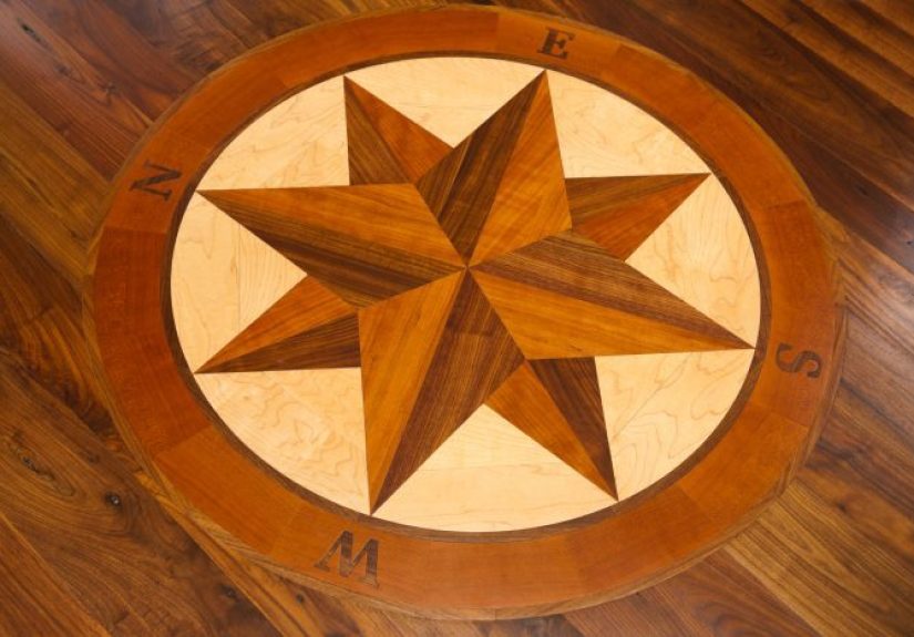
7) Compass rose / starburst medallion
What it looks like: a radial burstoften a compass rosemade from wedge-shaped segments that radiate from a center point.
This is the “statement necklace” of wood inlay patterns, and it can transform a plain tabletop into something people remember.
Where it shines: tabletop centers, entry tables, round panels, and box lids where the medallion becomes the hero element.
Design advice: keep the rest of the surface calm. A compass rose already has motion, direction, and contrast. If you surround it with a wild field
pattern, the whole piece can feel like it’s trying to win a talent show. Let the medallion be the lead singer.
Example: A circular compass rose in maple/mahogany/walnut on a darker tabletop, framed by a thin ring banding, creates a classic nautical vibe without
turning your dining room into a theme restaurant.
Making inlay look clean: practical tips that apply to every pattern
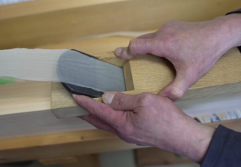
- Layout is everything. Crisp knife lines and careful marking often make the difference between “fine furniture” and “craft fair chaos.”
- Fit beats force. Inlay is happiest when it fits with gentle persuasion, not when it’s hammered in like you’re driving fence posts.
- Flush-up thoughtfully. Scrapers and careful sanding help avoid tearing out edges and rounding crisp corners. If you’re working with veneer-based inlay,
be extra conservative so you don’t sand through the pattern. - Practice repairs are part of the process. Tiny gaps happen. The goal is to make them unnoticeable, not to pretend they never existed.
- Work safely. Use eye protection, clamp your work, keep hands clear of cutters, and follow manufacturer guidance for any power tools. If you’re new to
routers or saws, getting help from an experienced woodworker (or an instructor) is a power move, not a weakness.
Beginner-friendly project ideas (that show off patterns without risking heartbreak)
- Picture frame: perfect for stringing or a narrow Greek key border.
- Small keepsake box: lid border banding + a simple center panel (try herringbone).
- Serving tray: parquetry-style field framed by stringing lines.
- Small table: a single banding strip on the apron or a medallion in the top center (when you’re ready).
Shop Lessons and Real-World Inlay Experiences (the extra )
Here’s something woodworkers learn the moment they start adding inlay: the pattern you choose is only half the story. The other half is how your hands behave when
the pressure is on, your coffee is wearing off, and you’re trying to keep a line perfectly straight while your brain whispers, “What if we… just eyeballed it?”
(Your brain is not a licensed surveyor. Don’t let it drive.)
One of the most common early experiences is discovering that inlay is a sequencing craft. The cleanest work usually comes from doing small, boring steps in
the right order: mark, score, remove waste, test fit, adjust, repeat. Skipping the “test fit” phase is how people end up with a perfect-looking cavity and an inlay
piece that refuses to drop inlike a cat that suddenly remembered it has free will.
Another real-world lesson: patterns behave differently depending on where they live. A herringbone banding on a narrow border is forgiving because the eye reads it as
movement along the edge. Put that same herringbone in the middle of a large panel, and the pattern becomes the main eventmeaning any drift in spacing or alignment
becomes more visible. That’s why many woodworkers “earn” their way toward full-field parquetry by starting with borders first.
There’s also the humbling experience of learning that contrast is not just about colorit’s about finish. Plenty of people pick two species that look
dramatically different when raw, then apply a finish that darkens the lighter wood and warms the darker one until the contrast softens. Sometimes that’s beautiful.
Sometimes it’s like turning the volume down on the best part of the song. The fix is easy and not glamorous: finish samples on scrap with your exact woods and your exact
schedule. It’s not “extra.” It’s how you avoid doing a gorgeous Greek key border that becomes invisible unless you stand at a 17-degree angle during a full moon.
And finally, the best experience: the first time a pattern clicks. You cut a clean string line. Your corners meet. The banding sits flush. You wipe the surface and the
design suddenly reads as one integrated piece. That’s when inlay becomes addictivein the wholesome, sawdusty way. You start seeing opportunities everywhere:
a simple box lid that could use a border, a drawer front that wants a geometric panel, a tabletop that’s begging for a quiet frame line. The trick is to keep your
enthusiasm slightly behind your skill level. Build reps. Repeat patterns. Get comfortable. Because once you’ve got these seven basics under control, you’ll have the
confidence to experimentwithout turning your next project into a very expensive lesson in humility.