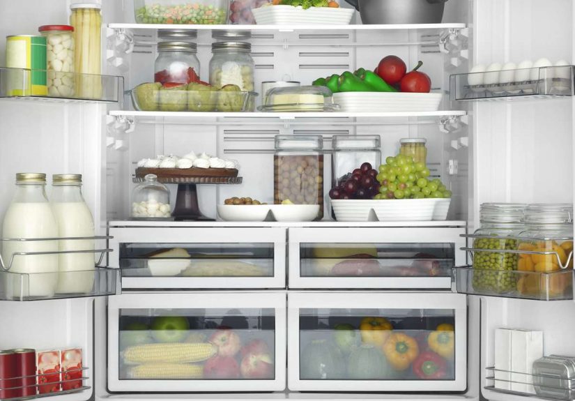


Want groceries to last longer and leftovers to stay worth eating? This guide explains how to store...
Personality disorders are often misunderstood, but they are real mental health conditions that affect emotions, identity, behavior,...
Going to a girl's house for the first time can feel awkward, but good manners make it...
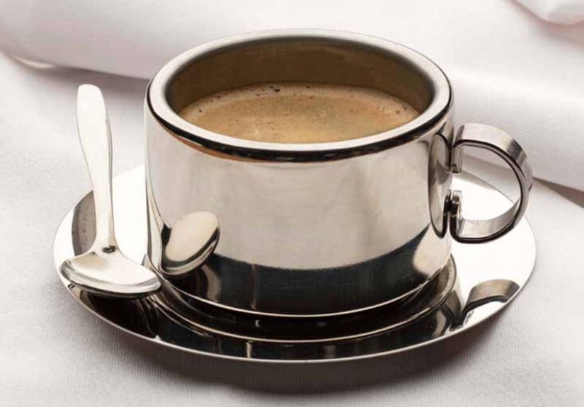
An insulated stainless steel coffee cup can be the difference between hot coffee and lukewarm disappointment. This...
Eclampsia is a rare but dangerous pregnancy complication that can turn warning signs like severe headache, vision...
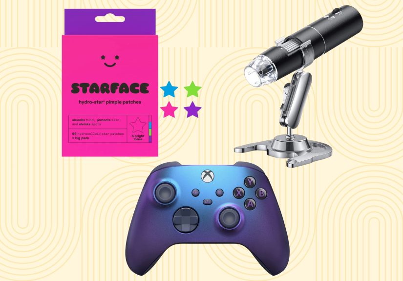
Need gift ideas for teens that won’t get the fake-smile treatment? This guide rounds up 42 of...

What is delta in options trading? This in-depth guide explains the most important options Greek in plain...

Obesity is more common in people with Down syndrome, but effective care goes far beyond telling someone...

Looking for tile ideas that make your home feel more stylish, custom, and unforgettable? This guide explores...
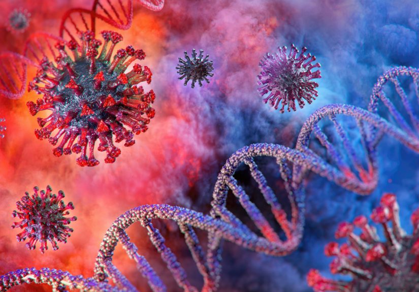
Herd immunity for COVID-19 was never the tidy endgame many hoped for. This in-depth article explains why...