Table of Contents >> Show >> Hide
- The Cover That Made History (And Why People Noticed)
- Who Is Jonathan Van NessAnd Why “Non-Female” Was the Word Everyone Used
- The 35-Year Gap: What Happened in Between?
- Why This Moment Hit Different in 2020-Era Culture
- Representation Isn’t a TrendIt’s a Feedback Loop
- The Ripple Effect: Beauty, Branding, and the “Permission Slip” Factor
- What Brands and Creators Can Learn From This Cover
- FAQ: Quick Answers People Still Google
- Closing Thoughts
- Experiences Around This Moment (Readers, Newsstands, and the Industry)
Picture this: you’re at the newsstand, minding your own business, when a familiar masthead hits you like a pop chorus you didn’t know you memorized.
Cosmopolitan UKbig, glossy, and historically very committed to the idea that “women’s magazine” means “women on the cover.”
Then you look closer and realize something has shifted. Not subtly. Not quietly. More like “high heels with Nike sneakers” energy.
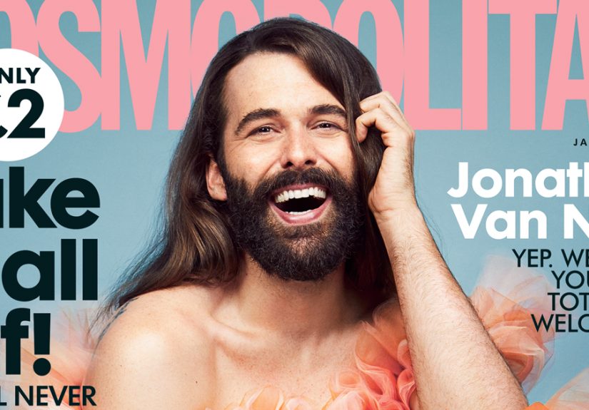
That’s essentially what happened when Cosmopolitan UK put Jonathan Van Ness on its cover as the first solo non-female cover star in more than three decades.
The internet did what it always does: celebrated, debated, meme’d, and thenif we’re luckylearned something.
And the magazine world did what it rarely gets to do anymore: feel like the center of culture for a minute.
The Cover That Made History (And Why People Noticed)
The headline version is simple: Cosmopolitan UK featured a non-female cover star for the first time in roughly 35 years.
The more accurate version is also more interesting: this was the first solo non-female cover in that spanmeaning one person, front and center, not a group shot and not a “special feature” tucked behind a celebrity pile-on.
That distinction matters because covers are a magazine’s loudest sentence. They’re not just decoration; they’re a mission statement in 300-point type.
A single-person cover says: this is the face of the issue, and by extension, a symbol of who the publication believes its readership isor could be.
In a media landscape where attention is currency and identity is a conversation, that’s a big editorial bet.
Who Is Jonathan Van NessAnd Why “Non-Female” Was the Word Everyone Used
Jonathan Van Ness is widely known from Queer Eye, plus a long list of ventures that collectively translate to: “beloved internet person who radiates joy and refuses to shrink.”
Van Ness has spoken publicly about gender expression and identifies as nonbinary while also using he/him pronouns in many contexts.
That nuance is exactly why many headlines leaned on the phrase “non-female” rather than “male.”
Is “non-female” a perfect phrase? Not really. It’s more of a media shorthandlike calling a croissant “a fancy bread situation.”
It communicates the historical point (Cosmo UK covers were overwhelmingly women) without forcing a simplistic label onto someone whose public identity doesn’t fit tidy boxes.
It’s clunky, but it was trying to be respectful while still making the “first in 35 years” math land with readers.
The 35-Year Gap: What Happened in Between?
A milestone like this raises an obvious question: how does a magazine go three and a half decades without a solo non-female cover star?
Part of the answer is traditionmagazines are famously loyal to formulas that have sold copies before.
Another part is marketing: for years, “women’s magazine” branding was treated like a strict dress code, not a vibe.
Historically, Cosmopolitan UK had featured a solo male cover in the 1980s (often cited as Boy George in 1984), but then returned to business as usual.
There were occasional exceptionslike a male group appearing much lateryet the solo spotlight stayed reserved for women.
So when the magazine finally put Van Ness alone on the cover, it felt less like a random celebrity booking and more like an intentional break in a long-running pattern.
Why This Moment Hit Different in 2020-Era Culture
The cover wasn’t just “a famous person in a great outfit.” It was a cultural signal.
By the late 2010s and early 2020s, mainstream conversations about gender, identity, and self-expression were no longer niche.
They were everywhereworkplaces, schools, entertainment, brand campaigns, family group chats, and yes, magazine covers.
Women’s magazines aren’t only for women (and never really were)
Here’s the thing most publishers have known quietly for years: audiences don’t read magazines the way marketing decks pretend they do.
People pick up issues because they like the voice, the advice, the celebrity, the fashion, the attitudeor because they forgot their headphones and now they’re making eye contact with a checkout line.
Many readers who enjoy “Cosmo content” don’t identify as women, and plenty of women don’t want their media diet boxed into “for women” as if they’re shopping in a separate aisle of the human experience.
A cover choice like this acknowledges a broader audience without erasing the magazine’s core promise: confidence, self-knowledge, and a slightly chaotic devotion to living your life loudly.
The business case: attention, loyalty, and relevance
Print media doesn’t get a lot of easy wins anymore. Covers have to work harder: they must sell physical copies and generate digital conversation.
A boundary-breaking cover can do bothespecially when it’s visually striking and culturally resonant.
And visually, this one delivered. Van Ness’s stylingpairing a dramatic gown with sneakerswas a perfect metaphor in fabric form:
elegance plus comfort, tradition plus rebellion, “I came to slay” plus “I might also run errands after.”
It was fashion as messaging, which is the whole point of a cover.
Representation Isn’t a TrendIt’s a Feedback Loop
Representation works less like a trophy and more like a thermostat.
When media reflects more kinds of people, it can shift what feels “normal,” which can reduce stigma, which encourages more visibility, which creates demand for more accurate representation.
It’s not instant, and it’s not always linear, but it’s real.
Visibility and belonging
When readers see themselves reflectedwhether through body type, race, disability, sexuality, or gender identityit can change their relationship with media.
They stop reading as a visitor and start reading as someone who belongs in the room.
That feeling is powerful, and it’s why covers matter.
This doesn’t mean every cover must be a social statement.
It means a publication has the option to expand who gets to be “default” without treating it like a rare special event.
The more ordinary inclusion becomes, the less “brave” it has to beand that’s the real goal.
Avoiding the token trap
The risk with any “first” is that it turns into a one-time headline instead of a lasting shift.
Audiences are quick to notice when inclusion shows up only when it can generate press.
So a meaningful moment like this demands follow-through: continued diverse cover choices, inclusive language inside the magazine, and content that treats a wide readership as normalnot as a sidebar.
The Ripple Effect: Beauty, Branding, and the “Permission Slip” Factor
One reason this cover resonated is that Van Ness’s public persona has long functioned like a permission slip for self-expression.
Shortly before the cover buzz, Van Ness also made headlines in beauty by partnering with a major nail brand as its first non-female (or first male, depending on wording) brand ambassador.
That mattered because beauty marketing has historically gendered everythingdown to the idea that nail polish is somehow “owned” by women.
When a visible figure shows up joyfully in a space people have been told they don’t belong, it creates a tiny cultural opening:
a teenage boy feels less weird about a manicure; a nonbinary person feels less alone; a woman feels less pressured to perform femininity in one narrow way.
The cover amplifies that same message at mass scale.
What Brands and Creators Can Learn From This Cover
1) Audience-first beats label-first
The phrase “women’s magazine” describes a legacy category, not a strict membership rule.
If your content is about confidence, relationships, health, money, work, style, and identitycongratulations, you’re talking about humans.
Modern audiences reward brands that speak to them as people first.
2) Let the visuals do some of the talking
The most effective editorial statements rarely feel like lectures.
They feel like art. Styling choicesgown plus sneakers, glamorous lighting with playful posturecan communicate inclusion and freedom without a single paragraph of explanation.
Then the story inside can do the deeper work.
3) Make “firsts” the beginning, not the finale
If a brand celebrates a milestone, the next step is building a track record.
That can mean featuring more diverse cover stars, hiring diverse editors and photographers, improving language standards, and commissioning stories that broaden the world rather than shrinking it back to old defaults.
FAQ: Quick Answers People Still Google
Was this the first man ever on a Cosmopolitan cover?
No. Different editions of Cosmopolitan across countries have featured men in various ways over time.
The milestone here was about Cosmopolitan UK and the rarity of a solo, non-female cover star after decades of mostly female cover tradition.
Why not just say “first male cover star”?
Because the cover star’s public identity and the public conversation around gender don’t always fit a simple binary label.
Many outlets used “non-female” to emphasize “not a woman cover star” while avoiding forcing an overly narrow category.
Did this change the magazine overnight?
A single cover doesn’t rewrite media history, but it can redirect it.
The bigger impact depends on consistency: future cover choices, editorial priorities, and whether inclusion becomes routine rather than occasional.
Closing Thoughts
The most interesting part of this moment isn’t the shock value of “a non-female person on a women’s magazine.”
It’s the quiet truth underneath: the category was always too small for the actual audience.
Cosmopolitan UK didn’t stop being Cosmo by featuring Jonathan Van Nessif anything, it leaned harder into Cosmo’s core promise:
be yourself loudly, love yourself publicly, and wear what you want, even if it confuses the algorithm.
If magazines are mirrors, then covers decide who gets reflected first.
This one widened the frameand in a culture that still debates who counts as “normal,” widening the frame is never just design.
It’s a statement about who belongs in the picture.
Experiences Around This Moment (Readers, Newsstands, and the Industry)
For many readers, the experience of seeing a cover like this is less “political” and more personallike bumping into an unexpected ally in a place that used to feel exclusive.
The magazine aisle has its own emotional architecture: glossy covers can feel like invitations or like velvet ropes.
People who have never felt targeted by “women’s magazine” marketing often don’t notice the rope.
People who have felt excluded notice it immediately.
One common experience described in reactions to inclusive beauty and fashion moments is a kind of relief: a sense that self-expression is allowed to be joyful instead of defensive.
Van Ness’s public style has always communicated that joybig laughs, big hair, big opinions, and a refusal to treat gender expression like a problem to solve.
When that energy shows up on a mainstream cover, it can feel like the culture saying, “You’re not doing too much. You’re doing you.”
Another experience is the ripple effect inside everyday relationships.
People often share boundary-pushing covers the way they share a song that explains their mood better than they can.
A friend sends it to a group chat with a simple “LOOK” caption.
A sibling posts it with heart emojis.
A parent sees it and asks a question they didn’t know how to ask before.
Even when the conversation starts awkwardly, it startsand that’s how norms shift in real life, not just in headlines.
Inside the media and fashion industries, these moments can feel like a high-stakes mix of excitement and calculation.
Editors know covers are both art and commerce: will advertisers complain, will readers cheer, will distribution partners flinch, will social media amplify or distort the message?
When the answer is “the audience is ready,” it’s often because the audience has been ready for a long timeand the industry is catching up.
The success of a widely discussed cover can also embolden other editors to push further, because proof of concept matters in boardrooms.
Of course, not everyone experiences it as progress.
Some readers feel whiplash when a familiar brand evolves, especially if they treat a magazine as a comfort object from a simpler time.
But cultural comfort has always been unevenly distributed.
For readers who rarely saw themselves centered, “comfort” often meant “not for you.”
So the deeper experience at play is a renegotiation of belonging: who is a magazine speaking to, who gets to be the face of it, and who is allowed to feel at home in its pages?
Ultimately, the most lasting experience may be the normalization effect.
The first time a boundary shifts, it’s headline-worthy.
The tenth time, it’s just Tuesdayand that’s the dream.
When inclusive covers become ordinary, readers stop bracing for impact and start focusing on what magazines should have been about all along:
ideas, style, self-knowledge, pleasure, ambition, and the messy, hilarious project of being human.