Table of Contents >> Show >> Hide
- Why the Space Outside the Frame Matters
- What’s Happening Outside the Frames of Famous Music Album Covers
- Abbey Road: Traffic, Timing, and One Very Efficient Myth
- Sgt. Pepper’s Lonely Hearts Club Band: A Pop-Art Universe Just Beyond the Edge
- Nevermind: A Cold Pool, a Fishhook, and a Whole Argument About Money
- Born in the U.S.A.: More Than a Flag, Less Than a Slogan
- The Dark Side of the Moon: Minimal Design, Maximum Universe
- London Calling: The Moment Before the Shatter
- Sign O’ the Times: Prince, Props, and Precision Disguised as Spontaneity
- Blonde: The Quiet Space Is the Story
- Let It Bleed: One of the Cleverest “Outside the Frame” Tricks Ever
- Why These Covers Still Work
- The Experience of Looking Beyond the Crop
Music fans love to argue about the greatest album covers of all time, and honestly, they should. A great cover is part branding, part storytelling, part visual sorcery. It is the frozen front door to an entire sound world. Before the first guitar squeal, piano chord, or dramatic inhale from the lead singer, the cover has already told you what kind of emotional weather to expect. Sometimes it whispers. Sometimes it struts. Sometimes it looks you dead in the eye and says, “This record may ruin your weekend, but in a chic way.”
What makes the most iconic album art so powerful is not just what appears inside the square. It is what the image suggests beyond the crop. Outside the frame, there is usually chaos, staging, symbolism, fatigue, design strategy, and the occasional traffic problem. In other words, the real story. The best famous music album covers work because they hint at a bigger world than the one they physically show. They make us curious about the sidewalk beyond the crosswalk, the studio floor beyond the spotlight, the people just off-camera, and the emotional mess tucked behind the pose.
That is why album cover analysis is so addictive. Looking past the edges reveals that many classic sleeves are not accidental snapshots at all. They are carefully shaped myths. Some are built like theater sets. Some are documentary moments that accidentally caught lightning in a bottle. Some are minimalist designs that imply a universe larger than the frame could ever hold. Either way, the missing space matters. It gives the image pressure, mystery, and room to breathe.
Why the Space Outside the Frame Matters
In the golden age of vinyl, cover art had room to act like architecture. A twelve-inch sleeve was not a thumbnail; it was an object. You held it, stared at it, flipped it over, read liner notes, and let the packaging shape the listening experience before the needle even dropped. That physical scale trained artists, photographers, and designers to think narratively. The best LP covers were never just portraits. They were visual arguments about identity, ambition, genre, and mood.
When we talk about what is happening outside the frame of famous album covers, we are really talking about hidden context. That context may be literal, like a cop stopping traffic for a Beatles photo shoot, or conceptual, like a designer turning a simple prism into one of rock’s most enduring symbols. Either way, the edge of the image is where imagination starts working overtime. It is also where myth begins.
What’s Happening Outside the Frames of Famous Music Album Covers
Abbey Road: Traffic, Timing, and One Very Efficient Myth
The Abbey Road cover looks casual enough to fool you. Four Beatles walk across a London zebra crossing, not smiling, not posing too hard, just moving forward like the coolest pedestrians in history. But outside the frame, the moment was far less effortless than it seems. The shoot itself was famously quick, with photographer Iain Macmillan working from a stepladder while traffic was held back and only a handful of usable shots were taken. That means the serenity of the image is a carefully selected slice of a much more practical scene.
What makes this cover fascinating is how much the crop removes. It strips away the rush, the public street, the logistics, and the fact that this was a band trying to turn ordinary pavement into legend. There is also the bigger symbolic space beyond the picture. The Beatles were not just crossing a road; they were crossing out of one era of their career and into their final stretch as a working group. Outside the frame sits the studio itself, years of collaboration, exhaustion, and the growing awareness that the machine was winding down. The image feels calm because the chaos has been politely cropped out.
Sgt. Pepper’s Lonely Hearts Club Band: A Pop-Art Universe Just Beyond the Edge
If Abbey Road is elegant understatement, Sgt. Pepper’s Lonely Hearts Club Band is the exact opposite: a glorious visual traffic jam. The cover is packed with cultural icons, bright uniforms, flowers spelling out “Beatles,” and both the real band and wax figures of the old band. It is a masterpiece of controlled overload. Looking at it feels like wandering into a costume party hosted by art school, vaudeville, and late-1960s psychedelia all at once.
Outside the frame, though, is even more interesting. There were cutouts to source, permissions to secure, figures to arrange, costumes to coordinate, and an entire concept to uphold: the Beatles as alter egos rather than their familiar public selves. The album cover does not simply show a crowd; it stages a cultural pantheon. The missing edges of the image contain the labor of collage, the mechanics of set-building, and the bigger idea that pop music could be as visually ambitious as film, painting, or theater.
That is part of why the cover still feels alive. It is not merely decorative. It is world-building. The frame gives us the parade, but outside the frame lies the workshop, the planning table, and the daring belief that a record sleeve could carry conceptual art without losing its pop appeal.
Nevermind: A Cold Pool, a Fishhook, and a Whole Argument About Money
Nirvana’s Nevermind cover is one of the most recognizable images in modern music: a baby underwater, reaching toward a dollar bill on a hook. The picture is simple, but the ideas around it are not. Outside the frame was a real pool, a real photo session, and the gritty practical reality of underwater photography. The shoot itself has been described as cold and difficult, which somehow feels perfectly on-brand for early-1990s grunge. Nothing about the finished image tells you the day was uncomfortable, but the chill is almost spiritually embedded in it.
The cropped image turns a messy setup into a clean symbol. Inside the frame, the baby looks suspended in a bright blue dream. Outside the frame sits the real point of the concept: innocence colliding with commerce. The fishhook dollar bill is not subtle, and it is not supposed to be. It turns the pool into an economic joke with teeth. That missing space beyond the crop is full of adult systems, record-label machinery, and the unsettling awareness that desire gets monetized early and often.
That tension is why the cover remains culturally sticky. It is memorable not because it explains itself, but because it doesn’t. It lets the viewer do the uncomfortable math.
Born in the U.S.A.: More Than a Flag, Less Than a Slogan
Bruce Springsteen’s Born in the U.S.A. cover is famous for how easily it can be misread. At first glance, it looks like a straightforward patriotic image: jeans, cap, red-and-white stripes, all-American iconography. But the power of the cover comes from the emotional space outside the frame. The songs on the record are full of bruised workers, battered dreams, restless towns, and hard national contradictions. So the crop does something clever. It presents a symbol big enough for the country to project onto, while the music underneath keeps complicating the story.
Outside the frame is the whole argument about America that the album refuses to simplify. The flag is there, yes, but so are disillusionment, grit, pride, irony, and fatigue. That is why the cover lasts. It does not illustrate the record in a literal way. It compresses the record’s tension into one unforgettable image. The frame gives you denim and stripes. The missing space gives you factories, veterans, back roads, and political misunderstanding. Together, that is the actual picture.
The Dark Side of the Moon: Minimal Design, Maximum Universe
Not every iconic album cover needs a photograph. Pink Floyd’s The Dark Side of the Moon proves that graphic design can create just as much off-frame mystery as any staged shoot. The prism and spectrum are famously clean, almost severe. There are no faces, no instruments, no scenery, no explanatory clutter. Just light entering, light splitting, and black space doing a lot of heavy lifting.
What is happening outside the frame here is conceptual rather than physical. The design suggests science, sound, time, madness, elegance, and infinity all at once. That is a ridiculous amount of work for one prism, but it somehow pulls it off. The missing space around the image becomes part of the composition. It feels cosmic, not because the cover shows the cosmos, but because it leaves enough darkness for your imagination to build one.
That is the genius of minimalist album cover design. Instead of crowding the square, it lets absence become meaning. The blankness around the symbol is not empty. It is charged.
London Calling: The Moment Before the Shatter
The Clash’s London Calling captures one of rock’s great split seconds: Paul Simonon smashing his bass onstage. The crop isolates the violence so perfectly that it feels almost mythic, like punk condensed into one body movement. But outside the frame is a fuller story: the venue, the audience, the bouncers, the frustration, the noise, the heat, the sense that control was slipping and that maybe slipping was the point.
The cover gets even smarter when you notice the typography. The lettering deliberately nods to Elvis Presley’s debut album, which means the image is doing two things at once. It honors rock history while attacking the idea that rock should sit still and behave. Inside the frame is destruction. Outside the frame is dialogue with the past.
That is why the cover still feels electric. It is not just punk rage frozen in amber. It is a visual argument about inheritance. Punk was not born out of nowhere. It arrived swinging, but it knew exactly which old shrine it was kicking on the way in.
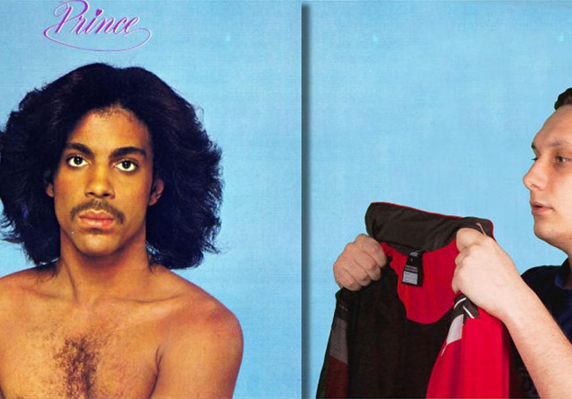
Sign O’ the Times: Prince, Props, and Precision Disguised as Spontaneity
Prince’s Sign O’ the Times cover looks dreamlike, layered, and slightly unstable in the best way. It feels as if you have walked into the middle of a performance that may or may not obey normal physics. That atmosphere is the whole point. Outside the frame was not some giant digital effects operation. It was a stripped-down warehouse setting, Prince’s own props, and a creative process that depended on instinct, control, and physical staging rather than glossy overproduction.
That matters because Prince was a master of making total intention look effortless. The blur, the cluttered theatrical mood, the odd balance between intimacy and spectacle, all of it suggests a world bigger than the rectangle. You imagine cables, props, spotlights, maybe a joke just told off-camera, maybe a moment of silence before another brilliant decision. The image looks improvised, but the intelligence behind it is razor sharp.
Outside this frame lives one of Prince’s great talents: he could make a constructed image feel personal and a personal image feel mythic. That is not easy. Most artists get one or the other.
Blonde: The Quiet Space Is the Story
Frank Ocean’s Blonde cover takes the opposite route from visual excess. The image is intimate, close, and emotionally withheld. Ocean stands in a tiled shower, green hair visible, head bent, body cropped tightly enough that the photo feels private without becoming decorative. It does not scream for attention. It lets uncertainty do the work.
What is happening outside the frame here is silence. Not empty silence, but meaningful silence. The missing space suggests solitude, memory, self-editing, and the emotional fog that runs through the record itself. You can almost feel the room continuing beyond the edges, but the image refuses to show you more than you need. That restraint is exactly why it lingers.
Some famous album covers become iconic because they are loud. Others do it by trusting understatement. Blonde belongs to the second category. It understands that mystery is not vagueness. Mystery is control.
Let It Bleed: One of the Cleverest “Outside the Frame” Tricks Ever
If there were an award for album art that literally answers the question “what happens outside the frame,” the Rolling Stones’ Let It Bleed would deserve a nomination on the spot. The front cover presents a bizarre stacked cake made of objects like a film canister, a clock face, a pizza, and a tire, with miniature Stones figures performing on top. It is chaotic, silly, and totally unforgettable. Then the back cover reveals the aftermath: the whole glorious thing has collapsed into a frosted disaster.
That is album cover storytelling at its sneakiest. The front gives you the spectacle. The reverse gives you the consequence. So the “outside” of the frame is not theoretical at all; it is built into the package. Flip the sleeve and the magic falls apart. The joke, of course, is that the collapse is just as visually satisfying as the setup.
This is why physical album packaging still has a special hold on people. A great cover is not always a single image. Sometimes it is a sequence, a reveal, or a visual punchline that only works when you handle the object like a curious human instead of flicking past it with a thumb.
Why These Covers Still Work
Famous music album covers last because they leave something out on purpose. They understand that viewers like to participate. We do not just want information; we want implication. We want to feel that there is weather beyond the edge, history behind the pose, and tension underneath the styling. The frame is only powerful when it hints at what it cannot contain.
That is why these images survive format changes, nostalgia cycles, and the thumbnail tyranny of streaming platforms. Even when reduced to tiny digital squares, the strongest covers still suggest a larger world. They still make us wonder what happened one second earlier, one foot to the left, or emotionally three years before the shutter clicked.
In that sense, the space outside the frame is where album art becomes myth. Not because it lies, but because it edits reality into something charged enough to outlive the moment. Great cover art does not merely document music. It teaches us how to imagine it.
The Experience of Looking Beyond the Crop
There is a particular kind of pleasure in staring at a famous album cover long enough that it stops feeling familiar and starts feeling strange again. Most people know these images in a shorthand way. You see the Beatles crossing the street, the Nirvana baby in the pool, the Pink Floyd prism, and your brain says, “Got it.” But if you stay with the image for another minute, something shifts. You begin noticing tension instead of recognition. The cover stops being a logo and becomes a scene. That is when the experience gets good.
Looking beyond the crop is part detective work and part daydream. You start asking wonderfully unnecessary questions. Was the room quiet or loud? Was the artist tired, annoyed, playful, self-conscious, freezing, or totally locked in? What had just happened before the shutter clicked? What happened one second later? That kind of curiosity turns the cover from decoration into evidence. It reminds you that every “iconic” image was once just a regular day with equipment, decisions, pressure, and somebody saying, “Okay, one more.”
There is also a physical side to this experience that streaming cannot fully replace. On a record sleeve, the image occupies your hands. You are not glancing at it; you are holding it. You can get close to the grain, the typography, the balance of negative space, the weird little details hanging out in the corners like they own the place. On a phone screen, a cover can still be powerful, but in larger form it becomes environmental. You do not just look at it. You enter it a little.
That is especially true with covers that imply motion. Abbey Road feels like the band will keep walking after the frame ends. London Calling feels like the smash is milliseconds away from becoming sound and splinters. Sign O’ the Times feels like the set extends into shadows filled with props and ideas. Even something still and quiet like Blonde feels suspended in a moment that is still unfolding emotionally, even if nothing dramatic is happening in a literal sense. Great album art makes stillness feel temporary.
The emotional experience can be even stronger than the visual one. Once you know the stories behind these covers, you cannot fully un-know them. The Beatles are not just crossing a street; they are carrying the weight of a band nearing its end. The Nevermind baby is not just underwater; the image is tied to a grim little joke about money and pursuit. Springsteen’s flag backdrop is not just patriotic theater; it hums with friction. These layers do not reduce the mystery. They deepen it. The more context you bring, the more space the image seems to create around itself.
That may be the best thing about iconic album cover design. It rewards repeat attention. A weak cover gets flatter the longer you look. A great one expands. It keeps opening doors beyond the edges of the square. It invites memory, analysis, projection, even argument. And sometimes the experience is surprisingly personal. A cover you knew as a teenager might feel rebellious then, sad at thirty, brilliant at forty, and almost tender later on. The frame stays the same. You change, and the missing space changes with you.
So yes, what is happening outside the frames of famous music album covers is partly staging, partly history, partly design. But it is also us. The viewer completes the scene. The listener supplies the weather. The fan carries the image forward. That is why these covers keep living long after the records first hit the shelf. They never really end at the border of the picture.