Table of Contents >> Show >> Hide
- What Is the Correlation Coefficient?
- Before You Calculate Anything
- The 4 Best Ways to Find the Correlation Coefficient
- How to Interpret Your Result
- Common Mistakes to Avoid
- Bonus Tip: If You Know R², You May Already Know r
- Which Method Should You Choose?
- Conclusion
- Experiences Related to Learning How to Find the Correlation Coefficient
- SEO Tags
If the phrase correlation coefficient makes you want to quietly close your laptop and take up gardening, take heart: it is much friendlier than it looks. At its core, the correlation coefficient is just a number that tells you how strongly two variables move together. If one goes up while the other also goes up, you probably have a positive correlation. If one rises while the other sinks like a dramatic soap-opera character, that is a negative correlation. And if the relationship looks random, your correlation may hover near zero.
Learning how to find the correlation coefficient is useful in school, business, research, health, finance, and just about anywhere people stare at data and ask, “Are these two things connected, or am I imagining it?” In this guide, you will learn four practical ways to calculate it, when to use each one, and how to avoid the classic mistakes that make a beautiful spreadsheet tell ugly lies.
We will keep the math clear, the examples simple, and the tone friendly. No statistical smoke bombs. No robot lecture voice. Just a clean explanation of what works, why it works, and how to get your answer without sacrificing your weekend.
What Is the Correlation Coefficient?
The correlation coefficient is a value between -1 and +1 that measures the strength and direction of a relationship between two variables. Usually, when people say “correlation coefficient,” they mean Pearson’s r.
Here is the fast interpretation:
- +1: perfect positive relationship
- -1: perfect negative relationship
- 0: no clear linear relationship
One important word there is linear. Correlation is best at measuring relationships that look roughly like a straight-line trend in a scatterplot. A curved relationship can fool you. So can an outlier that barges into your dataset like it owns the place.
Also, correlation does not prove causation. If ice cream sales and sunburn both rise in July, that does not mean popsicles are attacking people. It means a third factor, like hot weather, may be influencing both.
Before You Calculate Anything
Before finding the correlation coefficient, make sure your data pass a common-sense test:
- The data are paired. Each x-value should match one y-value.
- You are comparing the same observations in the same order.
- The relationship looks roughly linear if you plan to use Pearson’s r.
- You check for outliers, because one weird value can distort the result.
Think of correlation as a relationship detector, not a truth machine. It is powerful, but it likes clean data and honest expectations.
The 4 Best Ways to Find the Correlation Coefficient
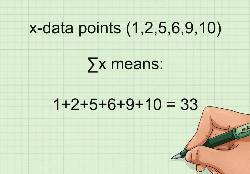
1. Calculate Pearson’s r by Hand with the Standard Formula
This is the classic method and the best one for understanding what the number actually means. The formula looks intimidating at first glance, but it is really measuring how the deviations of x and y move together.
Formula:
r = Σ[(x - x̄)(y - ȳ)] / √(Σ(x - x̄)² × Σ(y - ȳ)²)
In plain English, here is what you do:
- Find the mean of x and the mean of y.
- Subtract each value from its mean.
- Multiply each pair of deviations.
- Add those products.
- Divide by the square root of the product of the squared deviations for x and y.
Quick example:
Suppose your paired data are:
x = 1, 2, 3, 4, 5
y = 2, 4, 4, 4, 5
The means are x̄ = 3 and ȳ = 3.8. After working through the formula, the numerator is 6 and the denominator is about 6.93. That gives:
r ≈ 0.87
That means the variables have a strong positive linear relationship. Not perfect, but definitely not strangers.
Best for: homework, exams, learning the logic, and small datasets.
Watch out for: arithmetic mistakes. One missed square or swapped value and suddenly your “strong positive correlation” becomes “what on earth happened here?”
2. Use Covariance or z-Scores for a Cleaner Statistical Shortcut
If the standard formula feels like assembling furniture without instructions, this version is often easier to understand conceptually. Pearson’s r can also be written as:
r = covariance(x, y) / (sx × sy)
In other words, correlation is just covariance scaled by the standard deviations. Covariance tells you whether two variables move together, but its size depends on the units. Correlation fixes that by standardizing the result, which is why r always lands between -1 and +1.
You may also see the z-score version:
r = Σ(zxzy) / (n - 1)
This method is especially handy if you already know the covariance and standard deviations, or if your class is teaching standardized scores. For example, if the covariance of two variables is 6, and the standard deviations are 3 and 4, then:
r = 6 / (3 × 4) = 0.50
That would suggest a moderate positive relationship.
Best for: statistics students, research summaries, and anyone working from summary measures instead of raw data.
Watch out for: mixing sample formulas with population formulas. Statistics loves a tiny denominator detail almost as much as it loves Greek letters.
3. Find the Correlation Coefficient in Excel or Google Sheets
If your main goal is to get the answer quickly and accurately, spreadsheets are your best friend. They do not complain, they do not need coffee breaks, and they are excellent at repetitive math.
In Excel:
=CORREL(A2:A11,B2:B11)
In Google Sheets:
=CORREL(A2:A11,B2:B11)
That formula returns Pearson’s correlation coefficient for the two ranges. If your data are lined up properly, the result appears instantly. It is one of the easiest ways to calculate correlation for class projects, market analysis, survey results, or performance tracking.
If you want something more advanced in Excel, the Analysis ToolPak can generate a correlation matrix. That is especially helpful when you have several variables and want to see how every pair relates. Instead of one coefficient, you get a whole grid of them, which feels very professional and slightly powerful.
Best for: business users, students, analysts, and anyone handling medium to large datasets.
Watch out for: misaligned rows, blank cells, and comparing the wrong ranges. A spreadsheet will faithfully calculate nonsense if you feed it nonsense.
4. Use Spearman Rank Correlation When the Data Are Ranked or Messy
Sometimes Pearson’s r is not the best fit. Maybe your variables are ranks, maybe the relationship is monotonic but not perfectly linear, or maybe outliers are throwing punches at your dataset. That is where Spearman’s rank correlation coefficient comes in.
Spearman’s method works by ranking the x-values and y-values, then calculating Pearson’s correlation on those ranks rather than the raw data. It is a strong option when you are analyzing ordinal data, survey rankings, or relationships that move consistently in one direction without forming a neat straight line.
A simple version of the formula, when there are no tied ranks, is:
rs = 1 - [6Σd² / n(n² - 1)]
Here, d is the difference between the paired ranks.
Example: Imagine you rank five employees by training hours and productivity. If the ranks line up closely, Spearman’s coefficient will be high. That tells you the order of one variable tends to match the order of the other, even if the raw scores themselves are not perfectly linear.
Best for: ranked data, survey data, non-normal data, and situations where Pearson’s method feels too delicate.
Watch out for: assuming Spearman and Pearson always mean the same thing. They are related, but they answer slightly different questions.
How to Interpret Your Result
Once you have the number, the next challenge is interpreting it without becoming overconfident. Here is a practical guide:
- 0.00 to 0.19: very weak or almost no linear relationship
- 0.20 to 0.39: weak relationship
- 0.40 to 0.59: moderate relationship
- 0.60 to 0.79: strong relationship
- 0.80 to 1.00: very strong relationship
Use the same logic for negative values, except the direction flips. A result of -0.75 means a strong negative relationship: as one variable rises, the other tends to fall.
And remember: a correlation near zero does not always mean “no relationship at all.” It may simply mean there is no linear relationship. A curved pattern can hide behind a low Pearson r and smirk at your confusion.
Common Mistakes to Avoid
- Ignoring the scatterplot: Always look at the data first.
- Forgetting that correlation is not causation: Association is not proof.
- Using Pearson for ranked data without thinking: Spearman may be better.
- Letting one outlier hijack the result: Check unusual points carefully.
- Mismatching data pairs: Correlation only works when the pairs are correct.
- Overinterpreting a tiny coefficient: Statistical drama is still drama.
Bonus Tip: If You Know R², You May Already Know r
In simple linear regression, the correlation coefficient is directly related to the coefficient of determination:
r = ±√R²
The sign of r matches the sign of the slope. So if your regression output gives R² = 0.64 and the slope is positive, then r = +0.80. If the slope is negative, then r = -0.80. This is a handy shortcut when regression output is available and you just need the correlation.
Which Method Should You Choose?
If you are still deciding, here is the no-nonsense answer:
- Use Method 1 if you want to learn the math deeply.
- Use Method 2 if you already have covariance, z-scores, or summary statistics.
- Use Method 3 if you want speed and accuracy in everyday work.
- Use Method 4 if your data are ranked, non-normal, or not well suited to Pearson’s r.
The best method is the one that fits your data and your goal. Statistics is not about making everything fancy. It is about choosing the right tool before the wrong tool chooses chaos for you.
Conclusion
Finding the correlation coefficient does not have to feel like wrestling a textbook. Once you know what the number is trying to measure, the process becomes much more manageable. You can calculate Pearson’s r by hand, use covariance or z-scores for a cleaner statistical view, rely on Excel or Google Sheets for fast answers, or switch to Spearman’s rank correlation when your data need a more flexible approach.
The real trick is not just getting a number. It is understanding what that number can and cannot say. A strong coefficient can reveal a meaningful pattern, but it cannot prove cause and effect. A low coefficient can suggest weakness, but it may also hint that the relationship is curved instead of linear. In other words, correlation is useful, but it still expects you to think.
And honestly, that is not a bad deal. You do the thinking, the calculator does the arithmetic, and everyone gets to keep their dignity.
Experiences Related to Learning How to Find the Correlation Coefficient
People usually have the same emotional journey when learning correlation. It begins with confidence, takes a sharp turn into confusion, and ends with an oddly satisfying “Ohhh, now I get it.” Students often think the hardest part is the formula, but the bigger challenge is learning what the number actually means. Many can calculate r correctly and still misread the story behind it. That is a very human move, and statistics has been gently correcting it for years.
One common experience happens in the classroom. A student calculates a correlation of 0.82 between study time and test scores and feels triumphant. Then the instructor asks whether study time causes better scores, and the room gets quiet enough to hear a mechanical pencil roll off a desk. Suddenly everyone remembers sleep, tutoring, prior knowledge, stress, and whether the student spent three of those “study hours” alphabetizing highlighters. That moment matters because it teaches that correlation is useful, but context is king.
Another common experience shows up in workplaces. A marketing team might find a positive correlation between email frequency and sales, then rush to send more emails. Later they discover that their best customers were already more engaged, which explains both the higher email activity and the stronger buying behavior. The math was not wrong; the interpretation was. That is one of the most valuable lessons people learn from correlation: the number is honest, but people can still tell themselves a very creative story about it.
Beginners also tend to underestimate how much a scatterplot helps. Many people have the experience of calculating a weak correlation, only to look at the graph and realize the relationship is curved. It is a classic data plot twist. The coefficient seemed unimpressive, but the pattern was real all along. Others discover the opposite problem: one dramatic outlier made the relationship look much stronger than it really was. That experience usually turns a casual spreadsheet user into someone who double-checks graphs forever after.
Then there is the first time someone uses Excel or Google Sheets and gets a result instantly. It feels magical for about three seconds, right up until they realize they selected the wrong range. That is another rite of passage. Correlation rewards careful setup. If one column starts on row 2 and the other starts on row 3, the spreadsheet will still give you an answer. It just will not be an answer you should trust around other adults.
For many learners, the biggest breakthrough comes when they stop treating the correlation coefficient as a scary formula and start seeing it as a summary of a relationship. Once that shift happens, the topic becomes much more intuitive. You notice direction, strength, spread, outliers, and shape. You stop asking only, “What is r?” and start asking, “What is this data trying to say?” That is when statistics becomes genuinely useful. Not glamorous, perhaps. But useful in the wonderfully practical way that keeps bad decisions from wearing a fake mustache and sneaking into your report.