Table of Contents >> Show >> Hide
- What Is Wine Cork Letter Art?
- Before You Start: Natural vs. Synthetic Corks
- Supplies You’ll Need
- Step 1: Find and Prep Your Corks
- Step 2: Pick Your Letter Style
- Step 3: Choose Your Cork “Cut Style”
- Step 4: Plan Your Layout Like a Pro (So It Doesn’t Look Like a Cork Accident)
- Step 5: Pick the Right Glue (Because Gravity Is Not a Crafter’s Ally)
- Step-by-Step: The Classic Wine Cork Monogram Letter (Most Popular Method)
- How Many Corks Do You Need? A Practical Estimation
- Upgrade Ideas That Make Your Cork Letter Look Next-Level
- Troubleshooting: Common Problems and Fixes
- Eco-Friendly Extras: What to Do with Leftover Corks
- Conclusion: Your New Favorite “I Made That” Decor
- Experiences & Lessons Learned (So Your Letter Looks Better on the First Try)
If you’ve ever opened a drawer and discovered a small cork “population” that appears to be reproducing, congratulations: you’re halfway to classy, quirky wall decor.
Wine cork letter art (also called a cork monogram or cork initials wall art) turns a random pile of corks into something that looks intentionallike you meant to be the kind of person who casually hosts cheese boards.
This guide walks you through multiple ways to make DIY wine cork letters, from quick-and-easy to “I can’t believe I made this” impressive.
You’ll get tips on choosing a letter style, prepping corks, selecting adhesives, designing layouts that don’t look lumpy, and hanging your finished piece so it stays put.
And yes, we’ll talk about how many corks you actually needbecause nothing kills the vibe like running out halfway through the letter “S.”
What Is Wine Cork Letter Art?
Wine cork letter art is exactly what it sounds like: a letter (or word) made from wine corks, usually glued onto a sturdy base.
The final piece can be rustic, modern, farmhouse-y, minimalist, glam, or “my friend owns a hot glue gun and now we’re unstoppable.”
It works for initials, family names, inspirational words (hello, “HOME”), wedding decor, housewarming gifts, or a bar cart area that needs a little personality.
Before You Start: Natural vs. Synthetic Corks
For letter art, you can use both natural and synthetic corks. They glue differently, though, and they behave differently if you paint or seal.
If you’re not sure what you have, cutting one cork in half is the easiest “investigation.” Natural cork tends to look woody and uneven inside; synthetic cork often looks smooth and foam-like.
Quick decision guide
- Natural cork: more textured, slightly irregular, great for a warm, organic look.
- Synthetic cork: more uniform, often easier to cut cleanly, can look more “modern,” but sometimes needs stronger adhesive.
- Champagne corks: wider and more dramaticamazing for accents or a bolder 3D look.
Supplies You’ll Need
You can keep this simple or go full craft-goblin mode. Here’s the standard list:
Core supplies
- Wine corks (start with 40–120 depending on size and stylesee the “How Many Corks?” section)
- A letter base (wood letter, MDF letter, plywood cutout, foam board, or thick cardboard)
- Adhesive (hot glue gun + sticks is the fastest; stronger options are listed below)
- Scissors and/or utility knife (plus a cutting mat or scrap wood underneath)
- Pencil, ruler, and paper (for templates and planning)
Optional but helpful
- Sandpaper (to smooth wood edges or rough up glossy cork ends)
- Acrylic paint or wood stain (for the base or for cork accents)
- Clear sealer (spray or brush-on, ideally water-based for lower odor)
- Hanging hardware (sawtooth hanger, D-rings, Command strips, or picture wire)
- Decor add-ons: twine, faux greenery, mini lights, metal letters, or small photos
Step 1: Find and Prep Your Corks
How to get corks without making “drinking wine” your personality
- Ask friends and family to save corks for you (the fastest method, plus you get free storytelling with each cork).
- Ask restaurants or event venues if they’re willing to set corks aside.
- Buy unused corks online or at craft suppliers if you want a uniform look right away.
- Check cork recycling and collection programs in your areasometimes you can source craft-worthy corks and keep others out of the trash.
Cleaning and drying (simple version)
- Remove foil and wire (especially from champagne corks).
- Wipe corks down with a damp cloth to remove dust or sticky residue.
- Air-dry completelyovernight is ideal. Glue and moisture are not best friends.
If you notice strong odors or visible grime, use warm water with a tiny bit of mild soap, then dry thoroughly.
Avoid soaking corks for a long time if you plan to hot glue right awaytrapped moisture can weaken adhesion.
Step 2: Pick Your Letter Style
Option A: Store-bought wooden letter (fastest)
Craft stores sell wooden or MDF letters in a range of fonts and sizes. This method is beginner-friendly: you’re basically building a cork “skin” on a sturdy shape.
If you want a clean, gift-ready result with minimal tool drama, this is the move.
Option B: DIY plywood letter (sturdy and custom)
Want a specific font or a giant statement initial? Print a letter template, trace it onto plywood, and cut it out.
Sand the edges and you’ve got a base that can handle heavier cork layouts and stronger adhesives.
Option C: Framed letter art (polished and wall-friendly)
Instead of a freestanding letter, create a cork letter inside a frame: either glue corks to a backing shaped like a letter silhouette or outline a letter and fill it in mosaic-style.
This looks especially sharp for home offices, kitchens, and giftable “last name” pieces.
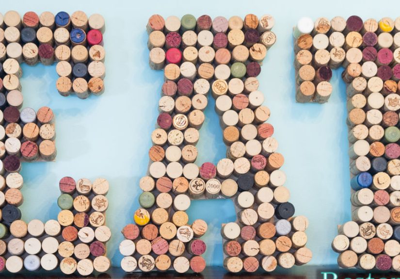
Step 3: Choose Your Cork “Cut Style”
How you place corks changes the whole look. You’ve got three main styles:
1) Whole corks (chunky, 3D, rustic)
Lay corks sideways across the base. This gives you depth and texture, and it’s forgiving if the corks are slightly different sizes.
It’s also the “wow, that’s cork” look.
2) Halved corks (flatter, more stable)
Slice corks lengthwise so they lay flat. This reduces wobble, makes gluing easier, and helps your letter sit closer to the wall.
Tip: gently steaming corks can make cutting easier and safer by softening them slightly.
3) Cork “coins” (mosaic look, great for crisp edges)
Slice corks into round discs (like little cork pancakes). This is ideal for framed art or tight, clean lettering because you can “pixel” your way around curves.
It takes longer, but the results can look surprisingly modern.
Step 4: Plan Your Layout Like a Pro (So It Doesn’t Look Like a Cork Accident)
Dry-fit first
Lay corks on the base before you glue anything. Rotate and mix corks so branding stamps and wine stains look intentional.
If you want a cleaner finish, face printed sides inward or outward consistently.
Keep your edges clean
The secret to letter art that looks “store-bought” is the outline.
Use smaller cork pieces near curves and corners, and save full-length corks for long straight sections.
If your letter has a skinny middle (like “K” or “R”), plan that area first so you don’t end up forcing corks to do yoga.
Create a pattern
- Brick pattern: stagger cork ends for a tidy, engineered look.
- Herringbone-ish: alternate angles for a modern twist.
- Ombre stain: place darker wine-stained corks at the bottom and lighter ones at the top.
- Memory map: cluster corks from trips or celebrations into sections of the letter.
Step 5: Pick the Right Glue (Because Gravity Is Not a Crafter’s Ally)
Hot glue (best for speed)
Hot glue is fast and forgiving. It’s great for lighter letters, quick projects, and anyone who doesn’t want to wait for curing.
Use small beads of glue and press firmly for a few seconds. Work in sections so the glue doesn’t cool before placement.
Stronger adhesives (best for heavy or long-lasting pieces)
If you’re making a large letter, a word sign, or anything that might live in a warm area (like above a kitchen stove),
consider a stronger adhesive such as epoxy or a strong craft adhesive.
Epoxy can also be used as a finishing layer for a sealed, durable surface in certain projects.
Safety note
If you’re using sharp blades or hot tools, work on a stable surface and keep fingers out of the “oops zone.”
If you’re a teen or crafting with kids, an adult should handle cutting and any power tools. You want letter art, not a dramatic origin story.
Step-by-Step: The Classic Wine Cork Monogram Letter (Most Popular Method)
1) Prep the base
- If using a wooden/MDF letter, lightly sand any rough edges.
- Optional: paint or stain the base (especially if gaps might show).
- Let the base dry fully before gluing corks.
2) Sort and test your corks
- Group corks by length and thickness.
- Decide whether you want labels showing or hidden.
- Do a full dry-fit on your letter to confirm you have enough corks.
3) Build the outline first
Start with the outside edges of the letter. This creates a crisp silhouette and helps everything else fall into place.
For curves, use shorter cork segments or halved corks angled slightly.
4) Fill in the center
Once the outline is done, fill the interior like you’re tiling a tiny cork floor.
Stagger seams where possible. If you hit a weird gap, don’t panictrim a cork to fit and pretend you planned it.
5) Reinforce and tidy
- Press down across the whole surface to ensure solid contact.
- Snip glue strings (the unofficial confetti of hot glue projects).
- If any cork feels loose, add a small bead of glue at the contact points.
6) Add hanging hardware
If your letter is lightweight, heavy-duty picture hangers or Command strips can work.
For larger letters, attach D-rings or a sawtooth hanger to the back of the base.
Make sure hardware is centered so the letter doesn’t tilt like it’s judging your interior design.
How Many Corks Do You Need? A Practical Estimation
Cork math isn’t perfect because corks vary, but here’s a reliable way to estimate so you don’t end up with half a letter and a dream.
Method 1: Quick visual estimate
- 8–10 inch letter: ~35–60 corks (whole cork layout)
- 12 inch letter: ~60–90 corks
- 18 inch letter: ~90–140 corks
Method 2: Area estimate (for the detail lovers)
A standard cork is roughly 1.75 inches long and about 0.9 inches wide. If you lay corks sideways, each cork covers about 1.5–1.7 square inches once you account for gaps and curves.
Measure the approximate surface area of your letter (height × average width of the letter shape), then divide by ~1.6.
Example: a 12-inch tall letter with an average “filled” width of 6 inches has ~72 square inches of surface area.
72 ÷ 1.6 ≈ 45 corks. Add 25–40% for curves, gaps, and corks that will be cutso plan for ~60 corks.
Upgrade Ideas That Make Your Cork Letter Look Next-Level
Make it color-coordinated
- Spray-paint the base black for modern contrast.
- Dry-brush a few corks with white acrylic for a “washed” farmhouse look.
- Create a two-tone letter by placing champagne corks in the center and regular corks on the edges.
Add a frame or shadow box
Framing a cork letter instantly makes it look more finished, and it also protects the edges from bumps.
A shadow box is especially great for chunky 3D letters made from whole corks.
Seal it (optional)
If your letter will live in a high-touch area, a clear sealer can help keep dust and smudges down.
Test first: some sealers slightly darken cork. Water-based options are often easier to work with indoors.
Turn it into functional decor
- Pinboard letter: glue cork “coins” flat so you can pin notes into the letter.
- Key hook letter: add small hooks along the bottom edge for keys or dog leashes.
- Bar cart sign: make a word like “CHEERS” and hang it above a drink station.
Troubleshooting: Common Problems and Fixes
“My corks keep popping off.”
Usually this happens when corks are dusty, damp, or the base surface is slick.
Wipe corks dry, lightly rough up contact points with sandpaper, and consider a stronger adhesive for heavier sections.
“My letter looks uneven.”
That’s normal when corks vary in thickness. Choose one “front face” direction (all corks oriented similarly),
and use halved corks in areas where you need flatter coverage.
“The outline is messy.”
Start over on the outline only. Seriouslyfixing the perimeter is the biggest visual improvement per minute of effort.
Use smaller cork pieces for tight curves and keep the edge consistent.
“I don’t have enough corks.”
Welcome to the most common cork-craft surprise.
Options: reduce letter size, switch to halved corks (more coverage), incorporate cork “coins” for filler, or mix in store-bought unused corks to finish.
Eco-Friendly Extras: What to Do with Leftover Corks
If you end up with extras (or you’re saving the non-matching ones for “future you”), you’ve got options.
Natural corks can be reused in garden and household projects, and both natural and synthetic corks can be collected for certain recycling and repurposing programs.
If a cork is too damaged or funky-smelling to craft with, don’t force ityour wall art shouldn’t have a mysterious odor story.
Conclusion: Your New Favorite “I Made That” Decor
Wine cork letter art is one of those projects that looks much harder than it is.
You’re basically combining three things humans love: personal meaning, tactile texture, and the satisfaction of turning “junk” into decor.
Whether you make a single initial, a family name, or a bold word sign for a kitchen or bar cart, the process is the same:
choose a sturdy base, plan a clean outline, glue with intention, and finish like you didn’t just learn what “cork math” is five minutes ago.
Now go make something beautifuland remember: the only acceptable craft hoarding is the kind that eventually becomes wall art.
Experiences & Lessons Learned (So Your Letter Looks Better on the First Try)
The first time I made cork letter art, I assumed two things: (1) I had “plenty of corks,” and (2) glue is glue.
Both assumptions were adorable. I started with a 12-inch wooden “M,” dumped my corks on the table, and felt wildly confident
like I should probably host a workshop called Crafting With Confidence and Questionable Math.
Lesson one hit fast: corks are not all the same size. Some are skinny, some are squat, some are champagne corks that look like they lift weights.
That variety is charming in theory and chaotic in practice. The fix was sorting first.
Once I grouped corks by size, the project stopped feeling like I was trying to tile a bathroom with random pasta shapes.
If you sort before you glue, your curves get smoother, your edges get cleaner, and your blood pressure stays in a reasonable ZIP code.
Lesson two: outlines are everything. I originally filled the center first because it felt efficient.
Then I reached the edges and realized my letter silhouette looked like it had melted a little.
Re-doing the perimeter took ten minutes and made the entire piece look twice as polished.
If you only have the energy for one “fancy” step, make it the outline.
That crisp outer shape is what tells people, “Yes, this is art,” instead of “I dropped corks on a letter and panicked.”
Lesson three: cutting corks is a “slow down” activity. When I rushed, the slices were uneven and the corks rolled like tiny logs plotting my downfall.
A cutting mat and a steady hand helped, but the biggest improvement came from softening corks slightly before cutting.
Even a small bit of prep can make the difference between clean halves and cork confetti.
Also: don’t cut toward your hand. Ever. Cork crafts should not involve bandages that become part of the aesthetic.
Lesson four: hot glue is fantastic… until it isn’t. For smaller letters, hot glue is a dreamquick, satisfying, and instantly stable.
For bigger pieces, heat and gravity can slowly win. On a large word sign I made later, a few corks started to loosen after being hung near a warm kitchen area.
The fix was using a stronger adhesive in the heaviest sections and saving hot glue for quick positioning.
If your project is large, heavy, or going somewhere warm, choose your glue like you’re choosing a teammate for a tug-of-war: pick the strong one.
Lesson five: the best cork letters tell a story. The most complimented piece I’ve made wasn’t the neatestit was the most personal.
I grouped corks from trips together (one corner was basically “vacation memories”), kept a few stamped logos visible on purpose,
and added one champagne cork right in the center like a tiny trophy.
People notice those details. It turns decor into conversation, and it makes the piece feel less like a generic DIY and more like a little time capsule.
Final lesson: always make 10% more cork “coverage” than you think you need. Curves eat corks. Gaps appear. A cork splits.
Suddenly you’re staring at an unfinished letter at 10:47 p.m. wondering if you can “artistically” turn an “E” into an “F.”
Save yourself: over-collect, dry-fit everything, and keep a few extra corks aside for fixes.
Your future self will thank you, probably while dramatically holding a glue gun like a microphone.