Table of Contents >> Show >> Hide
- What Opera Actually Fixed on iPhone (And Why You’ll Notice Fast)
- The Real Hero Feature: Tab Management That Doesn’t Hate You Back
- Meet Aria: Opera’s Built-In AI That’s Meant to Help (Not Get in the Way)
- Privacy and Performance: The “Daily Driver” Features That Matter
- How to Set Up Opera on iPhone for Maximum “Easy Mode”
- Opera vs. Safari vs. Chrome on iPhone: Who Should Switch?
- Real-World Experiences: How Opera Makes iPhone Browsing Feel Easier (500+ Words)
- Conclusion
If you’ve ever tried to browse the web on your iPhone one-handed while holding a coffee, a subway pole, a grocery bag,
or (let’s be honest) your dignity… you know the struggle. Your thumb is doing gymnastics. Tabs are multiplying like
gremlins. The address bar is way up there like it pays rent in the top-left corner.
Opera’s recent wave of iPhone-focused updates is basically a love letter to anyone who’s tired of “thumb yoga” and
“tab chaos.” Opera One for iOS leans hard into what makes mobile browsing feel easier: a bottom search bar option,
swipe-first navigation, a more immersive full-screen view, smarter tab management, and quick access to its built-in
AI assistant, Aria. The vibe is simple: fewer taps, less clutter, more “why didn’t every browser do this already?”
Let’s break down what Opera changed, why it matters, and how to make your iPhone browsing feel less like a chore and
more like a superpower (or at least like a calm, organized superpower that doesn’t have 97 tabs open).
What Opera Actually Fixed on iPhone (And Why You’ll Notice Fast)
Most iPhone browsers can load pages, keep bookmarks, and pretend you don’t have an unhealthy relationship with open
tabs. The difference is how quickly you can get where you want to goespecially when you’re using one hand.
Opera’s iOS redesign focused on three “pain points” that iPhone users feel every day:
- Navigation: searching, switching, and moving around pages without finger acrobatics
- Tabs: keeping your browsing from turning into a digital junk drawer
- Utility: quick tools (privacy, AI help, shortcuts) that don’t slow you down
Opera One for iOS introduced multiple navigation styles so you can pick the setup that matches your hands and habits:
a standard layout, a Fast Action Button approach, or a bottom search option that puts the search bar within easy reach.
It’s a small change with huge “daily life” impactbecause searching is what we do constantly, not once per month when
we remember we have a browser.
Bottom Search Bar: The “Stop Stretching Your Thumb” Upgrade
Opera’s Bottom Search style moves the search bar to the bottom of the screen so your thumb can reach it naturally.
This makes quick searches, new URLs, and switching tasks feel easierespecially on larger iPhones where top-of-screen
controls can feel like they’re a zip code away.
Opera also emphasizes gesture-driven access to search (think: swipe to trigger search instead of hunting for an icon),
which is one of those changes you don’t fully appreciate until you go back to a browser that makes you tap through menus
like it’s a scavenger hunt.
Full-Screen Browsing: More Page, Less Chrome
Opera’s iPhone experience leans into immersive browsing. When you scroll, interface elements can get out of the way so
the content takes center stage. That’s especially noticeable when you’re reading articles, comparing product specs, or
just trying to focus without a parade of buttons stealing your screen space.
The goal isn’t to look fancy. The goal is to let your phone feel bigger without you buying a bigger phone.
Start Page Carousel: Quick Updates Without the Mess
Opera’s iOS start page can present a swipeable carousel that mixes things like news and live updates. Whether you love a
curated start page or you prefer to open straight into search, this design idea is about speedgetting something useful
immediately, then moving on.
The Real Hero Feature: Tab Management That Doesn’t Hate You Back
iPhone tab overload is a universal experience. You open a page “for later,” then later becomes next week, then next month,
then the heat death of the universe. Safari can handle tabs, surebut Opera’s latest iOS tab tools are built specifically
for people who live in “too many tabs” territory.
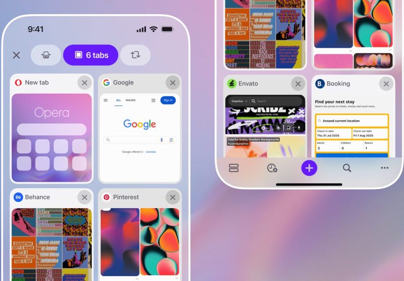
Grid View vs. List View: Choose Your Anti-Chaos Style
Opera One for iOS lets you pick between different tab layouts, including a visual grid and a compact list. The grid view
is great when you recognize pages by their previews (“Oh yeah, that one with the blue chart!”). The list view is great
when you’re dealing with a ridiculous number of tabs and want maximum density without feeling overwhelmed.
This matters because “tab management” isn’t one-size-fits-all. Some people are visual. Some people are minimalist.
Some people just want to survive.
Tab Groups: Turn Your Tab Monster Into Organized Projects
Opera’s tab grouping is designed for real life: planning a trip, handling work research, comparing purchases, reading a
pile of recipes you’ll never cook, and so on. You can collect related tabs into named groups and even use color to keep
categories distinct.
In practice, this is the difference between:
- Before: “Where did that hotel tab go? I swear I opened it.”
- After: “Trip Planning” group → “Hotels” → there it is.
Tab Search: Find the One Tab You Actually Need Right Now
Opera adds tab search so you can type a keyword and locate a tab by its title or URL. This is a lifesaver if you open
a bunch of pages across a few days and then suddenly need that one specific pagelike a receipt, a login portal, a
tracking number, or the article you promised you’d cite for a project.
If you’ve ever rage-closed tabs because “this is impossible,” tab search is the calmer timeline.
Smarter Tab Navigation: Normal, Private, and Synced Tabs
Opera’s redesigned tab gallery makes it easier to move between regular tabs, private browsing, and synced tabs from other
devices. That’s especially handy if you bounce between a laptop and iPhone and want continuity without emailing yourself
links like it’s 2011.
Meet Aria: Opera’s Built-In AI That’s Meant to Help (Not Get in the Way)
Opera’s Aria AI is built into the iOS browser experience, and Opera has been steadily making it easier to access.
Instead of being a separate app or a clunky add-on, Aria is treated like a browser featuresomething you can call on
when you need a quick summary, a rewrite, an explanation, or help thinking through a question.
What Aria Is Useful For on iPhone
The most practical iPhone use cases aren’t “AI for AI’s sake.” They’re “AI because I’m busy and my screen is small.”
Think:
- Summarize pages fast: perfect when a page is long and you just need the key points
- Explain jargon: translate tech, finance, or medical speak into plain English
- Draft quick text: messages, outlines, short emails, or captions (without switching apps)
- Search smarter: get quick answers while staying in your browser flow
Opera has also highlighted voice input and image-related AI capabilities in its iOS updatesfeatures that make sense on
a phone, where typing isn’t always convenient and where screenshots/photos are part of everyday life.
Aria Without an Account: Fast Access When You’re On the Go
A standout iOS tweak: Opera has enabled “accountless” Aria access, meaning you can use Aria without having to sign in.
That’s a big deal for casual use. You can test it, use it in a pinch, or rely on it while moving through your day
without turning “ask a quick question” into “log in, confirm email, verify device, forget why you came.”
Opera has also tied Aria into iPhone home screen widgets and quick actions, making it easier to launch straight into
search, tabs, private mode, or AI help with a single tap.
One-Tap Access: AI Should Be Convenient, Not a Quest
In newer versions, Opera places Aria more prominently in the interface so you can access it quickly (especially helpful
when you’re in “research mode” and juggling multiple pages). The best browser tools are the ones you actually useand
making Aria easy to reach is what turns it from a novelty into a habit.
Privacy and Performance: The “Daily Driver” Features That Matter
Most people don’t wake up excited to configure privacy settings. They just want fewer creepy ads, less tracking, and a
browser that doesn’t feel like it’s dragging a backpack full of bricks.
Ad Blocking: Cleaner Pages, Fewer Distractions
Opera includes a built-in ad blocker on iOS, aimed at cutting down pop-ups and page clutter. The real win isn’t just
aestheticsit’s usability. Less junk on the page often means fewer accidental taps and a smoother reading experience.
Built-In VPN: Extra Protection When You’re Out in the Wild
Opera also promotes a built-in VPN feature in its iOS app. For many users, the most relatable VPN moment is public Wi-Fi:
airports, cafés, hotels, coworking spacesplaces where you’d rather not broadcast your browsing like a billboard.
That said, keep expectations realistic. A VPN can help protect traffic on untrusted networks and obscure some network-level
visibility, but it doesn’t magically erase your digital footprint. Websites can still track you in other ways, accounts
still identify you when you log in, and privacy is always a “layers” game.
Private Browsing and Tracking Prevention
Opera supports private browsing mode and leans on Apple’s underlying anti-tracking mechanisms as well. The practical result:
fewer third-party tracking cookies doing backflips behind the scenes. It’s not a cure-all, but it’s a meaningful baseline.
How to Set Up Opera on iPhone for Maximum “Easy Mode”
You don’t need to become a browser mechanic to benefit from Opera’s changes. A few small setup steps can make the
experience feel dramatically smoother.
1) Make Opera Your Default Browser
- Open Settings on your iPhone
- Scroll down and tap Opera
- Tap Default Browser App
- Select Opera
Now links you open from apps (email, messaging, social, notes) can land in Opera instead of bouncing you into Safari by
default. It’s a small change that reduces friction all day long.
2) Choose Your Navigation Style
In Opera’s settings, look for navigation options and try the styles:
- Bottom Search if you want one-handed comfort
- Fast Action Button if you like a thumb-friendly control hub
- Standard if you prefer a more traditional layout
This is where Opera quietly wins: it doesn’t force you into one design philosophy. It lets you pick the one that matches
your habits.
3) Use Tab Groups Like Real Projects
If you want the “Opera effect” immediately, start grouping tabs by purpose. A simple starter set might be:
- Work / Research
- Shopping / Price Checks
- Travel / Planning
- Read Later (be honest… you’ll still procrastinate, but at least it’s organized)
4) Add Opera Widgets for One-Tap Launch
If you’re the kind of person who wants speed without thinking about it, Opera’s iOS widgets can give you one-tap access
to search, tabs, private browsing, or Aria. This is especially useful if your iPhone home screen is your “command center.”
Opera vs. Safari vs. Chrome on iPhone: Who Should Switch?
Safari is deeply integrated with Apple’s ecosystem. Chrome is great if you live in Google services and want sync parity
across devices. Opera’s pitch on iPhone isn’t “we load the internet.” It’s “we make using the internet easier.”
Choose Opera if you care most about…
- One-handed browsing comfort (bottom search + gesture flow)
- Better tab control (layouts, groups, search)
- Built-in tools like an ad blocker and integrated AI assistance
- Quick actions (widgets, customizable shortcuts, faster entry to what you need)
Choose Safari if you care most about…
- Apple ecosystem cohesion (iCloud Keychain, Apple services, continuity features)
- “It just works” defaults with minimal setup
- Staying native and keeping everything Apple-first
Choose Chrome if you care most about…
- Google account sync across desktop and mobile
- Workflow continuity if your world is Gmail, Drive, Docs, and Google Search
The good news: switching your default browser on iPhone isn’t permanent. Try Opera for a week. If your tabs feel calmer
and your thumb feels less angry, you’ll know.
Real-World Experiences: How Opera Makes iPhone Browsing Feel Easier (500+ Words)
Here’s what “easier browsing” looks like in real lifenot in a product demo with perfect lighting and zero distractions,
but in the messy chaos of actual iPhone usage.
Experience #1: The Commute Scroll (One Hand, No Problem)
You’re standing on a train or walking down a sidewalk, and you need to look something up quicklymaybe a meeting location,
a restaurant menu, or whether that “one weird trick” headline is nonsense. In a typical browser layout, you do the thumb
stretch: reach up, tap the address bar, try not to drop your phone, and pretend it’s fine. With Opera’s bottom search
setup, search is already where your thumb lives. It’s not just fasterit feels physically easier. It’s the difference
between “I’ll look later” and “I’ll look now.”
Experience #2: The Tab Monster Intervention
You start with good intentions: one tab for flights, one for hotels, one for “things to do,” and one for weather. Two days
later, you’ve got 46 tabs, half of them are the same hotel but with different dates, and one tab is somehow a recipe for
banana bread. Opera’s tab groups let you split the mess into projects so you can actually find things again. The best part
is tab searchbecause even with groups, you’ll still lose one tab eventually. You type “hotel” or “museum tickets” and
Opera helps you locate the page instead of making you play “guess which tiny preview is the right one.”
Experience #3: Shopping Without Losing Your Mind
Shopping on iPhone is brutal when you’re comparing models, reading reviews, and checking return policies. You bounce between
specs, pricing, and the same five review sites that all say different things. With Opera’s grid view, it’s easier to visually
recognize what’s open (the review page, the product page, the comparison page). With list view, it’s easier to manage volume
when you’ve opened “just one more” link 20 times. Group the tabs as “Laptop Options” or “Headphones” and suddenly you’re
doing organized comparison instead of chaotic doomshopping.
Experience #4: When You Need Answers Fast (Aria as a Sidekick)
Sometimes you’re not browsing for funyou’re browsing because you need clarity. A dense article, a technical explainer, a
confusing policy page, or a long thread that could have been a paragraph. That’s where a built-in AI assistant can actually
be helpful: summarize the page, explain a term, rewrite a confusing section into plain English, or help you build a quick
checklist from what you’re reading. The key is that it stays in the browser flow. You’re not switching apps, copying text,
and losing your place. You’re staying focused, and the browser is doing the “support work.”
Experience #5: The “I Have Two Seconds” Shortcut Life
The underrated iPhone upgrade is widgets and quick actions. When Opera puts search, private mode, tabs, or Aria within a tap
from your home screen, it turns browsing into something you can do in micro-momentswaiting for an elevator, standing in a
line, walking to your car. Those little time slices add up, and the browser feels less like a chore because you’re not
spending half your time just getting started.
In all these experiences, the theme is the same: Opera doesn’t try to reinvent the web. It tries to remove the tiny bits of
friction that make iPhone browsing annoying. Less stretching. Less hunting. Less clutter. More control. More flow.
And once you get used to that, “normal browsing” can start to feel weirdly… inefficient.
Conclusion
Opera’s iPhone updates are a smart reminder that browsing isn’t just about loading pagesit’s about getting to what you
want with minimal effort. Bottom search and swipe-friendly navigation make the iPhone feel easier to use one-handed.
Better tab layouts, grouping, and tab search help you stay organized even when your curiosity runs wild. And with Aria built
in (and increasingly easy to access), you can summarize, clarify, and move faster without leaving your browser.
If Safari feels “fine” but not “fun,” and if Chrome feels “familiar” but not “calm,” Opera is worth a serious try.
Your thumb (and your tabs) will probably thank you.