Table of Contents >> Show >> Hide
- Meet Cloud Dancer: The White That Refuses to Be Boring
- Why Pantone Picked This Color for 2026
- Why the Choice Feels So Surprising
- How Cloud Dancer Works in Real Interiors
- What to Pair With Cloud Dancer
- Beyond Interiors: Fashion, Beauty, and Brand Appeal
- Not Everyone Loves It, and That’s Part of the Story
- What Cloud Dancer Really Says About 2026
- Experiences That Make Cloud Dancer Feel Real
Every year, Pantone drops its Color of the Year like a tiny design thunderbolt. Sometimes the pick struts in wearing sequins. Sometimes it arrives wrapped in velvet drama. And sometimes, as with Pantone’s 2026 choice, it floats in quietly, opens a window, and lets the room exhale.
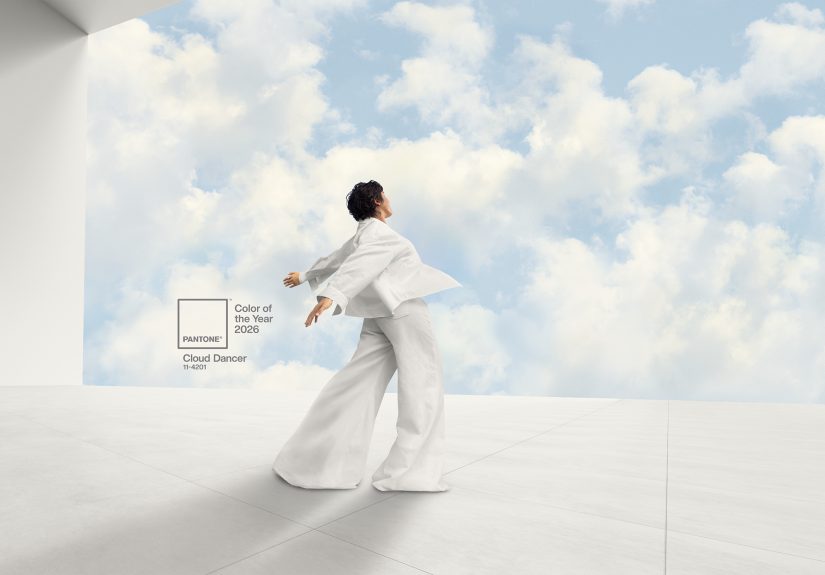
The official pick is PANTONE 11-4201 Cloud Dancer, an airy white that feels less like a flashy trend and more like a cultural mood board. At first glance, it might seem almost too subtle for a title this big. White? Really? That’s the headline? But that’s exactly what makes this choice so interesting. In a year when people are tired of visual clutter, constant notifications, loud aesthetics, and “look at me” everything, Cloud Dancer reads as a reset button with excellent lighting.
And no, this isn’t just “plain white wearing a fancy name tag.” As anyone who has ever spent 45 minutes comparing paint swatches in a hardware store knows, white is a whole personality spectrum. Some whites feel icy and clinical. Others feel buttery and sleepy. Cloud Dancer lands in a sweet spot: soft, balanced, expansive, and calm without feeling sterile. It’s the kind of color that makes a room feel bigger, a bedroom feel gentler, and your overworked brain feel like maybe it can stop doing cartwheels for five minutes.
That’s why Pantone’s 2026 Color of the Year matters. It isn’t just a shade selection. It’s a signal. It tells us where design, lifestyle, fashion, and even emotional priorities are drifting. And in 2026, they seem to be drifting toward lightness, clarity, and a version of luxury that whispers instead of shouting from a velvet chaise lounge.
Meet Cloud Dancer: The White That Refuses to Be Boring
Cloud Dancer is best described as a lofty, ethereal white with a soft, breathable quality. It is not a harsh gallery white, not a blue-toned hospital white, and not a yellowing cream pretending to be neutral. Its magic lies in its balance. It feels open and pure, but still warm enough to live with.
That balance is a big reason the color has landed so strongly across design coverage. Editors and designers have described it as a blank canvas, a calm backdrop, and a visual pause button. Those ideas matter because a neutral color only becomes powerful when it does more than blend in. Cloud Dancer does not disappear. It creates room. It lets texture matter. It gives shape, shadow, light, and materials more authority.
In other words, this is a color for people who want their homes to breathe. It is minimalist, yes, but not bleak. Serene, but not sleepy. Fresh, but not cold. It is the interior-design equivalent of crisp sheets, sheer curtains, and one glorious hour with your phone on silent.
Why Pantone Picked This Color for 2026
Pantone’s annual choice is never random. The company studies movements across fashion, interiors, art, beauty, technology, travel, entertainment, and broader culture. The point is not to reward the loudest color in the room. It is to select the shade that best captures the emotional atmosphere of the moment.
For 2026, that atmosphere appears to be defined by a craving for relief. People want simplicity. They want clarity. They want fewer visual interruptions and more emotional breathing room. Cloud Dancer fits that mood perfectly. It suggests a clean slate, a fresh start, and the possibility of thinking more clearly after a period of overstimulation.
That makes this pick feel especially timely. Over the past several years, trend culture has often rewarded saturation: louder colors, bolder contrasts, maximalist styling, dopamine decor, high-drama finishes, and rooms that seem to yell before you even sit down. Cloud Dancer is the opposite impulse. It does not reject creativity; it clears space for it. Pantone appears to be saying that innovation does not always begin with noise. Sometimes it begins with quiet.
There is also something very 2026 about choosing a color that reflects the tension between digital life and human connection. More people are trying to create homes that feel restorative, not performative. They want spaces that support concentration, softness, and genuine comfort. Cloud Dancer speaks directly to that desire. It feels modern, but not machine-made. Clean, but not soulless. Contemporary, but still deeply human.
Why the Choice Feels So Surprising
Let’s be honest: when people hear “Color of the Year,” they usually expect, well, more color. A juicy jewel tone. A spiced earth tone. Something moody, dramatic, or at least capable of making a throw pillow feel very important. Cloud Dancer breaks that expectation, and that is part of why the reaction has been so strong.
It is also a major shift from Pantone’s 2025 pick, Mocha Mousse, which leaned warm, rich, and indulgent. Mocha Mousse felt like dessert with opinions. Cloud Dancer feels like opening the windows after the party. That contrast tells a bigger story: the cultural mood has moved from cozy abundance to edited calm.
The surprise factor has fueled both admiration and skepticism. Some people love the restraint. Others wonder if white can really carry the emotional weight of a Color of the Year title. That debate is actually useful. It reminds us that color is never just decorative. It is psychological. Social. Symbolic. A Pantone choice can start arguments precisely because people bring meaning to color, whether they realize it or not.
And that may be Cloud Dancer’s sneakiest strength. It makes people slow down and look harder. Suddenly everyone is talking about undertones, texture, reflection, softness, balance, and what “fresh” really means in a home or wardrobe. Not bad for a color some people initially dismissed as “just white.”
How Cloud Dancer Works in Real Interiors
If you are wondering whether Cloud Dancer is more concept than reality, the answer is no. This shade is wildly usable. In fact, that may be why so many home publications immediately connected it to practical rooms and everyday living.
Living Rooms
In a living room, Cloud Dancer can make the whole space feel brighter and more open without forcing a stark modern look. Pair it with linen upholstery, oak furniture, boucle accents, or layered rugs, and it reads as soft sophistication. Add deeper browns, shadowy plum, muted olive, or dusty blue, and suddenly the room has dimension without losing its calm center.
Bedrooms
This is where Cloud Dancer really earns its keep. Bedrooms benefit from colors that lower the temperature emotionally. On walls, bedding, or curtains, this white creates a cocoon effect when paired with tactile materials like brushed cotton, chunky knits, matte ceramics, and soft wood finishes. It feels airy enough for daylight and gentle enough for evening. That is not easy, and yet here we are.
Bathrooms
Spa-like bathrooms were practically born for a color like this. Cloud Dancer plays beautifully with stone, plaster, glass, pale tile, and warm metallic accents. It can make small bathrooms feel less boxed in and larger ones feel more serene. Add fluffy towels, curved mirrors, and one well-behaved plant, and you are halfway to a boutique hotel that charges too much for citrus water.
Kitchens and Workspaces
In kitchens, Cloud Dancer offers a cleaner, softer alternative to icy whites. It works especially well when the goal is brightness with warmth. Think painted cabinets, open shelving, handmade ceramics, and natural wood stools. In home offices, it creates a focused backdrop that feels light rather than distracting. That matters when your desktop already contains enough tabs to qualify as an emotional event.
What to Pair With Cloud Dancer
One of the smartest things about Cloud Dancer is its flexibility. Pantone and design editors alike have leaned into the idea that it can harmonize with a wide range of palettes, which makes it practical for both trend lovers and cautious decorators.
For a soft, uplifting look, pair it with powdery pastels: pale blush, misty lavender, whisper blue, or washed sage. For a more tailored interior, bring in warm browns, cocoa tones, or moody plum accents. For coastal freshness, breezy blue-greens and sandy neutrals work beautifully. And for a contemporary contrast, black details or sculptural dark wood can give the softness of Cloud Dancer more structure.
The real secret, though, is texture. Because Cloud Dancer is subtle, it needs surfaces with character. Boucle, chenille, limewash, linen, wool, ribbed glass, matte tile, brushed metal, raw wood, and lightly imperfect ceramics all help the color come alive. This is not a flat white for flat rooms. It is a nuanced white for layered spaces.
Beyond Interiors: Fashion, Beauty, and Brand Appeal
Cloud Dancer is not confined to walls and sofas. Pantone’s Color of the Year program always stretches across categories, and 2026 is no different. The shade lends itself naturally to fashion because it can shift from structured to floaty depending on fabric. In crisp tailoring, it looks elevated and intelligent. In organza, chiffon, or padded outerwear, it feels airy, dreamy, and soft.
Beauty trends can also borrow from its mood. Think milky manicures, luminous skin, creamy eye shadows, and understated packaging that signals quiet luxury rather than loud branding. In product design, Cloud Dancer makes sense for objects meant to feel clean, calm, and future-facing. That is why brand collaborations around the color are such a logical extension. Reports have already linked Cloud Dancer to special partnerships across furniture, stationery, art, and even mood-setting playlists.
That cross-category appeal is important for SEO readers and trend watchers alike. When Pantone names a Color of the Year, it is not just predicting paint swatches. It is influencing how products are styled, merchandised, photographed, marketed, and emotionally framed. Cloud Dancer may be quiet, but commercially, it has range.
Not Everyone Loves It, and That’s Part of the Story
Of course, no Pantone reveal would be complete without debate. Some critics have called the choice too safe, too plain, or even a little boring. Others have argued that picking white at this moment feels provocative in ways Pantone may or may not have intended. There has also been online pushback from people who simply wanted more obvious color from, you know, the color authority.
But controversy does not automatically weaken the choice. In some ways, it strengthens it. A selection that sparks conversation has cultural traction. Cloud Dancer is making people discuss the meaning of calm, the politics of taste, the emotional use of neutrality, and the difference between simplicity and emptiness. That is a surprisingly rich conversation for a shade that looks, at first glance, like a cloud deciding to mind its business.
And if history tells us anything, it is that Pantone picks often feel odd before they feel inevitable. Trend adoption rarely begins with universal applause. Sometimes it begins with confusion, then curiosity, then a suspicious number of new throw blankets in the exact same tone.
What Cloud Dancer Really Says About 2026
Ultimately, Pantone’s 2026 Color of the Year is not about proving that white is exciting. It is about proving that restraint can be meaningful. Cloud Dancer reflects a wider appetite for rooms, routines, and aesthetics that feel lighter and less burdened. It captures the idea that peace is aspirational, that simplicity can still feel luxurious, and that clarity may be the design language people need most right now.
In a world obsessed with more, Cloud Dancer makes the case for enough. Enough noise reduction. Enough softness. Enough space to think, rest, and create. It is a breath of fresh air precisely because it does not compete for attention. It gives attention back to the things that matter: shape, texture, light, comfort, and the emotional atmosphere of a space.
So yes, Pantone picked white. But not an empty white. Not a forgettable white. Not a surrender white. Cloud Dancer is a poised, thoughtful white that arrives with remarkable timing. It asks us to edit, to soften, to breathe, and maybe to stop confusing busyness with beauty.
For 2026, that feels less like a trend and more like a collective exhale.
Experiences That Make Cloud Dancer Feel Real
To understand why Cloud Dancer resonates, it helps to think less like a paint deck and more like a person moving through a day. Imagine waking up in a bedroom where the walls are soft white, the curtains glow with morning light, and nothing in the room is visually shouting at you before coffee. The color does not demand a reaction. It gives you a gentle beginning. That experience matters more than trend language ever could.
Or picture coming home after a long day of screens, meetings, traffic, headlines, and a phone battery that has somehow died despite doing absolutely nothing useful. You step into a living room layered in whites, warm woods, and quiet textures. The sofa looks soft. The light feels diffused. The space is calm, not because it is empty, but because it is edited. That is the emotional job Cloud Dancer performs. It removes friction.
There is also something deeply experiential about the way this color changes with light. In the morning, it can feel crisp and optimistic. By late afternoon, it softens. At night, under warm lamps, it becomes cozy rather than cool. That flexibility is why white done well never feels one-dimensional. Cloud Dancer is less a fixed statement than a mood surface. It receives the day and gives it back in a gentler form.
In fashion, the experience is similar. Think of a structured white shirt that makes you feel instantly pulled together, or a soft off-white knit that feels clean, expensive, and easy all at once. The appeal is not just visual. It is psychological. Wearing a calm color can feel like clearing your throat before speaking, or smoothing the table before starting something new. It suggests readiness without noise.
Even outside design, the color taps into familiar sensory memories: clouds rolling across a bright sky, clean sheets, paper before the first word, sea foam, soft feathers, sun through gauzy curtains. That may sound poetic, but it is also why the pick works commercially. People respond to colors that already live in memory. Cloud Dancer feels recognizable before it feels trendy.
And then there is the creative side of the experience. A blank page can be intimidating, yes, but it can also be liberating. That is the promise hidden inside this shade. Cloud Dancer says there is still room to imagine. Still room to begin again. Still room to make something lighter, smarter, quieter, and more intentional. In that sense, Pantone’s 2026 choice is not just about decorating a home. It is about changing the emotional weather inside it.
Maybe that is why the color lingers. It does not just look fresh. It feels fresh. It feels like a pause that improves your thinking. A room that lowers your shoulders. A wardrobe that feels easy. A house that breathes better. A small but meaningful rebellion against the idea that more is always better. Sometimes less clutter, less glare, less visual pressure, and less performance create the richest experience of all. Cloud Dancer understands that. And in 2026, a lot of people probably will too.