Table of Contents >> Show >> Hide
- What this tile actually is (and what “modular” means in real life)
- Quick specs that matter when you’re planning a project
- Why Arctic White works in so many homes
- Best places to use Rittenhouse Square Arctic White
- Design playbook: how to make white subway tile feel fresh
- Installation notes (DIY-friendly, but still professional-minded)
- Care and maintenance: keeping Arctic White looking crisp
- Cost, ordering, and planning like someone who’s been burned before
- FAQ
- Real-world experiences: what it’s like choosing, installing, and living with this tile (extra notes)
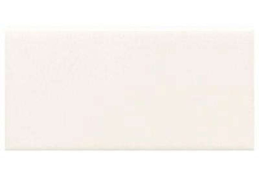
If you’ve ever shopped for “white subway tile,” you already know the truth: there are approximately nine million whites.
Some are warm and creamy. Some are cool and crisp. Some look bright in the store and then read as “old notebook paper”
under your kitchen lights. The Rittenhouse Square Arctic White Ceramic Modular Wall Tile lands firmly in the
clean, classic, bright-but-not-blinding campmaking it a go-to for backsplashes, bathroom walls, and that
“I want timeless, but I still want it to feel intentional” vibe.
This tile is best known as a 3″ x 6″ glazed ceramic wall tile in a reliable subway format.
The “modular” part means the sizing is designed to play nicely with grout joints and pattern layouts,
so your rows line up the way your brain wants them to.
In other words: fewer “why is that seam drifting like it’s trying to escape?” moments.
What this tile actually is (and what “modular” means in real life)
Let’s decode the name without turning this into a tile museum tour. “Rittenhouse Square” is the collection,
“Arctic White” is the color, “ceramic” is the material, and “modular wall tile” is the format.
In practice, you’re looking at a glazed ceramic subway tile intended primarily for walls and backsplashes,
available in finishes like semi-gloss and (in some listings) matte.
If you’re ordering online, double-check the finish and SKU so you get the sheen level you actually want.
Why do people care about sheen? Because it changes everything:
semi-gloss bounces light and feels a little more “classic/clean,” while matte reads softer and more modern.
Both can look great. One might make your under-cabinet lighting look like a magazine photo.
The other might make it look like a calm spa. Choose your fighter.
Quick specs that matter when you’re planning a project
Here are the details you’ll actually use when you’re estimating quantities, shopping trim, or trying to avoid
an emergency second order (a.k.a. the universe’s favorite way to test your patience).
- Nominal size: 3″ x 6″ wall tile
- Thickness: about 5/16″
- Coverage per case: about 12.5 sq. ft. (often ~100 pieces per case)
- Recommended grout joint (walls): about 1/16″
- Shade variation: low (great for a uniform, consistent look)
- Coordinating options: trims (including bullnose) and coordinating pieces like shelf rail and mosaics may be available depending on your source
One more practical note: the collection also includes coordinating items in certain colors (like shelf rail),
which is helpful if you want a finished, vintage-inspired edge without relying solely on metal trim.
If you’re doing a niche, a soap shelf, or a classic half-wall, these matching pieces can make the whole project feel “built-in” instead of “good enough.”
Why Arctic White works in so many homes
1) It’s a “background tile” that doesn’t disappear
Arctic White is bright and clean, but it doesn’t scream for attention.
That makes it the perfect supporting actor for dramatic countertops, bold paint, statement hardware,
or patterned floors. It’s the tile equivalent of a white button-down shirt: reliable, flattering,
and shockingly versatileuntil you spill spaghetti sauce on it (more on that later).
2) The 3×6 subway format is timeless for a reason
Subway tile has stuck around because it’s flexible. You can make it traditional, modern, farmhouse,
industrial, coastal, or “I just want my kitchen to look like it has its life together.”
Designers regularly point out that subway isn’t the problemboring layout choices are.
Change the pattern, change the vibe.
3) It plays well with grout (and grout is the real main character)
White tile is a blank canvas, but grout color is your brushstroke.
Matching grout makes everything feel seamless and calm.
Light gray gives gentle definition and is often more forgiving for maintenance.
Charcoal or colored grout turns the whole wall into a graphic pattern (which can look incredible in the right space).
Important: some manufacturers caution against very dark grout with certain glossy ceramic tiles because it can
visually emphasize surface hairline lines (often called “crazing”) if they occur.
If you love high contrast, test a sample board first instead of committing your entire kitchen to a “surprise feature.”
Best places to use Rittenhouse Square Arctic White
Kitchen backsplash
This is the classic useand for good reason. Glazed ceramic cleans up well and handles everyday splashes.
Arctic White works especially well with:
- Butcher block: warms up the crisp white for an inviting look
- Dark stone or quartz: creates a sharp, modern contrast
- Brass or black hardware: makes the white tile feel intentional and styled
- Open shelving: keeps the backdrop bright so your dishes (and plants) look like decor
Bathroom walls and shower surrounds
White tile in a bathroom is basically a cheat code for making a small space feel larger.
In showers and wet areas, success is less about the tile and more about the system:
waterproofing, proper mortar coverage, correct grout, and good ventilation.
Arctic White reflects light nicely, which is great if your bathroom lighting currently feels like it was installed in 1997 and never forgiven.
Fireplace surround or feature wall
If you want “clean and classic” without going full farmhouse shiplap, a glossy or semi-gloss white ceramic surround can look sharp.
Consider a vertical stack layout to make it feel updated, or a herringbone inset for a subtle statement.
Design playbook: how to make white subway tile feel fresh
Choose a layout that matches your style
- Classic offset (running bond): traditional, timeless, easy to live with
- Vertical stack: modern, makes ceilings feel taller
- Horizontal stack: clean-lined and contemporary, great for minimalist kitchens
- Herringbone: more “designed,” perfect for a feature backsplash behind a range
- Basketweave or mixed-format moments: if you incorporate coordinating mosaics or a framed inset
Pick grout color with both aesthetics and reality in mind
A quick, brutally honest guide:
- White grout: seamless and classic, but shows stains more easily
- Light gray grout: subtle definition, often the best balance of style and maintenance
- Medium gray or greige: warmer, softer contrast that can hide everyday discoloration
- Charcoal/black grout: bold and graphic, but requires commitment (and careful testing)
- Color grout: playful and modernbest on smaller areas or accent walls if you want it to feel deliberate, not accidental
Pair it with the right finishes
Arctic White looks especially good with:
- Warm metals: brushed brass, champagne bronze, warm nickel
- Moody paint: deep green, navy, charcoal, even matte black cabinetry
- Natural textures: oak shelving, linen Roman shades, woven baskets
- Stone or terrazzo floors: for a high-end, layered look
Installation notes (DIY-friendly, but still professional-minded)
You can absolutely DIY a backsplash with a 3×6 ceramic tilemany people do.
The trick is treating it like a system, not a craft project you start after dinner with “good vibes.”
Prep is the difference between “wow” and “why”
- Start with a flat, clean surface. Uneven walls make subway tile look crooked even when it isn’t.
- Dry layout first. Plan your centerline and cuts so you don’t end up with tiny slivers at the edges.
- Use a level reference line. Countertops are not always level, even when they look innocent.
Adhesive and coverage: the unglamorous heroes
In dry interior areas you generally aim for strong, consistent coverage; in wet areas you need excellent coverage.
Use the right trowel notch, comb in one direction, and press tiles in with a slight wiggle to collapse ridges.
Back-buttering (keying a thin layer of mortar on the back of the tile) can help improve contact and reduce voids.
Spacing, alignment, and the “step back test”
Small-format tile is forgiving in some ways and brutally honest in others.
Use spacers for consistency, check your lines frequently, and step back every few rows.
If something drifts, fix it earlybecause grout does not magically correct geometry. Grout only highlights your geometry decisions.
Grouting and sealing (especially in kitchens and baths)
Let mortar cure fully before grouting. Clean as you go, because dried grout haze is not a personality trait you want.
In many residential projects, sealing cement-based grout helps resist stains and makes routine cleaning easier.
(If you choose a pre-sealed or epoxy grout, follow that product’s instructions instead.)
Care and maintenance: keeping Arctic White looking crisp
Glazed ceramic is generally easy to maintain. Routine cleaning with a gentle, compatible household cleaner and
a soft cloth or sponge is usually enough. Avoid abrasive pads that can dull the glaze.
For showers, regular light cleaning prevents soap scum buildup from becoming a weekend-long negotiation.
- Daily/weekly: wipe splashes, especially behind the stove and sink
- Monthly: check grout lines for discoloration and spot-clean early
- As needed: re-seal grout if your grout manufacturer recommends it and water no longer beads on the surface
A quick reality check: the tile itself is usually not the hard part to keep cleanit’s the grout.
Choosing a grout color with a little forgiveness (like light gray) can save you a lot of scrubbing drama later.
Cost, ordering, and planning like someone who’s been burned before
How much tile should you buy?
Measure your square footage, then add waste:
10% extra for simple layouts, 15% extra for herringbone or lots of cuts.
If your tile comes in cases (often around 12.5 sq. ft. per case), round up.
You want leftover tile; you do not want “one tile short” energy.
Order all at once when possible
Even with low shade variation, it’s smart to order enough tile at the same time for consistency.
If you’re mixing finishes (semi-gloss field tile with matte accents, for example), confirm compatibility and lead times.
Some coordinating colors or trims can be special order.
FAQ
Is Arctic White a warm white or a cool white?
Arctic White is generally perceived as a cleaner, cooler white compared to creamier off-whites.
Lighting matters: warm bulbs can soften it, and daylight can make it feel crisp.
Always view a sample in your actual space.
Is a 1/16″ grout joint realistic for 3×6 tile?
It can be, especially for wall applications with a consistent tile and a flat substrate.
If your walls are uneven or you’re installing as a beginner, a slightly wider joint can be more forgiving.
The goal is straight lines and even spacing, not winning the “smallest grout line” contest.
Can I use it in a shower?
Yes, ceramic wall tile can be used on shower walls when installed properly over an appropriate waterproofed system.
The key is following best practices for wet-area installations: waterproofing, correct thinset, excellent coverage,
proper curing, and a grout/caulk strategy that handles movement.
What’s the easiest way to make it look less “builder basic”?
Pick one upgrade:
a more interesting layout (vertical stack or herringbone), a thoughtful grout color (soft gray or warm greige),
or a finished edge detail (shelf rail, bullnose, or a clean metal trim).
Any one of these can take the look from “default” to “designed.”
Real-world experiences: what it’s like choosing, installing, and living with this tile (extra notes)
Here’s what homeowners and installers often notice with a tile like Rittenhouse Square Arctic Whitethe kind of
practical stuff you only learn after you’ve stared at your backsplash at three different times of day like it’s a mood ring.
First, the color reads “clean” fast. In a kitchen with darker cabinets or countertops, it can instantly brighten the room,
almost like you upgraded your lighting without touching a single wire. People often say the biggest “wow” moment is the day
the grout haze is cleaned off and the tile finally reflects light the way they imagined in their head.
Second, your grout choice will feel like a personality test.
Many folks start out thinking, “I’ll do white grout for a seamless look,” and then remember they cook.
Light gray becomes the popular compromise because it still looks classic but doesn’t announce every splash of coffee or marinara.
If someone goes bold with dark grout, they usually love the graphic lookright up until they realize they also committed to
keeping every line crisp and consistent. (Dark grout doesn’t hide uneven spacing; it puts it on a billboard.)
The smartest “experience-based” move is making a small sample board: a few tiles, your intended grout, and the exact lighting
your kitchen or bath actually uses.
Third, installation feels easy… until it doesn’t. A 3×6 tile is manageable, cuts cleanly, and stacks predictably,
which is why DIYers often choose it for a first backsplash. Then the wall reminds you it’s not perfectly flat.
People who have the smoothest results usually did two unsexy things: they prepped the surface carefully and they used a level line
instead of trusting the countertop. That one decisionstarting from a true level referenceoften separates
“Pinterest-perfect” from “close enough if you squint.”
Another common experience: semi-gloss finishes can make a space feel cleaner, but they also make texture and residue more visible in certain lighting.
If your backsplash sits under strong under-cabinet LEDs, you might notice splatters sooner. The good news is that glazed ceramic
usually wipes down easily, so it’s less “hard to clean” and more “hard to ignore when the light hits it just right.”
In bathrooms, homeowners often report that the tile itself stays looking great, while grout maintenance is the real long game.
A consistent routinequick wipe-downs and occasional grout spot-cleaningkeeps it looking fresh without turning your Saturday into a grout-themed saga.
Finally, there’s the emotional experience: white tile is calming. It makes a kitchen feel brighter in the morning,
and it makes a bathroom feel more “finished,” even if you haven’t upgraded anything else yet.
A lot of people pair Arctic White with one “spice” elementbrass hardware, a bold paint color, a warm wood shelf, or a patterned runner
and that’s where the design starts to feel personal instead of generic.
If you want the tile to feel less like a default choice and more like a deliberate one, add a single signature move:
a vertical stack behind the range, a framed inset, or a shelf rail detail. The tile will happily do the classic part
you just give it one interesting line to read.