Table of Contents >> Show >> Hide
- Quick Take: Matching Is Allowed, Not Required
- Why This Decision Matters for Curb Appeal
- When Painting Them the Same Color Works Beautifully
- When Experts Recommend NOT Matching
- The “Better Than Matching” Approach: Coordinate Like a Pro
- Color Rules That Keep You Out of Trouble
- Paint Finish: What Sheen Should You Use on Exterior Doors?
- Step-by-Step: How to Decide in a Weekend Without Regret
- Specific Examples: What Works on Common Home Styles
- Mistakes to Avoid (So Your House Doesn’t Look “Accidentally Loud”)
- Conclusion: Match If It Serves the House, Not the Trend
Your front door is the handshake of your house. Your garage door is… the large, hardworking coworker who shows up early, does the heavy lifting, and would prefer not to be perceived.
So when homeowners ask, “Should I paint my front door and garage door the same color?” what they’re really asking is: Do I want my home to look pulled togetheror accidentally audition for a matching-outfits family photo?
Here’s the good news: there’s no single “correct” answer, and that’s exactly why this decision is so powerful. The best choice depends on your home’s style, how prominent your garage is from the street, your exterior color palette, and how bold you want your entry to feel.
Below is a practical, expert-informed guide to help you choose with confidence (and avoid the most common curb-appeal faceplants).
Quick Take: Matching Is Allowed, Not Required
Experts generally agree on a simple rule: your front door and garage door don’t have to match, but they should coordinate.
Matching can look intentional and crisp in the right contextespecially with neutrals or when your garage and entry have similar visual weight.
But if your front door is meant to be the star (spoiler: it usually is), keeping the garage door quieter often creates a more balanced, welcoming look.
Why This Decision Matters for Curb Appeal
From the street, your eye typically looks for three things: the overall exterior color scheme, the path to the front door, and any large architectural elements (hello, garage).
Because many homes have garages that face the street, the garage door can dominate the front elevationsometimes more than homeowners realize.
Paint color changes what feels “big” and what feels “important.”
The front door is a focal point by nature
Design pros often treat the front door as the place for personality: a bold color, richer finish, or statement hardware. It’s where guests enter, deliveries land, and first impressions form.
When you match the garage door to a bold front door color, you’re telling the world: “Yes, this garage is also the main character.”
Sometimes that’s fun. Often, it’s… not the vibe.
The garage door is usually a “blend-in” element
Most exterior color guidance steers homeowners toward garage doors that harmonize with the siding or trim, especially on front-facing garages.
This reduces visual bulk and lets the entry read as the destination.
When Painting Them the Same Color Works Beautifully
Matching can look high-end and cohesive when the conditions are right. Here are the scenarios where experts are most likely to give a thumbs-up.
1) Your chosen color is neutral (and intentional)
If you love a calm, tailored exterior, matching doors in a neutral can look sharp: soft white, warm greige, taupe, charcoal, or deep bronze.
Neutrals tend to feel “designed,” especially when paired with consistent hardware finishes and clean trim lines.
2) Your garage doesn’t visually overpower the facade
Matching is easiest when the garage isn’t the biggest thing on the front of the houselike a side-entry garage, a recessed garage, or a home where the front porch and entry have strong architectural presence.
In these cases, matching reads as a deliberate style choice, not an accidental spotlight.
3) Your home style leans modern, minimalist, or monochrome
Contemporary exteriors often look best with fewer competing accents. A single door color (or a tightly related family of tones) can create a sleek, unified lookespecially on modern farmhouse, modern craftsman, or Scandinavian-inspired facades.
Think: black doors on a white home with black windows, or a deep slate on a light gray exterior.
4) Your front door is not a “pop” color
If your front door is a refined, muted tone rather than a bright statementsay a smoky blue-gray, deep olive, or soft black-greenmatching can reinforce the mood without screaming for attention.
It feels curated, not costume-y.
When Experts Recommend NOT Matching
If matching can look cohesive, why do so many designers avoid it? Because the garage door is often enormousand paint is basically a megaphone.
1) Your front door is bright, bold, or saturated
A cheerful red, sunny yellow, teal, or cobalt front door can be gorgeousbut putting that same color on a large garage door may overwhelm the exterior.
The result can feel less “welcoming entry” and more “giant colored billboard attached to house.”
2) Your garage faces the street and dominates the front elevation
If the garage is the first thing you see from the curb, matching it to the front door can make the garage visually compete with the entry.
Many pros aim to visually “shrink” a front-facing garage by using a body color (or a close cousin) so it recedes.
3) You want the entry to feel special (and easy to find)
Visitors should instantly know where to go. A distinct front door color helps guide the eye.
If the garage matches exactly, the house can lose that clear “come in here” signalespecially from a distance.
4) The garage door material and the front door material are very different
A steel garage door and a wood front door (or a fiberglass front door with faux grain) won’t reflect light the same way. Even with the same paint color, the finish can look mismatched.
When materials differ, coordination often works better than exact matchingthink shared undertones instead of identical shades.
The “Better Than Matching” Approach: Coordinate Like a Pro
If you want your exterior to look intentional without going full twinsies, use one of these designer-approved coordination strategies.
Option A: Make the garage door the siding color (or one shade lighter/darker)
This is a classic curb-appeal trick: blend the garage into the home’s main color so it visually recedes. It’s especially helpful for large, street-facing garages.
Then you can give the front door a stronger accent color without the garage hijacking the spotlight.
Option B: Match the garage door to the trim color
Matching to trim can create crisp structure, especially on traditional homes. It works best when your trim color is already a key part of the exterior design (like bright white on a cottage-style home or a warm cream on brick).
Just know this can make the garage door more visually prominentsometimes that’s great, sometimes it’s not what you intended.
Option C: Repeat the front door color in smaller accents
Want a bold front door without painting the garage the same color? Repeat that hue in smaller elements:
shutters, planters, house numbers, a bench, exterior light fixtures, or even a seasonal wreath palette.
The eye reads it as a deliberate theme instead of a random color decision made in a parking lot paint aisle.
Option D: Use the same color family, different depth
This is a sweet spot for many homeowners: choose a shared undertone (warm vs cool), but vary the intensity.
Example: a deep navy front door with a softer blue-gray garage door; or a forest-green front door with a muted sage garage door.
From the curb, it looks coordinatedup close, it feels layered.
Color Rules That Keep You Out of Trouble
1) Pay attention to undertones
“Neutral” doesn’t always mean neutral. Greige can lean pink, green, or yellow. Charcoal can lean blue or brown.
If your siding is warm (beige, creamy white, warm brick), choose door colors with warm undertones. If your siding is cool (true gray, blue-gray, crisp white), stay in cooler tones.
Undertones are the difference between “designer exterior” and “why does my door look vaguely seasick?”
2) Consider sun exposure and heat
Dark colors can absorb more heat and may fade faster in harsh sunespecially on large surfaces like garage doors.
If you love a dark look, choose exterior-rated paint systems designed for durability and consider sheen and placement to reduce the “baked in the sun” effect.
3) Don’t ignore the roof, stone, and brick
Your roof and masonry aren’t changing every weekend, so treat them as the permanent members of your color team.
Pull a door color that complements those fixed elements. When in doubt, sample colors next to the most dominant fixed material (brick, stone, roof shingles) before committing.
Paint Finish: What Sheen Should You Use on Exterior Doors?
Finish matters almost as much as color because doors are touched, wiped, and weathered.
Many paint experts recommend satin or soft gloss/semi-gloss for exterior doors to balance durability, cleanability, and visual richness.
A slightly higher sheen can make a front door feel more “special,” while satin can look sophisticated and less reflective on large garage panels.
Front door finish tips
- Satin: A popular choice for a refined look that still cleans well.
- Soft gloss / semi-gloss: More shine, more drama, often easier to wipe cleangreat if you love a classic, polished entry.
Garage door finish tips
- Satin: Often ideal to avoid highlighting dents or texture on large panels.
- Avoid super high-gloss on big garage doors unless you’re committed to perfect prep; shine can emphasize imperfections.
Step-by-Step: How to Decide in a Weekend Without Regret
Step 1: Decide what should stand out
Ask: “From the street, do I want people to notice my entry or my garage?”
If the answer is “the entry,” your front door gets the more distinctive treatment.
Step 2: Choose a coordination strategy
Pick one: garage matches siding, garage matches trim, doors match each other, or same color family with different depths.
Having a strategy prevents the “I guess this looked nice on a tiny paint chip” phenomenon.
Step 3: Sample like a skeptic
Paint large sample swatches and look at them morning, midday, and evening.
Colors shift dramatically outdoorsshade, warm bulbs, cool daylight, and reflected lawn-green can all change how a paint reads.
Step 4: Think about hardware and lighting
A gorgeous door color can fall flat with dated lighting or clashing metal finishes.
Coordinated hardware (matte black, aged brass, brushed nickel) and good lighting can make even a simple color choice feel upscale.
Step 5: Plan for practical painting conditions
Exterior painting goes best when you avoid direct sunlight, extreme heat, and very high humidity.
Work in the shade when possible and follow your paint brand’s temperature guidelines so your finish cures properly and lasts.
Specific Examples: What Works on Common Home Styles
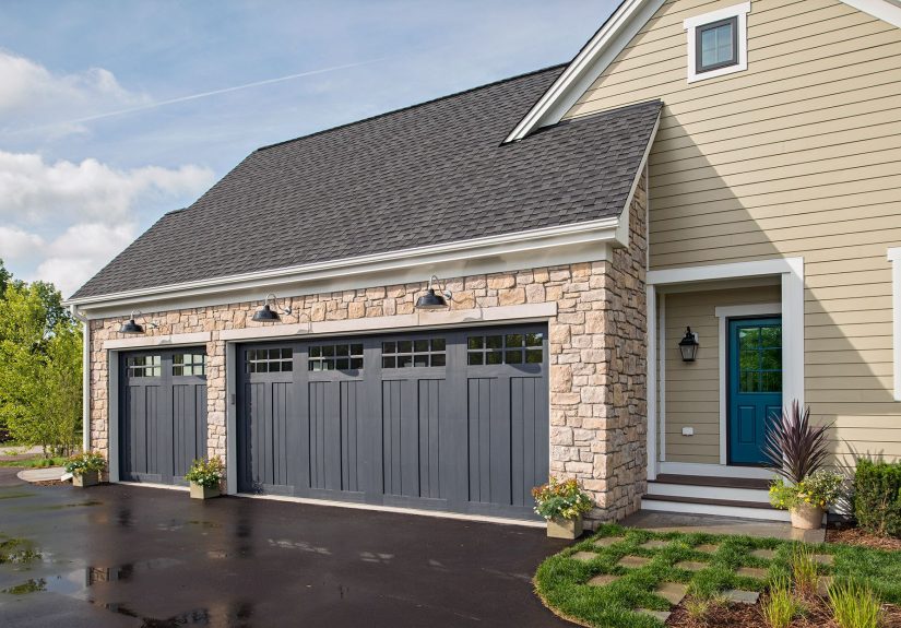
Traditional brick home
Great approach: Garage door in a body/trim color that blends; front door in a richer accent like navy, deep green, or classic red.
Brick already has a strong visual presenceyour goal is harmony, not a color battle.
Modern farmhouse
Great approach: Coordinated doors in black or charcoal can look crisp, especially with black windows.
If you want warmth, consider a wood-toned front door with a garage door that matches siding or trim to keep the wood feature special.
Craftsman
Great approach: Earth tones shine hereolive, clay, deep brown, warm gray.
A front door in a deeper version of your trim or accent color feels authentic, while the garage door often looks best blending into the main exterior color.
Coastal or light, airy exteriors
Great approach: Soft blues, blue-grays, and sea-glass greens can be gorgeous on the front door.
Keep the garage door quieterwhite, pale gray, or a siding-matching toneso the house stays breezy rather than busy.
Mistakes to Avoid (So Your House Doesn’t Look “Accidentally Loud”)
- Going bold on both doors when the garage dominates the facade.
- Choosing two similar-but-not-quite colors that look like a mismatch from the curb.
- Ignoring undertones and ending up with a door that clashes with brick, stone, or roofing.
- Picking a sheen that highlights flaws on a large garage door.
- Skipping samples and trusting a tiny paint chip like it’s never lied before.
Conclusion: Match If It Serves the House, Not the Trend
Painting your front door and garage door the same color can look polished and intentionalespecially with neutrals, minimalist styles, or homes where the garage isn’t the dominant feature.
But in many cases, experts lean toward a more strategic approach: let the garage door blend with the siding or trim, and use the front door as the place for personality.
The best exteriors feel cohesive from the street and thoughtful up close. Choose a plan (match, blend, or coordinate), test in real outdoor light, and pick finishes designed to handle weather and wear.
Your future selfstanding in the driveway admiring a clean, balanced facadewill thank you.
Real-World Experiences: What Homeowners Notice After the Paint Dries (Extra Insights)
In real projects, the “right” answer usually reveals itself the moment people see the house from the curb instead of from three feet away in the driveway. One common experience: homeowners fall in love with a bold front door colorsay a deep teal or a classic redthen briefly consider putting that same color on the garage for “consistency.” Once it’s mocked up, the garage often becomes the loudest thing on the house. The front door loses its specialness because the garage is bigger and closer to the street. Many people end up keeping the bold color on the front door and shifting the garage to a siding-matching tone. The overall look instantly feels calmer and more “expensive,” even though it’s the same paint budget.
Another frequent scenario happens with modern farmhouse and contemporary homes: matching actually looks fantastic when the palette is restrained. A homeowner chooses a warm white exterior with black windows and black lighting, then paints both doors black in a satin finish. The result reads crisp and architectural, not matchy-matchy. The key detail is that black is functioning as a structural accent across the whole facadewindows, lights, railings, and doorsso the match feels like a design system, not a coincidence.
Homeowners with traditional brick facades often learn a different lesson: brick is already visually “busy,” and the wrong garage color can make it feel even louder. Painting the garage door bright white (because it seems safe) sometimes backfires by pulling attention to the garage and away from the entry. Many people report that switching the garage door from bright white to a softer cream, a warm gray, or even a brick-friendly greige makes the garage visually shrink. Then a front door in a deeper, richer accentnavy, forest green, or oxbloodbecomes the welcoming focal point again.
Finish is another surprise. Homeowners sometimes use a higher gloss on the garage door expecting it to look “fresh,” but the shine can reveal every panel ripple, ding, or uneven textureespecially in strong sunlight. A common “aha” moment is moving the garage to satin (more forgiving) while giving the front door a slightly richer sheen for a subtle, intentional hierarchy. People also notice that color samples shift outdoors: a gray that looks perfect in the store can lean blue in shade or green near landscaping. The homeowners who feel happiest long-term are the ones who test large samples and view them at multiple times of day before committing.
Finally, there’s the lifestyle factor. Families with kids, pets, and lots of comings-and-goings often prioritize cleanability. A front door in a wipeable sheen feels practical, and a garage door in a forgiving finish avoids constant touch-ups. The best real-world outcomes usually come from balancing style with how the home is actually usedbecause curb appeal is great, but not if you’re repainting every season like it’s a hobby you didn’t sign up for.