Table of Contents >> Show >> Hide
- Who Is Lenneke Wispelwey?
- Why Her Pastel Pottery Feels So Different
- The Tactile Factor: Why “Soft Touch” Is the Right Idea
- A Family of Forms: Cups, Vases, Plates, and More
- Why Pastel Pottery Feels So Current Right Now
- How to Style Pastel Pottery Without Making Your Home Look Like a Macaron Box
- The Emotional Pull of Gentle Objects
- Experience: What It Feels Like to Live With Pastel Pottery
- Conclusion
Some ceramics shout for attention. They arrive in your dining room like a marching band in a sequined jacket, demanding applause before the salad is even dressed. Lenneke Wispelwey’s pottery does the opposite. It speaks softly, but it absolutely has opinions. Her pastel porcelain feels gentle at first glance, almost whisper-light, yet the longer you look, the more you notice the discipline underneath: the geometry, the surface changes, the subtle shifts in tone, the way each piece seems designed to belong to a family without becoming a clone of its siblings.
That balance is the magic of Wispelwey’s work. It is sweet without becoming sugary, modern without turning cold, and decorative without losing its common sense. You can admire one of her vases like a small sculpture, but you can also pour coffee into one of her cups and get on with your morning. In a design culture that often forces us to choose between “gallery object” and “thing you actually use,” her pieces politely refuse the drama. They want to be lived with.
For anyone interested in pastel pottery, contemporary porcelain, or the renewed love of handmade tableware, Wispelwey’s work is a smart case study in why soft color and tactile craft continue to resonate. Her ceramics are pretty, yes, but they are also precise. That is what makes them memorable.
Who Is Lenneke Wispelwey?
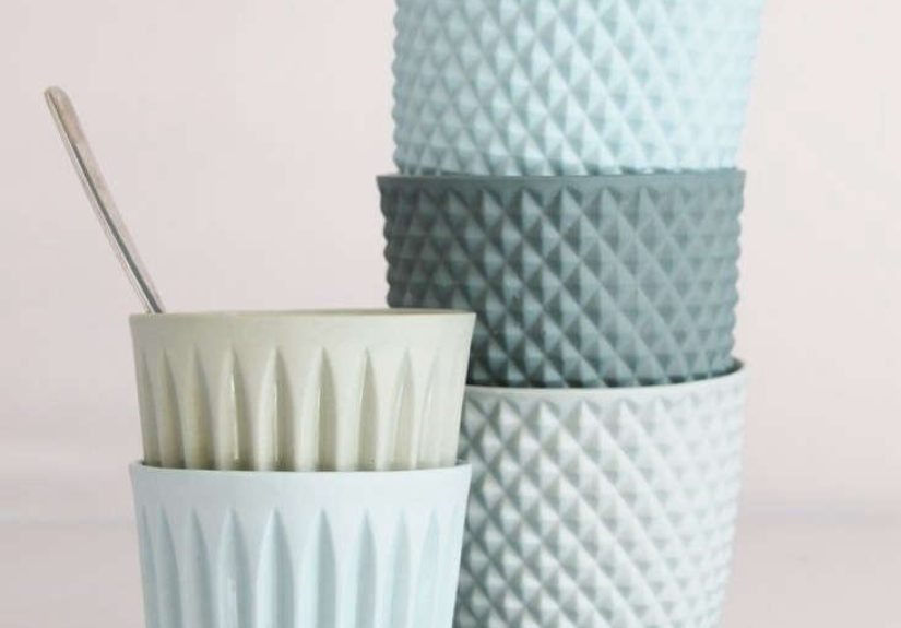
Lenneke Wispelwey is a Dutch ceramic artist and designer based in Arnhem, a city that has long punched above its weight in contemporary design. Since establishing her studio in 2008, she has become known for porcelain pieces that look airy and approachable while carrying a strong visual identity. You can spot her work by its powdery color palette, its crisp faceted details, and its alternating matte and glazed finishes that invite your eyes and fingertips to do a little teamwork.
What makes her story especially charming is that the logic of her collections is rooted in a human feeling rather than a marketing slogan. Design writers have often noted her idea that different objects can behave like members of a family: connected, recognizable, and full of small distinctions. That is why her cups, bowls, plates, planters, and vases feel related rather than repetitive. They share a visual language, but each object still gets to have its own personality. Frankly, more family reunions could learn from this.
Her work has circulated through design media, retailers, and exhibitions on both sides of the Atlantic, and it has also appeared in functional ceramics conversations in the United States. That matters, because Wispelwey is not simply making decorative novelties. She sits within a wider craft tradition that takes utility seriously while still allowing delight to have a seat at the table.
Why Her Pastel Pottery Feels So Different
Pastels are tricky. Use them carelessly and a room can start to look like a cupcake exploded. Use them with intelligence and they become sophisticated, calming, and deeply modern. Wispelwey understands the difference. Her colors tend to behave less like frosting and more like chalky daylight. Think petal pink, mint, pale blue, soft yellow, seafoam, and powdery green. These are not loud statement shades. They are mood setters.
Part of the appeal comes from restraint. Instead of relying on one flat candy color, Wispelwey often works with several shades of the same hue. That tonal variation gives the objects rhythm. A cup or vase can feel cohesive and layered at once, as though the color is breathing rather than sitting stiffly on the surface. It is a subtle effect, but it adds sophistication without any need for visual acrobatics.
Then there is the geometry. Critics and editors have described the mathematical play in her work, and that is exactly right. The shapes are clean, folded, faceted, and orderly. Yet because they are paired with soft colors, the result never feels severe. It is the design equivalent of a very kind architect. Structure is there, but it is not barking orders.
Porcelain Does a Lot of Heavy Lifting
Wispelwey’s chosen material is a major part of the story. Porcelain has long been prized for its whiteness, delicacy, and strength. Museums and ceramics historians still describe it as a material celebrated for its pure white body, translucency, and durability. Those qualities matter in contemporary design too. A white porcelain base lets pastel glaze and surface treatment read with unusual clarity. Colors appear luminous rather than muddy. Edges stay crisp. Fine details remain elegant.
That is one reason her work feels both fresh and rooted in tradition. She is using a material with centuries of prestige, but she is not trapped by historical fussiness. Instead, she treats porcelain as something tactile and friendly. In her hands, it loses the museum whisper and gains everyday warmth.
The Tactile Factor: Why “Soft Touch” Is the Right Idea
The title “Soft Touch” is not just a color reference. It is also a clue to how these pieces behave in the hand. American ceramics writing has increasingly emphasized tactility: satin glazes, textured surfaces, soft rims, the visible record of process, and the emotional connection that happens when pottery feels made rather than manufactured. Wispelwey fits beautifully into that conversation.
Her contrast between biscuit porcelain and glazed areas creates a subtle push-pull. One surface absorbs light; another reflects it. One feels dry and powdery; another feels glassy and smooth. That tension gives even a simple cup extra character. The object is not merely seen. It is experienced.
And that word, experience, matters. Functional ceramics in the best sense are not passive. They influence how you set a table, how you notice flowers, how long you linger over coffee, even how you arrange a windowsill. A mass-produced mug can hold tea. A good ceramic cup can also alter the mood of the moment. That may sound dramatic, but anyone with a favorite mug knows it is also embarrassingly true.
A Family of Forms: Cups, Vases, Plates, and More
One of the most satisfying things about Wispelwey’s body of work is its range. She has made cups, carafes, bowls, plates, plant pots, vases, and even a birdhouse project memorable enough to be singled out in design coverage. This variety reinforces the idea that her work is a visual family rather than a one-hit wonder. You can build a table setting around her pieces, but you can also scatter them through a home as small punctuation marks of color and form.
Her cups are especially effective because they combine utility with pattern and shape in a compact format. A cup is intimate. You hold it close, rotate it, notice the rim, the thickness, the color breaks. It is one of the best forms for understanding an artist’s priorities. In Wispelwey’s case, those priorities seem clear: coherence, tactility, friendliness, and visual wit.
Her vases show another side of the same language. Because they often come in grouped colors and varied heights, they can function like a cluster rather than a solo act. One small vase is lovely. Three or five together start to feel like a conversation. That approach aligns neatly with current tablescape and interior styling trends in the U.S., where designers increasingly recommend small vases in multiples, layered place settings, and collected ceramics that feel personal rather than perfectly matched.
Why Pastel Pottery Feels So Current Right Now
Wispelwey’s best-known pieces first drew attention years ago, but they still feel current because the wider design culture has moved toward exactly the territory she handles so well. Handmade ceramics remain desirable because they add texture and intimacy to interiors. Glazed dishware continues to trend because people want tables that feel expressive, not sterile. Pastel hues keep returning because they brighten a room without exhausting it. Even current color talk in interiors has favored soft greens and other gentle shades that freshen a table or shelf with very little effort.
In other words, Wispelwey was not chasing a passing trend. She was already working in a zone that has aged remarkably well: soft color, strong form, domestic usefulness, and visible craft. That combination has legs. Or feet. Tiny porcelain feet, probably.
There is also a broader cultural reason for the endurance of this aesthetic. People increasingly want homes that feel collected and lived in rather than showroom-perfect. Design publications regularly celebrate handmade ceramics because they bring irregularity, warmth, and personality into otherwise controlled spaces. Wispelwey’s work delivers exactly that, but with a polished edge that keeps it from feeling rustic or random.
How to Style Pastel Pottery Without Making Your Home Look Like a Macaron Box
The easiest way to use Wispelwey-inspired pastel pottery well is to let the pieces do the talking. Start with a neutral base: a white tablecloth, pale wood shelving, limestone countertops, or linen napkins in oatmeal, flax, or soft gray. Then add one or two ceramic hues and repeat them gently. A mint planter, a pale blue cup, and a blush vase can happily coexist if the rest of the scene stays calm.
Another good strategy is tonal layering. Instead of assembling a rainbow convention, build around variations of one family. Several shades of blue, green, or pink tend to look more refined than a full pastel buffet. Wispelwey’s own use of closely related shades makes a strong case for this approach.
Texture is equally important. Pastels look richer when paired with natural materials like woven placemats, wood, paper, and stone. This prevents the scheme from feeling too polished or too precious. The contrast between soft ceramics and rougher surroundings gives the arrangement depth. It also makes the pottery feel usable rather than ceremonial.
The Emotional Pull of Gentle Objects
There is a reason people remember ceramics like these. They are not only attractive; they are emotionally legible. Soft colors signal ease. Rounded or gently faceted forms feel approachable. Repetition with variation gives a sense of order without monotony. These are powerful design tools because they calm the eye while still rewarding attention.
Wispelwey’s pieces also carry a slightly nostalgic quality, though not in a dusty or sentimental way. They feel like future heirlooms: objects that could sit comfortably in a contemporary apartment but also seem capable of surviving changing tastes. That is a difficult trick. Many trendy home accessories look dated before the receipt is cold. Good porcelain tends to age with more dignity.
And perhaps that is the deepest appeal here. In a loud marketplace, quiet confidence stands out. These pieces do not need gimmicks. They win you over slowly, which is usually how the best things work.
Experience: What It Feels Like to Live With Pastel Pottery
Living with pastel pottery is a little like discovering that your home has learned better manners. The shift is not dramatic, but it changes the atmosphere. A cup in a tender blue does not merely hold coffee; it softens the visual noise of the morning. A small vase in chalky pink can make grocery-store tulips look suddenly poetic. A pale green planter on a windowsill turns a practical corner into something that feels considered, even if the plant inside is still recovering from your wildly inconsistent watering schedule.
That is the thing about ceramics in this register: they create experience through repetition. You do not admire them once and move on. You use them on sleepy Tuesdays. You notice them while making toast. You see afternoon light slide across a matte surface and realize that the object looks completely different at 4 p.m. than it did at breakfast. Their value grows through contact.
Pastel pottery also changes the pace of a table. It encourages a more relaxed, layered style of setting that feels welcoming instead of stiff. When you mix soft-toned cups, bowls, and little vases, the arrangement reads as thoughtful but not intimidating. Guests tend to lean in, pick things up, ask questions, and actually use what is in front of them rather than treating the table like a museum display with stricter rules than airport security.
There is also a pleasure in the mismatch that is not really a mismatch at all. Pieces in related shades create harmony without the deadening effect of perfect uniformity. One bowl can be a dusty mint, another a pale aqua, a third a creamy white with a glazed edge, and together they look intentional rather than accidental. This kind of visual flexibility is a gift for real homes, where life rarely arranges itself into identical sets.
For many people, these objects become memory markers. The vase you use for the first daffodils of spring. The little cup you reach for when you need comfort tea after a long day. The planter that travels from apartment to apartment because you cannot imagine your kitchen without it. Ceramics are excellent at collecting routine, and routine is where attachment lives.
There is a sensory side, too. The coolness of porcelain, the contrast between matte and gloss, the slight weight in the hand, the brightness of color against a white body: these details make everyday rituals feel less disposable. You begin to notice what design people call tactility and what normal people call “this just feels nice.” Honestly, normal people may have the better phrase.
And perhaps that is why Lenneke Wispelwey’s work continues to charm. It does not ask you to become a ceramics scholar or a tablescape aristocrat. It simply offers objects that improve the texture of ordinary life. They are calm, cheerful, clever, and quietly useful. Not bad qualities for a vase. Also not bad qualities for a person, come to think of it.
Conclusion
Lenneke Wispelwey’s pastel pottery works because it understands a design truth that many louder objects forget: softness can be strong. Her porcelain combines gentle color with disciplined form, tactile surfaces with practical function, and whimsy with restraint. It feels contemporary without being disposable and beautiful without becoming fussy. That is a rare mix.
For collectors, decorators, and everyday users who want ceramics with personality, her work offers a persuasive model of what modern pottery can be. It can be functional, emotionally resonant, quietly playful, and visually smart all at once. In a world full of hard edges and digital sameness, that kind of soft touch lands with surprising power.