Table of Contents >> Show >> Hide
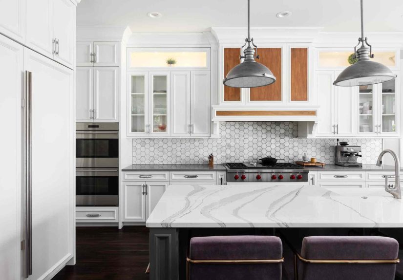
- The One Color Designers Say to Skip: Stark White
- Why Stark White Fails in Real Kitchens
- What to Use Instead: Designer-Friendly Alternatives That Still Feel Bright
- How to Pick the “Right White” for a Kitchen (Without Regrets)
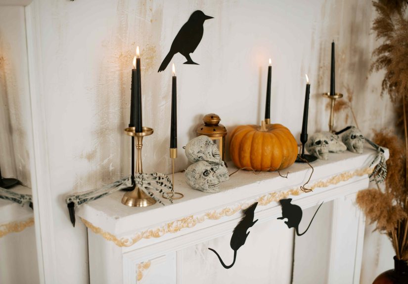
- But WaitIs White Ever a Good Kitchen Color?
- Quick Cheat Sheet: When Stark White Will Betray You
- Conclusion: Skip the Stark White, Keep the Bright
- Real-World Experiences: What Happens When You Paint a Kitchen Stark White
Kitchens are where life happens: coffee spills, spaghetti splatters, late-night snacking decisions you’ll deny in court, and the occasional “I’ll just
wipe it later” lie we all tell ourselves. So if there’s one room where paint has to be both pretty and practical, it’s the kitchen.
That’s why many designers agree on one surprisingly common paint choice you should skipespecially on kitchen walls and large expanses:
stark, cool “printer-paper” white. It sounds safe. It sounds timeless. It sounds like it belongs in a crisp magazine spread. But in an
actual working kitchen? Stark white can behave like white jeans at a marinara festival.
The One Color Designers Say to Skip: Stark White
Let’s define the culprit. Designers aren’t declaring war on all white paint. They’re calling out
stark white: the bright, high-contrast white that reads cool, icy, or slightly blue/gray under many light sources.
It’s the kind of white that makes a sheet of paper look “right” and your kitchen look… unexpectedly tense.
Stark white is popular because it feels simple: pair it with anything, right? Except kitchens are a perfect storm of visual “anything”:
warm wood tones, cool stainless steel, creamy cabinets, patterned stone, glossy tile, and lighting that changes from morning sun to evening LEDs.
Stark white doesn’t blend into that partyit shows up wearing a tuxedo and judging everyone’s appetizer choices.
Why Stark White Fails in Real Kitchens
1) It broadcasts every mess like it’s breaking news
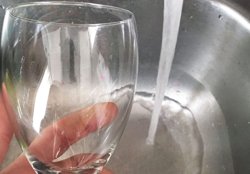
Kitchens collect residue. It’s not a personal failure; it’s physics plus bacon. Stark white makes the everyday realities of cooking impossible to ignore:
fingerprints near the pantry, splash marks by the sink, scuffs where the trash can bumps the wall, and that mysterious smudge that appears the second
you host company. If you want a paint color that quietly helps you feel calm, stark white is not that friend.
2) It can read cold, sterile, or “commercial”
Many designers describe stark white kitchens as feeling flat or clinicalmore “break room” than “welcome home.”
That effect can be even stronger if your finishes are also cool (white quartz with gray veining, stainless appliances, chrome hardware).
Instead of cozy and layered, the room can tip into “dentist office chic,” and nobody wants to floss next to the stove.
3) Lighting turns it weird (sometimes very weird)
Kitchens rarely have one perfect light source. You’ve got window light (which shifts throughout the day), overhead fixtures, pendants, under-cabinet lights,
and whatever bulb you grabbed at the hardware store because it was “on sale.” Cool whites can look blue, gray, or slightly green depending on the bulb
temperature and surrounding finishes. That’s how people end up saying, “Why does my wall look like melted ice?”
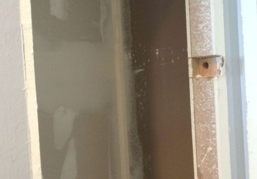
4) It highlights wall imperfections and wonky surfaces
The brighter and cleaner the color, the more it reveals. Stark white can emphasize drywall seams, texture inconsistencies, patchwork repairs,
and the subtle wavy spots that exist in many real-life walls. Kitchens already have a lot of reflective surfaces; stark white can amplify the
“everything is under a spotlight” vibe.
5) It can make other whites look dirty by comparison
Here’s the sneaky problem: you don’t just have one “white” in a kitchen. You may have white cabinets, white trim, white subway tile,
and white applianceseach with their own undertone. When your wall paint is an ultra-bright, cool white, it can make the “warmer whites”
around it look dingy or yellowed even when they’re perfectly nice. The result is a mismatch that feels accidental.
What to Use Instead: Designer-Friendly Alternatives That Still Feel Bright
If you love the clean, airy look of a light kitchen, you don’t need to abandon whiteyou just need a white that behaves.
Designers often recommend shifting from stark white to a soft white or warm off-white
that has a little depth and forgiveness.
Option A: Warm whites and creamy off-whites
Warm whites have subtle undertones (often beige, cream, or a gentle hint of red/yellow) that make a kitchen feel inviting instead of icy.
They’re also better at hiding everyday grime and minor wall flaws.
- Sherwin-Williams Alabaster (soft, warm, widely loved for a reason)
- Sherwin-Williams Dover White (warm and classictest it in your lighting)
- Benjamin Moore White Dove (a designer staple: bright without being harsh)
- Benjamin Moore Simply White (lively and clean, but can show warmth depending on light)
- BEHR Swiss Coffee (cozy, approachable, and popular for kitchens)
- BEHR Smoky White (soft and warm-leaning)
The key is not the paint name; it’s the undertone. A warm off-white can still look fresh and modern, but it won’t punish you for cooking.
Option B: Soft greige, taupe, and “barely-there” neutrals
If white feels risky but you still want bright, a light greige or taupe can be the perfect compromise. Think of it as white’s calmer cousin:
still airy, but less likely to glare or look cold.
These tones play nicely with both warm woods and cooler finishes, and they tend to age well (translation: you won’t hate them next year).
Option C: Pale, muted color with a neutral backbone
Want a kitchen that feels light but not monochrome? Consider soft, muted color that reads like a neutral at a distance:
gentle sage, dusty blue, or an earthy putty tone. These colors can bring warmth and personality while still feeling timeless.
Bonus: muted color makes your cabinets, counters, and backsplash look intentionallike you planned the vibe instead of accidentally assembling it.
How to Pick the “Right White” for a Kitchen (Without Regrets)
Step 1: Identify undertones like a detective (a stylish detective)
White paint isn’t just white. Manufacturers blend pigments to create undertonestiny hints of yellow, red, green, blue, or violet.
Those undertones are what make one white look creamy and another look icy.
A quick trick: compare your potential whites against a sheet of true bright paper. The undertone will reveal itself fast.
If the paint suddenly looks blue-gray or stark by comparison, you’ve found the “skip it” energy.
Step 2: Test in the actual kitchen (not your imagination)
Designers constantly repeat this because it saves people from heartbreak: test your paint.
Paint a large sample area or use sample boards you can move around. Look at it in morning sun, afternoon glare, and evening artificial light.
If your white flips from “fresh” to “cold hospital hallway,” it’s not the one.
Step 3: Let fixed elements lead
Cabinets, countertops, floors, and backsplash aren’t changing as easily as paint. Your wall color should support them.
If your cabinets are a creamy white, a cool stark wall white may clash. If your countertop has warm veining, a warm white wall often feels smoother.
Matching undertones doesn’t mean “everything identical”it means everything looks like it belongs in the same story.
Step 4: Respect kitchen lighting (because it has opinions)
Kitchens often have bright task lighting. Cool LEDs can make cool whites look even cooler. Warm bulbs can make some whites read more creamy.
If you’re set on a light palette, consider warm to neutral bulbs (many designers favor a warm, welcoming range) and make sure under-cabinet lighting
doesn’t turn your wall color into a science experiment.
Step 5: Choose a cleanable finish
Kitchens need wipeable walls. Many pros recommend eggshell or satin for kitchen walls because they’re more durable and easier to clean
than flat finishes. For areas that see frequent splashes (like behind the sink), some people go with a higher sheen for extra scrub-abilityjust remember
higher sheen can highlight wall imperfections.
But WaitIs White Ever a Good Kitchen Color?
Absolutely. White kitchens are popular because they feel bright, flexible, and classic. The designer “skip” is not “white” as a conceptit’s
stark, cool, unforgiving white used in places where real life happens.
If you want a white kitchen that still feels elevated, the magic is in layering:
mix a soft white wall with slightly warmer trim, add natural wood, choose hardware with warmth, and use texture (tile, stone, textiles) to prevent the
room from feeling flat. The goal is “fresh and welcoming,” not “lab clean and tense.”
Quick Cheat Sheet: When Stark White Will Betray You
- You cook often (aka you use the kitchen as a kitchen)
- You have warm cabinets or warm stone and don’t want a clash
- You have cool LED lighting and hate the idea of blue-ish walls
- Your walls aren’t perfectly smooth (most walls are not)
- You want a cozy vibe and not “freshly sanitized” energy
If you still love that crisp look, choose a white with a touch more softness and test it thoroughly. “Crisp” doesn’t need to mean “cold.”
Conclusion: Skip the Stark White, Keep the Bright
The kitchen paint color designers most often warn against isn’t some wild neon or risky trendit’s the deceptively “safe” choice:
stark, cool white. In real kitchens, it shows mess, exaggerates imperfections, and can feel sterile under common lighting.
The better move is simple: pick a white (or near-white) with a little warmth, a little depth, and a lot more grace. Test it in your kitchen’s lighting,
match undertones to your fixed finishes, and choose a cleanable sheen so your walls survive actual life. Your kitchen can still be bright and timeless
just without the vibe of an operating room.
500-word experience add-on
Real-World Experiences: What Happens When You Paint a Kitchen Stark White
Designers can warn us all day long, but the most convincing lessons tend to come from lived experienceusually right after you’ve spent a weekend painting,
eaten takeout on the floor, and sworn you’ll “never do a home project again.” Here are the kinds of real-life scenarios people run into when they choose
a stark, cool white for the kitchen (and what they often do next).
Experience #1: The “It Looked So Clean… for 48 Hours” Kitchen. Someone paints their kitchen a bright, cool white because it looks crisp
online. Day one is incredible. Day two: the first pancake splatter lands near the stove, and suddenly the wall looks like it’s keeping receipts.
Grease haze around the cooktop becomes visible from across the room. Even when everything is technically “clean,” the wall reads as “not as clean as it
should be,” which is a surprisingly exhausting vibe for a place where you’re trying to enjoy a cup of coffee.
Experience #2: The Undertone Surprise Party. In the paint store, stark white looks neutral. At home, under cool LED cans, it turns
faintly blue. Under the warm pendant over the island, it shifts againnow it’s slightly gray. Add under-cabinet lighting and the backsplash starts
reflecting that coolness right back onto the walls. The homeowner begins describing their kitchen as “cold,” even though the thermostat is fine.
Often, the fix isn’t repainting the entire room immediatelypeople start by swapping bulbs, adding warmer fixtures, or introducing wood and warm metals
to counterbalance the chill. But many eventually say, “I should’ve started with a warmer white.”
Experience #3: The Great White Mismatch. This one is common: the walls are stark white, but the cabinets are a softer white,
the trim is a third white, and the countertop has creamy undertones. Instead of a clean monochrome look, it becomes a “white-off.”
Once you notice it, you can’t unsee it. People often try to solve it with decor (rugs, art, warm wood stools), and it helpsbut the bigger relief comes
when the walls shift to a white that harmonizes with the cabinets rather than competing with them.
Experience #4: The “Why Does It Feel So Loud?” Reaction. Bright white seems quiet in theory, but in a kitchen full of reflective surfaces
it can feel visually intenselike the room is always turned up a notch. Homeowners sometimes describe it as glare, especially in sunny kitchens.
In response, they add window treatments, switch to softer bulbs, or repaint with an off-white or greige that absorbs light more gently.
The pattern in these experiences is consistent: people don’t usually regret choosing a light kitchenthey regret choosing a light color that’s too harsh,
too cool, and too unforgiving for how kitchens actually work. The happiest outcomes come from a softer white (or light neutral) that still looks bright
but doesn’t demand perfection every time someone makes toast.