Table of Contents >> Show >> Hide
- When Tinder Meets the Boardroom
- The Slide Deck That Launched a Thousand Screenshots
- Why “Bad” Sometimes Works Better Than “Perfect”
- The Comedic Tightrope: Funny vs. Try-Hard
- If You Want to Copy the Idea (Without Becoming a Meme)
- What This Says About Dating Culture (Besides “We’re Tired”)
- Safety & Sanity: Don’t Let the Bit Override the Basics
- Final Take: So Bad, It’s… Actually a Little Good?
- Extra: of “Been There, Swiped That” Experiences (Composite Stories)
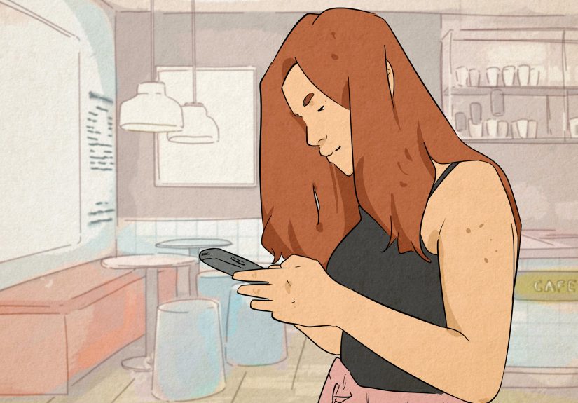
Online dating is basically a talent show where the only judges are thumbs, attention spans, and a split-second vibe check. You’ve got roughly three seconds to convince a stranger you’re not a bot, not a scam, and not about to open with “I don’t check this app, add me on Snap.” So when someone decides to use their Tinder photo carousel to upload a full-on presentationlike a tiny PowerPoint pitch deck for romanceit feels both unhinged and… honestly? Kind of brilliant.
But sometimes the presentation is so aggressively “corporate meeting energy” that it circles back around to comedy. Think: big title slide, chaotic bullet points, a “why you should swipe right” agenda, and the emotional courage to attach a literal call-to-action to a dating profile. It’s the kind of move that makes you laugh, screenshot, and immediately send to your group chat with a caption like: “She really brought a deck to a swipe fight.”
When Tinder Meets the Boardroom
The “Tinder slideshow” idea has popped up in different viral moments over the years: people turning their profiles into mini decks, “resume-style” pitches, or motivational slides that read like a startup founder trying to raise a seed round called Love. The format is simple: instead of six normal photos, you use some slots for slidestext-heavy, meme-y, or intentionally awful designso the person swiping has to keep going to see what fresh chaos is next.
And yes, it’s inherently funny. Tinder is built for quick visuals, not long explanations. So the moment you demand someone’s attention like you’re presenting quarterly results, you’re breaking the unspoken social contract of the app. That rule-breaking is the joke. But it can also work, because it signals something the algorithm can’t measure: personality with a pulse.
The Slide Deck That Launched a Thousand Screenshots
The funniest versions usually follow the same accidental recipe: genuine effort + slightly cursed execution. The person isn’t trying to be cringe; they’re trying to be memorable. Unfortunately for them (and fortunately for us), the “memorable” part sometimes arrives wearing Comic Sans and a background gradient straight out of a 2007 science fair.
The best part is that it often feels like an earnest attempt to stand outthen suddenly you’re staring at a slide that reads like: “Strengths: can parallel park. Weaknesses: will steal your fries.” It’s a romantic SWOT analysis. It’s an investor pitch where the product is “me” and the market is “whoever finds this funny.”
Slide-by-Slide: The Anatomy of a Hilariously Bad Tinder Presentation
1) The Title Slide
Usually some version of: “It’s a Match!” or “Why You Should Swipe Right: A Brief Presentation.” The tone is immediately clear: you’re not dating, you’re attending a seminar. Bonus points if the title includes a fake company logolike “WLKEND Dating Solutions LLC”for absolutely no reason.
2) The Agenda Nobody Asked For
This is where the chaos gets formal. The agenda slide often lists sections like: “Fun Facts,” “Credentials,” “Hobbies,” “What You Gain,” and “Q&A (aka messages).” It’s funny because it’s over-structured for something as irrational as attraction. Nobody has ever fallen in love because someone followed a clear outline. Yet here we are.
3) “Fun Facts” That Are Not Facts
“Large sock collection.” “Craft beer enthusiast.” “Wears hats.” “Fought a dinosaur (won).” The goal is to be quirky, but the delivery lands somewhere between “adorable” and “I have a lockbox of rubber ducks.” The best decks mix normal facts with one absurd claimbecause it creates a conversation hook that’s easier than “hey.”
4) The “Value Proposition” Slide
This is where the presentation fully commits to being a pitch deck: a list of benefits you’ll allegedly receive by dating this person. Examples might include:
- Access to someone who will hype you up like you’re a celebrity.
- Handmade playlists that are 40% romance and 60% chaos.
- Someone who’ll try new restaurants even when the menu is “too creative.”
- Free comedy, because apparently this deck exists.
It’s ridiculous, but it’s also doing something smart: it’s painting a picture of what spending time together feels like. Dating profiles aren’t résumés. They’re trailers.
5) The “Bragging Rights” Slide
Some decks include a playful angle like: “Things you can brag to your friends about if we match.” This works because it reframes dating from pressure (“will this go anywhere?”) to play (“this could be a fun story”). People swipe when they can imagine a momentnot just a person.
6) The Terms & Conditions (Where It Gets Too Real)
The last slide is often the funniest and the riskiestbecause it’s where honesty shows up wearing a clown wig. “I will double-text.” “I’m weird about sharing food.” “I’m obsessed with my dog.” If the deck is truly “so bad it’s hilarious,” this slide includes one line that’s either wildly self-aware or wildly alarming. The key difference is tone: self-aware is charming; alarming is… a left swipe with purpose.
Why “Bad” Sometimes Works Better Than “Perfect”
The funniest Tinder presentations succeed for the same reason a slightly messy friend is more lovable than a flawless influencer: imperfection signals humanity. Polished profiles can feel like adsbeautiful, curated, and vaguely suspicious. A goofy slide deck feels like someone took a risk, and risk is inherently interesting.
There’s also a practical reality: on swipe-based apps, photos do a lot of the heavy lifting. But once someone is already intrigued, creativity and specificity can turn “maybe” into “okay, I have to see where this goes.” A presentation forces specificitybecause you can’t hide behind generic lines like “I love tacos” when you’ve committed to a title slide.
The Comedic Tightrope: Funny vs. Try-Hard
The difference between “iconic” and “please stop” is surprisingly smallabout one slide, two fonts, and a single bullet point that reads like it came from a hostile corporate training.
It’s funny when:
- It’s self-deprecating without self-hating. “I’m a little awkward” is charming. “I’m terrible, please fix me” is not.
- It’s specific. Real details beat generic “I love adventures” every time.
- It invites conversation. The best decks include at least one easy question someone can ask.
- It’s kind. Punchlines that target whole groups (“no drama,” “don’t be crazy”) read like a warning label.
It’s try-hard when:
- It’s a resume with romantic buzzwords (“synergy,” “stakeholders,” “deliverables”) and zero warmth.
- It’s a list of demands masquerading as “standards.”
- It relies on negativitycomplaining about the app, dating, exes, or “what’s wrong with people.”
If You Want to Copy the Idea (Without Becoming a Meme)
Look, if you’re considering a Tinder presentation, I support your chaos. But I also want you to survive it. Here’s how to steal the concept in a way that reads playfulnot painfully desperate.
Keep it short
One or two slides can be charming. Six slides can be hilarious. Ten slides is an elective course. Remember: the goal is curiosity, not completion.
Lead with a real photo
Your first photo should clearly show you. The slide deck is seasoning, not the meal. If your first image is a title card, some people will never swipe far enough to meet the protagonist.
Write like a human, not like a brand
The charm comes from personality and voice. Swap “I enjoy traveling and new experiences” for “I will absolutely plan a trip around a sandwich I saw on TikTok.”
Give people an easy opener
Add one slide that ends with a question: “Pick our first-date vibe: tacos, bookstore, or trivia night?” You’re basically handing matches a script, and that’s a gift.
What This Says About Dating Culture (Besides “We’re Tired”)
The rise of “presentation profiles” is partly a comedy trend, but it also reflects dating app fatigue. When everyone is swiping through similar photos and recycled bios, anything that feels different becomes a relief. A weird little slideshow is a tiny rebellion against sameness.
It’s also a reminder that dating profiles aren’t just marketingthey’re communication. The best profiles convey: “This is what it’s like to talk to me.” A hilarious deck can do that in a way a standard bio can’t.
Safety & Sanity: Don’t Let the Bit Override the Basics
Creativity is great, but dating apps are still the internet. Keep personal info private (last name, exact workplace, where you live). Meet in public for first dates. Tell a friend where you’re going. Stay in control of your transportation. And if someone tries to rush intimacy or money talk, take that as your exit cue.
The funniest Tinder presentations work because they’re playfulnot because they reveal everything. Your profile should spark interest, not serve as a full autobiography with footnotes.
Final Take: So Bad, It’s… Actually a Little Good?
A Tinder PowerPoint profile is comedy because it treats dating like a business pitch. But it’s also weirdly effective because it dares to be specific, silly, and memorable. If your deck makes someone laugh, you’ve already done the hardest part: you made them feel something. And in swipe-land, feeling something is the whole point.
Extra: of “Been There, Swiped That” Experiences (Composite Stories)
Below are composite, true-to-life scenarios based on common dating-app moments people regularly describebecause once you’ve swiped for long enough, you realize the app is less “dating marketplace” and more “digital improv theater.”
1) The Résumé Bio. You match with someone whose profile reads like LinkedIn had a romantic relapse: “Results-driven. Passionate about synergy. Looking for a partner to scale laughter.” You want to roast them, but you also respect the commitment. The date, predictably, feels like an interview. They ask what your “five-year relationship goals” are while you’re still deciding whether to order fries.
2) The “I’m Not Here Often” Classic. Another profile says they don’t use the app, but includes three other apps where they also claim they’re never online. It’s the digital version of someone waving at you while walking away. You realize the point isn’t availabilityit’s collecting attention across platforms like trading cards.
3) The Presentation That Saves the Conversation. You see a slideshow profile that’s objectively ugly: mismatched fonts, a neon background that could power a small city, and bullet points that sound like a kid wrote them during detention. But one slide ends with: “Ask me about the time I accidentally joined a competitive dodgeball league.” Suddenly you have an opener that isn’t “how’s your week?” The chat becomes easy because the profile did its job: it gave you a story-shaped handle to grab onto.
4) The “Too Perfect” Profile Trap. Sometimes you match with someone whose photos are flawless, bio is perfectly witty, and prompts are suspiciously polished. You feel like you’re talking to a brand account. Then you meet in person and realize the profile was a highlight reel from 2019. They’re fine, but the mismatch is jarringlike you ordered one thing and got something adjacent. It’s not that they lied; it’s that the profile promised a vibe they can’t realistically maintain.
5) The One That Actually Works. The best “creative profiles” don’t try to be universally appealing. They aim for the right audience. A goofy deck, a niche joke, a specific obsessionthese aren’t for everyone, and that’s the point. The moment you stop trying to win all swipes, you start attracting the people who laugh at the same things you do. And that’s when dating apps feel less like a numbers game and more like a weird little filter that finally filters something useful: humor compatibility.